Art with Heart Wow Tutorials

Wednesday, 29 June 2022

AWHT Colour Creations #9 Blackberry Bliss

Blackberry Bliss with Cottage Rose and Water-colouring

Hello. Welcome to Valley Inspirations with Andrea and the Art with Heart Colour Creations Blog Hop. We are continuing to work though the Stampin' Up! colours in alphabetical order. 


This week’s Blog Hop is focussing on a muted deep purple called Blackberry Bliss. Blackberry Bliss is part of the Regals Colour Family and is a rich luscious colour. Think of the staining on your fingers when picking blackberries. This colour is gorgeous when used with other pinks and mauves and also works really well with other colours.  


Blackberry Bliss is produced in Stampin' Up!'s card-stock, both A4 & 12"x12"Classic Stampin' inks (ink pads re-inkers); Stampin' Write Markers; Stampin' Blends, Watercolour Pencils, Regals Designer Series Paper, Pretty Prints DSP, Design A Daydream DSP and the retiring New Horizons DSP. The card below has used Blackberry Bliss Classic Stampin' ink, Card-stock and Stampin' Write Marker plus a range of other non-BB bits and pieces.

Show a valued friend how much you appreciate them with a gorgeous Blackberry Bliss Cottage Rose card.

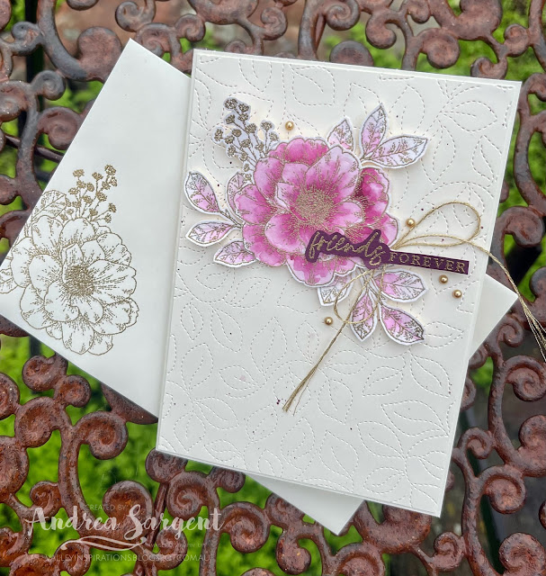
This card only shows a tad of the full depth of Blackberry Bliss, ie via the fussy cut sentiment that was heat embossing in gold on Blackberry Bliss card-stock. However, the gorgeous gold embossed Cottage Rose was water-coloured with Blackberry Bliss Classic Stampin' ink. I so love water-colouring with SU inks as it can show a colours various undertones. Isn't Blackberry Bliss beautiful when water-coloured?

Show a valued friend how much you appreciate them with a gorgeous Blackberry Bliss Cottage Rose card.

As indicated, the large rose and leaves from the Cottage Rose stamp set was heat embossed with Versamark, Gold Emboss Powder and a Heat Gun on Shimmery White card-stock. Blackberry Bliss Classic ink was applied with a fine Water Painter to water-colour the rose while a little Fresh Freesia Classic ink was used on the leaves. Its interesting that they look to be the same colour when diluted. Some Blackberry Bliss ink was flicked over a Very Vanilla  background panel with the fine Water Painter. A Very Vanilla background was embossed with the Stitched Greenery die. I so love the subtle stitched effect of this die. 

Show a valued friend how much you appreciate them with a gorgeous Blackberry Bliss Cottage Rose card.

The leaves were fussy cut away from the rose to enable a different arrangement. The rose was positioned with Dimensionals while the leaves were adhered in place with a little Tombow Multipurpose Liquid Glue. The Gold heat embossed sentiment came from the same stamp set and was popped up with Mini Dimensionals.

Show a valued friend how much you appreciate them with a gorgeous Blackberry Bliss Cottage Rose card.

I was running out of time and searching for some Gold Elegant Trim but first found some retired ... Twine. Given time restrictions I used the latter but know that the Gold Elegant Trim would have been brilliant too. The final touch was the addition of some tiny Gold Pearl Jewels.

Show a valued friend how much you appreciate them with a gorgeous Blackberry Bliss Cottage Rose card.

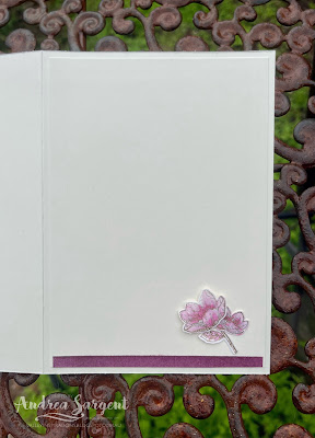
A Very Vannila card inner was decorated with a couple of small flowers and an extra leaf together with a left over strip from a blended background created for the second card. More of that in a minute. A Very Vanilla C6 Envelope was gold heat embossed with the rose spray to tie the envelope with the card it will hold.

Show a valued friend how much you appreciate them with a gorgeous Blackberry Bliss Cottage Rose card.

I had designed two cards for this Blackberry Bliss blog hop but a range of things & interruptions used up my available time. I pushed to create the second card but the more I pushed the more mistakes I made, so decided that the second card will need to be finished at a later time. Disappointing, but that is life. The cards were designed to be a "Ying & Yang", that is, the background on this card is uncoloured and the rose is water-coloured; where as the background of the second card was coloured (a blended background) and the flowers were gold embossed and uncoloured. Hopefully I will finish it soon and share it here.

Show a valued friend how much you appreciate them with a gorgeous Blackberry Bliss Cottage Rose card.

Thank you so much for dropping by. I do value the time you spent with me.

There is more Blackberry Bliss creativity. To continue with the blog hop, click on the "next" graphic below to be taken to the blog of the lovely, Ros Davidson. I always look forward to checking out Ros' creation (I wonder what she has in store this week). I do love seeing everyones' projects - always so much inspiration.

Hope to see you next week when we will be featuring a delightful colour, Blushing Bride, as we continue the weekly 2022-2023 Colour Creations blog hops.

Stay well, stay safe and be kind to yourself and others. 

Andrea 💕🐾


If you find a broken link or have come to this blog hop from a different entry point, you can view the full list of participants on Catherine Proctor’s blog @ What Cathy Made. Cathy is our wonderful Art With Heart Team Colour Creations Coordinator.  I so appreciate all she does in coordinating this blog hop each week. She is such an amazing lady. Check out her wonderful creation while you are there.

If you live in Australia, don't already have a Stampin' Up! demonstrator and would like your own copy of Stampin' Up's 2022-2023 Annual Catalogue and or the July - December 2022 Mini Catalogue then let me know and I will be delighted to send them to you.  Please don't hesitate to make contact with any other queries about these projects or Stampin' Up!. 


#colourcreationsbloghop  #stampinup #stampinupaustralia #stampinupsouthpacific #stampinupdemo  #handmadecards #makeacardsendacard #stampinupdemonstrator #papercrafting #artwithheartteam  #papercrafter  #stamper #cottagerose #valleyinspirations

Wednesday, 22 June 2022

AWHT Colour Creations #8 Bermuda Bay

Bermuda Bay with Butterfly Brilliance

Hello. Welcome to Valley Inspirations with Andrea and the Art with Heart Colour Creations Blog Hop. We continue to work though the Stampin' Up! colours in alphabetical order. 


This week’s Blog Hop is focussing on a deep turquoise called Bermuda Bay. Bermuda Bay is part of the Brights Colour Family and is a strong green-blue (or is that blue-green) colour. Some people classify it as a green while others view it as a blue. Bermuda Bay is gorgeous when used monochromatically with other green-blues such as Pool Party and Coastal Cabana. As the name suggests it is a great colour for water. Surprisingly it looks lovely with Gorgeous Grape or is delightful with Parakeet Party.  


Bermuda Gay is produced in Stampin' Up!'s card-stock, both A4 & 12"x12"Classic Stampin' inks (ink pads re-inkers); Stampin' Write Markers; Watercolour Pencils, Brights Designer Series Paper, Pretty Prints DSP, Robot Buddies Card Kit and Kindness Card Kit. The card below has used Bermuda Bay Classic Stampin' ink, Card-stock and Stampin' Blends plus a range of other non-BB bits and pieces.

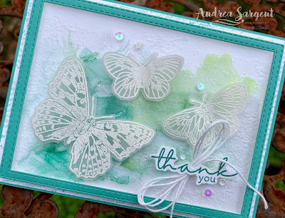
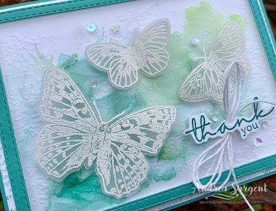
Embossed butterflies flying over an alcohol wash of colour is a lovely way to say "thank you".

I recently saw a U-tube where alcohol inks were used with blending solution on acetate. As I watch I wondered if it would also work using Stampin' Up!s Alcohol Blends and high proof Isopropyl Alcohol on Window Sheet. I decided to give it a go and had 2 different designs in mind using two different colour combos. I started with one idea but this design morphed as I played. I have another piece of coloured window sheet but ran out of time to create a 2nd project - It has been one of those weeks!

Embossed butterflies flying over an alcohol wash of colour is a lovely way to say "thank you".

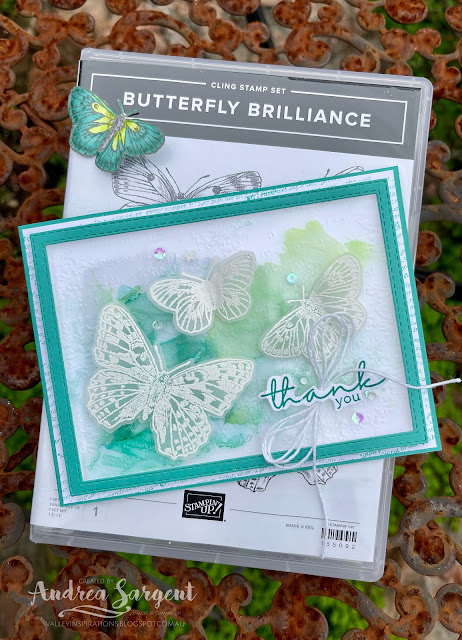
I started by scribbling some Light & Dark Bermuda Bay Blends and Light and Dark Parakeet Party on a piece of Window Sheet (acetate). I spray/dribbled some Isopropyl Alcohol over sections of the colour and then moved the colour around with a hand-squeeze blower tool. You could also blow through a straw. I needed to apply ink in a few layers to build up a stronger colour - following the same process of adding alcohol and blowing the colour around.

Embossed butterflies flying over an alcohol wash of colour is a lovely way to say "thank you".

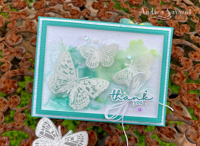
A stitched frame was die cut using the two largest Stitched Rectangles dies. This was adhered directly to the acetate. Some Mini Dimensionals were added underneath the frame to enable the colour to sit above the background panel. A Basic White piece of card-stock was dry embossed with the Timeworn Type 3D embossing folder. A piece of Basic White card-stock that had been stamped in 2nd generation Bermuda Bay ink with text from the Artfully Layered stamp set was added to a Bermuda Bay card-stock base. 

Embossed butterflies flying over an alcohol wash of colour is a lovely way to say "thank you".

Vellum card-stock was white heat embossed after being stamped in Versamark ink using the Butterfly Brilliance stamp and my trusty Stamparatus. It is interesting that the camera shows the embossing as a more creamy colour than the eye picks up in real life. The butterflies could have been cut with the coordinating Butterfly die but as I was talking with someone, I relaxed and fussy cut them out. The Bermuda Bay "Thank you" sentiment also came from the Artfully Layered stamp set - it was on my desk as the other design I had in mind would have used it. A triple White Bakers Twine bow was tucked under the sentiment and the design was finished off with some delightful Sparkle & Shine Sequins.


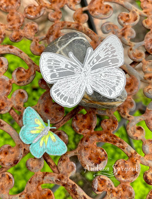
As the rain started to fall while I was photographing the card, I wasn't able to photograph the card inner or a peak at the decorated envelope. I added the largest embossed butterfly inside the card and will add some stamped butterflies to the envelope. Initially I had coloured a couple of the smaller butterflies with Bermuda Bay and Parakeet Party Blends but decided not to add them to the card.

Embossed butterflies flying over an alcohol wash of colour is a lovely way to say "thank you".


Thank you so much for dropping by. I do value the time you spent with me.

There is more Bermuda Bay creativity. To continue with the blog hop, click on the "next" graphic below to be taken to the blog of the lovely, Sharon Davern. I always look forward to checking out Sharon's creation (I wonder what she has in store this week - will it be a fancy fold???). I do love seeing everyones' projects - always so much inspiration.

Hope to see you next week when we will be featuring a beautiful deep colour, Blackberry Bliss, as we continue the weekly 2022-2023 Colour Creations blog hops.

Stay well, stay safe and be kind to yourself and others. 

Andrea 💕🐾


If you live in Australia, don't already have a Stampin' Up! demonstrator and would like your own copy of Stampin' Up's 2022-2023 Annual Catalogue and or the new July - December 2022 Mini Catalogue then let me know and I will be delighted to send them to you.  Please don't hesitate to make contact with any other queries about this project or Stampin' Up!. 

If you find a broken link or have come to this blog hop from a different entry point, you can view the full list of participants on Catherine Proctor’s blog @ What Cathy Made. Cathy is our wonderful Art With Heart Team Colour Creations Coordinator.  I so appreciate all she does in coordinating this blog hop each week. She is such an amazing lady. Check out her wonderful creation while you are there.


#colourcreationsbloghop  #stampinup #stampinupaustralia #stampinupsouthpacific #stampinupdemo  #handmadecards #makeacardsendacard #stampinupdemonstrator #papercrafting #artwithheartteam  #papercrafter  #stamper #butterflybrilliance 
#artfullylayered #valleyinspirations

Wednesday, 15 June 2022

AWHT Colour Creations #7 Basic Gray

#7 Basic Gray with Blessings of Home and Whale Done

Hello. Welcome to Valley Inspirations with Andrea and the Art with Heart Colour Creations Blog Hop. Each week we focus on a Stampin' Up! colour as we consecutively work though the Stampin' Up! colours in alphabetical order. Some weeks are more challenging than others but it is always interesting.


This week’s Blog Hop is featuring a neutral colour called Basic Gray. Basic Gray is part of the Neutrals Colour Family and is a mid grey. This colour works well with mid blues or pinks or yellows and many other colour combos. I have explored two of these colour combos with this blog's two cards.  


Basic Gray is produced in Stampin' Up!'s card-stock, both A4 & 12"x12"Classic Stampin' inks (ink pads, spots re-inkers); Stampin' Write Markers; Watercolour Pencils, Neutrals Designer Series Paper, Happy Forest Friends DSP, Kindness Card Kit, Classic Matte Dots, Christmas Whimsy Card Kit and Heart and Home DSP, Doilies, Memories and More Card Pack and Cards & Envelopes. The cards below have used Basic Gray Classic Stampin' ink, Card-stock, Stampin' Write Marker and Color Pencil plus a range of other non-BG bits and pieces.

I have created 2 cards to showcase Basic Gray:

Show someone you care with a personally created card.

While I love using Basic Gray I did find it stretched me to use it as the hero of the projects.

CARD 1:

I love combining pink with grey and couldn't go past this combo for my first card.

Show someone you care with a personally created card saying Thank you.

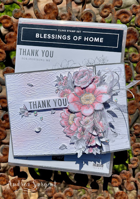
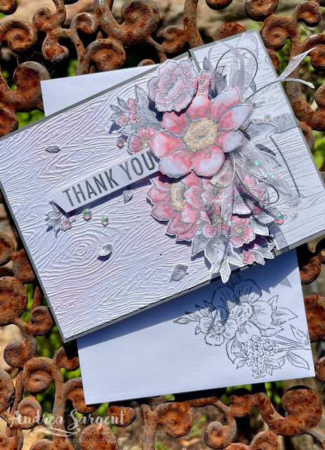
I decided to have a floral arrangement part hanging off the edge of the card and thought I would achieve this by using an off-centre gatefold - well the join is way over to the right side as you look at the card. The large floral image from the Blessings of Home stamp set was stamped a couple of times onto Basic White card-stock in Versamark ink and heat embossed with Silver Emboss Powder and a Heat Gun.

Show someone you care with a personally created card saying Thank you.

The flowers were coloured with Flirty Flamingo Stampin' Blends combo with some Pale Papaya Blends for the flower centres. The leaves were coloured with the Smoky Slate Stampin' Blends combo. The Dark Smoky Slate Blend colours in a Basic Gray shade, but to ensure some Basic Gray was used on the leaves I added a little Basic Grey Watercolor Pencil to give extra depth. A Colour Lifter Blend was also used to add highlights. Some of the flowers and tiny leaves were coloured on the second embossed image. Extra flowers were fussy cut and layered over the arrangement to provide extra dimension and interest.

Show someone you care with a personally created card saying Thank you.

A woodgrain piece of the retiring Blessings of Home DSP was layered on the right little flap and a piece of Basic White card-stock that had been embossed with a Timber 3D embossing folder was adhered to the larger card-front. A light blending of Blushing Bride ink was added with a Blending Brush over the embossed woodgrain panel and some Basic Gray ink splatters were added with a Stampin' Write Marker. The coloured and layered floral arrangement was centred over the edge of the larger card front so that the flowers would hang off the edge and over the woodgrain DSP when the card was closed. Some of the delightful Glittered White Organdy ribbon was cut in half and tied in a bow together with some Silver Elegant Trim. The bow was tucked under the layered large flower with a couple of Glue Dots - they are so handy.

Show someone you care with a personally created card saying Thank you.

The card front was finished with a Silver heat embossed "Thank You" sentiment from the same stamp set with the lower smaller words cut away. Tiny coloured leaves and a tiny collection of flowers were added to look as if they were floating over the background. Some beautiful Iridescent Basic Rhinestones added a touch of sparkle.

Show someone you care with a personally created card saying Thank you.

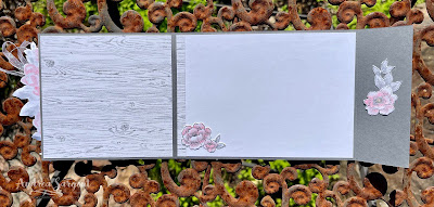
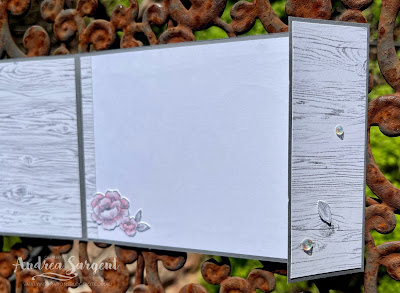
Some of the woodgrain DSP also was added inside the larger front flap and a strip on the centre panel. Coloured and fussy cut flowers and leaves were added to the card inner as well.

Show someone you care with a personally created card saying Thank You.

A C6 Basic White envelope was stamped and Silver heat embossed using the smaller flower arrangement from the Blessings of Home stamp set.

Show someone you care with a personally created card saying Thank You.

CARD 2:

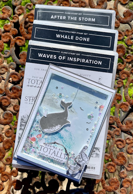
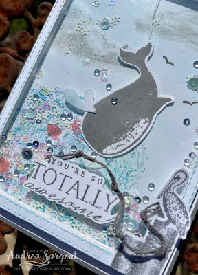
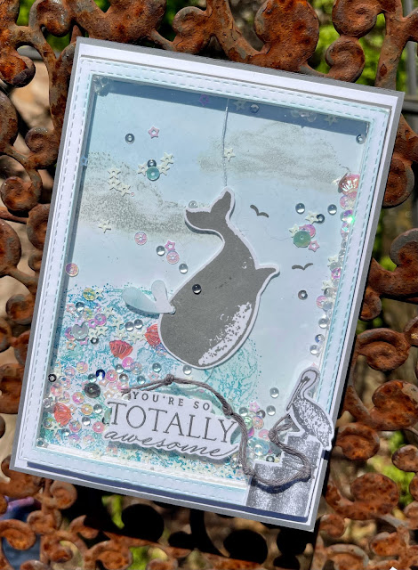
As I was working on Card 1 I started thinking of a shaker card with a Basic Gray Whale. I just had to give it a go with the whale also moving when the card is shaken.

Show someone you care with a personally created card saying you think they are Totally Awesome.

A background panel of Basic White card-stock was stamped with the large wave from the Waves of Inspiration stamp set using Balmy Blue, Coastal Cabana and Pacific Point inks and a Sponge Dauber. Clouds from the After the Storm stamp set were added with third generation Basic Gray ink. The clouds were more somber than I wanted so I over stamped with White Craft ink. A few birds from this last set were added in Basic Gray ink.

Show someone you care with a personally created card saying you think they are Totally Awesome.

A whale from the Whale Done stamp set was stamped in Basic Gray ink on Basic White card-stock. This was punched out using the Whale punch, which also cut out "a spirt of water". A piece of sewing thread was laid down the back of the whale and a white punched out whale was adhered on the back gluing the thread in place. 

Show someone you care with a personally created card saying you think they are Totally Awesome.

Dimensional Strips were added to the edge of the background panel and the thread was centred at the top and bottom, ensuring there was some leeway with the thread to allow the whale to move when the card is shaken. Tear 'n Tape was applied to the top and bottom lengths of the Dimensional Strips. Two frames were layered on top of the Dimensional Strips. A piece of Window Sheet was layered over the framed area after some Sparkle and Shine Sequins (plus a few extra sequins from the retired sequins that had been part of the Whale suite when it was first been introduced) were sprinkled over the whale and scene. A little Balmy Blue ink was blended over the final frame and it was adhered in place. 

Show someone you care with a personally created card saying you think they are Totally Awesome.

The wooden poles & Pelican from the Waves of Inspiration set was Silver heat embossed, trimmed down and added to the corner of the frame. A sentiment from the same stamp set was also Silver heat embossed on Basic White card-stock and fussy cut before being adhered directly to the acetate. Some White Bakers Twine was coloured with a Basic Gray Stampin' Write Marker before tying it in knots and then curling the twine around the pelican and sentiment.

Show someone you care with a personally created card saying you think they are Totally Awesome.

The Basic White card inner was stamped with the wave from the Waves of Inspiration stamp set that was coloured with Coastal Cabana and Pacific Point inks and a Basic Gray whale from the Whale Done set was added. Some Balmy Blue ink was very lightly blended over the sky area. Some wooden poles with a pelican were stamped on the front of a C6 Basic White envelope.

Show someone you care with a personally created card saying you think they are Totally Awesome.

That is it from me for this week. Thank you so much for dropping by. I do value the time you spent with me.

If you live in Australia, don't already have a Stampin' Up! demonstrator and would like your own copy of Stampin' Up's 2022-2023 Annual Catalogue and or the January - June 2022 Mini Catalogue then let me know and I will be delighted to send them to you.  Please don't hesitate to make contact with any other queries about these projects or Stampin' Up!. 

There is more Basic Gray creativity. To continue with the blog hop, click on the "next" graphic below to be taken to the blog of the talented, Rachel Woolard. I always look forward to checking out Rachel's creation (I wonder what she has in store this week). I do love seeing everyones' projects - always so much inspiration.

Hope to see you next week when we will be featuring a lovely colour, Bermuda Bay, as we continue the weekly 2022-2023 Colour Creations blog hops.

Stay well, stay safe and be kind to yourself and others. 

Andrea 💕🐾


If you find a broken link or have come to this blog hop from a different entry point, you can view the full list of participants on Catherine Proctor’s blog @ What Cathy Made. Cathy is our wonderful Art With Heart Team Colour Creations Coordinator.  I so appreciate all she does in coordinating this blog hop each week. She is such an amazing lady. Check out her wonderful creation while you are there.

If you live in Australia, don't already have a Stampin' Up! demonstrator and would like your own copy of Stampin' Up's 2022-2023 Annual Catalogue and or the coming July - December 2022 Mini Catalogue then let me know and I will be delighted to send them to you.  Please don't hesitate to make contact with any other queries about this project or Stampin' Up!. 

#colourcreationsbloghop  #stampinup #stampinupaustralia #stampinupsouthpacific #stampinupdemo  #handmadecards #makeacardsendacard #stampinupdemonstrator #papercrafting #artwithheartteam  #papercrafter  #stamper #whaledone 
#blessingsofhome #wavesofinspiration #valleyinspirations

Wednesday, 8 June 2022

AWHT Colour Creations #6 Balmy Blue

#6 Balmy Blue with Wild & Sweet and Bamboo Beauty

Hello. Welcome to Valley Inspirations with Andrea and the Art with Heart Colour Creations Blog Hop. We are working though the standard Stampin' Up! colours in alphabetical order, starting with "B". 


This week’s Blog Hop is focussing on a soft blue called Balmy Blue. One of my favourite SU colours. Balmy Blue is part of the Subtles Colour Family and is a delightful blue. This colour is gorgeous on its own or can be combined with so many other colour combos. It is great with other subtle colours.


Balmy Blue is produced in Stampin' Up!'s card-stock, both A4 & 12"x12"Classic Stampin' inks (ink pads re-inkers); Stampin' Write Markers; Stampin' Blends, Watercolour Pencils, Subtles Designer Series Paper, Awash in Beauty DSP, Robot Buddies Kids Card Kit, For Everything Fancy Sequins, Christmas Whimsy Card Kit, Solid Faceted Gems and Abstract Beauty Ephemera Pack, SDSP and Cards & Envelopes . The cards below have used Balmy Blue Classic Stampin' ink (re-inker), Card-stock and a Stampin’ Blends plus a range of other non-PP bits and pieces.

I had planned to create 2 cards, but only 1 is finished to showcase Balmy Blue. Here it is:


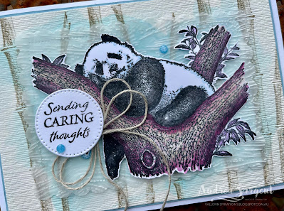
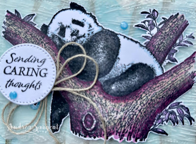
I had decided to use a water-colour wash on Fluid 100 Watercolor Paper as background for a panda from the Wild & Sweet stamp set. I love the panda as it reminds me of the 2 pandas we have in the Adelaide Zoo - Wang Wang and Funi. After designing this card I saw Stesha Bloodhart's card where she used bamboo in the background. It was such a great idea so I needed to add some bamboo too.


The water-coloured background was stamped with bamboo from the Bamboo Beauty stamp set in Gray Granite Classic Stampin' ink. This panel was mounted on Balmy Blue card-stock before being mounted to the Thick Basic White card base. In real life the creamy tinge of the water-colour paper isn't as noticeable.


The lazy panda image was stamped on basic White card-stock with Momento Black ink. It was stamped a couple of times to get a good black. The image was coloured with Stampin' Blends before being fussy cut out. I wanted the Balmy Blue, reminiscent of the sky, to show behind the panda. The panda's black areas were further defined with Black Stampin' Blends and the white areas had some Balmy Blue Blends added as shading to bring some Balmy Blue into the focal image. As I was planning to tie the colours of the 2nd card in to this card I included some Fresh Freesia and Rich Razzleberry with the Crumb Cake Blends on the tree and leaves. (Sorry there is no second card.)


A large label was die cut in Vellum using the Scalloped Contour dies. The label was embossed with the Timber 3D embossing folder (I love embossing Vellum). Some Dimensionals popped up the focal image on the Vellum. A sentiment from the Bamboo Beauty stamp 
set was also stamped in Momento before being die cut with a Beautiful Shapes die. A double Linen Twine bow was tucked under the sentiment and a few Fine Sparkle Adhesive-backed Gems were added for a little bit of sparkle.


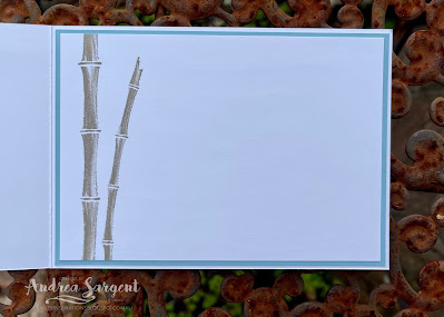
A piece of Basic White card-stock was stamped with the bamboo in Gray Granite ink before being adhered to a slightly larger piece of Balmy Blue card-stock.  one of Stampin' Up!s Basic White C6 Envelope was also stamped with the bamboo stamps in Gray Granite ink


Thank you so much for dropping by. I do value the time you spend with me.


There is more Balmy Blue creativity. To continue with the blog hop, click on the "next" graphic below to be taken to the blog of the lovely Christine Blain. I always look forward to checking out Christine's creation (I wonder what she has in store for us tonight?). I do love seeing everyones' projects - there is always so much inspiration.

Hope to see you next week when we will be featuring a Neutral, Basic Grey, as we continue the weekly 2022-2023 Colour Creations blog hops.

Stay well, stay safe and be kind to yourself and others. 

Andrea 💕🐾


If you find a broken link or have come to this blog hop from a different entry point, you can view the full list of participants on Catherine Proctor’s blog @ What Cathy Made. Cathy is our wonderful Art With Heart Team Colour Creations Coordinator.  I so appreciate all she does in coordinating this blog hop each week. She is such an amazing lady. Check out her wonderful creation while you are there.
If you live in Australia, don't already have a Stampin' Up! demonstrator and would like your own copy of Stampin' Up's 2022-2023 Annual Catalogue and or the coming July - December 2022 Mini Catalogue then let me know and I will be delighted to send them to you.  Please don't hesitate to make contact with any other queries about this project or Stampin' Up!. 

#colourcreationsbloghop  #stampinup #stampinupaustralia #stampinupsouthpacific #stampinupdemo  #handmadecards #makeacardsendacard #stampinupdemonstrator #papercrafting #artwithheartteam  #papercrafter #wild&sweet #stamper #bamboobeauty