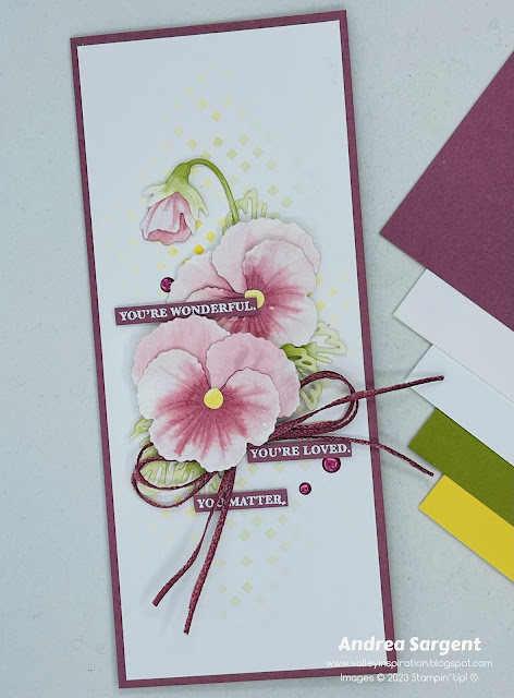
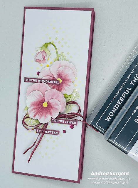
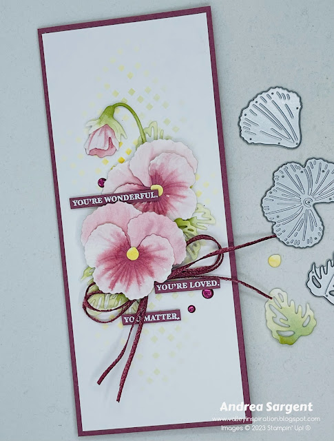
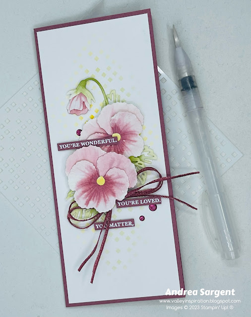
Wild Wheat with Timeless Arrangements
Hello. Welcome to Valley Inspirations with Andrea and the Art with Heart Colour Creations Blog Hop. We are working though the Stampin' Up! colours in alphabetical order, focussing on one colour each week. First, we are showcasing the new colours, including the new 2023-2025 In Colours.
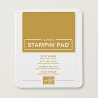
This week’s Blog Hop is focussing on a muted mustard colour called Wild Wheat. Wild Wheat is part of the new 2023-2025 In Colour Family and is an interesting colour. This colour would be lovely when used for grasses, autumn leaves, muted flowers and I also see the colour in tree lichen. I’m still exploring coordinating colours but I think it works well with complementary colours, eg mauves/purples (as used in the card below) and earthy tones as used last week.
Wild Wheat is produced in Stampin' Up!'s card-stock, both A4 & 12"x12"; Classic Stampin' inks (ink pads & re-inkers); Stampin' Write Marker; Stampin' Blends Combo; In Color Designer Series Paper as well as Fresh As A Daisy, Let’s Go Fishing DSPs; plus In Color Luster Speciality Paper & Treat Bags, In Color Textured Ribbon & Jute Trim; and In Color Dots.
Wild Wheat card-stock, ink, In Color Textured Ribbon and In Color Dots have been used in creating this project plus a range of non-Wild Wheat bits and pieces.
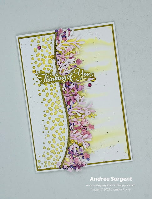
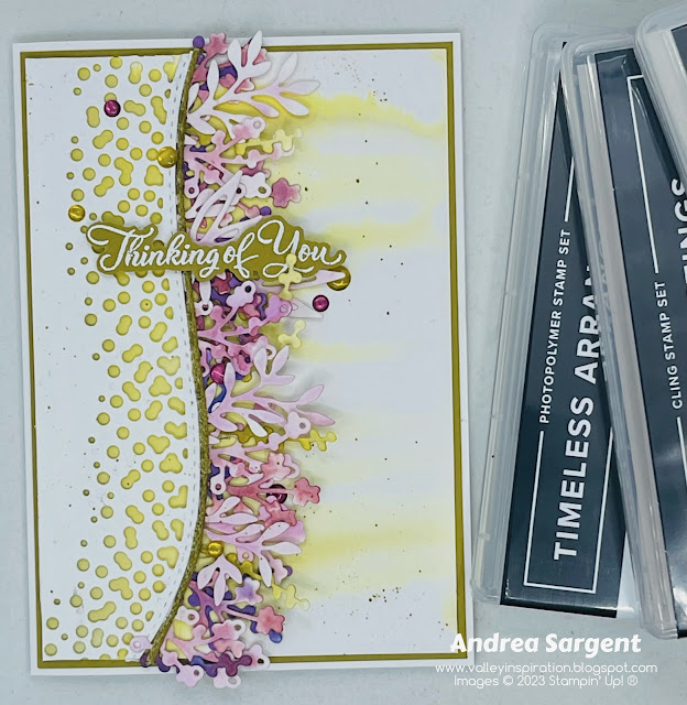
I loved Wild Wheat as part of last week’s card were I stamped feathery grasses in this ink. However, I struggled a little to showcase Wild Wheat this week. As I love to do, I started by creating a water-coloured background with Wild Wheat Classic Stampin’ ink using the wet on wet water-colour technique and the large flat Water Painter. I added ink to one of the long sides of a piece of Fluid 100 Watercolor paper and encouraged it to drip down to the other side of the panel. I love the drip effect. Later, it was layered on a Wild Wheat card-stock panel and then onto a Thick Basic White card base.
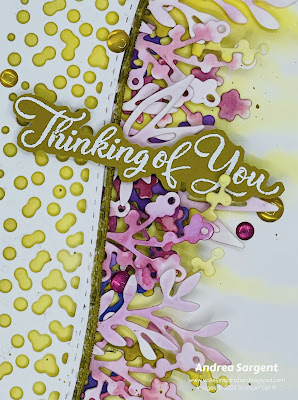
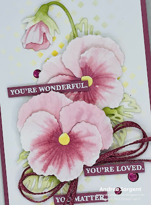
But how would I use the water-coloured background panel??? I decided to add a die cut panel of Basic White card-stock that had been cut with the long Around the Bend holy die. That way I could show some of the solid coloured light Wild Wheat section of the water-coloured panel as well as the drippy section. This decision did make a later step more difficult but more on that later on. I was also wanting to work with my new Timeless Arrangements dies, so I used the range of leafy dies to cut multiple pieces from Fluid 100 Watercolor Paper. They were coloured with Fresh Freesia, Moody Mauve, Highland Heather and a little Orchard Oasis. A few long thin pieces were coloured with Wild Wheat ink.
When all the water-coloured pieces were dry, the rectangular base section of the leaves were each cut in half so the base wouldn’t show through the holes once they were adhered. Pieces were layered lighter to darker with the bases being bent to match the curve of the top panel. Multi-purpose Liquid Glue adhered all the pieces in place. As there were 5 layers of card-stock adhering the leaves in place, I layered scrap pieces of card-stock to the other side of the top panel to give even dimension.
As I wasn’t happy with the way the card was looking I tried this and that and something else. After much trial and error, I added a thin strip of the Wild Wheat Textured Ribbon along the curved edge. A sentiment from the Go To Greetings stamp set was white heat embossed on Wild Wheat card-stock, using Versamark ink, White Emboss Powder and a Heat Tool. A mix of Wild Wheat & Moody Mauve In Color Dots finished the card front.
The card inner was created with a panel of Basic White card-stock mounted on a slightly larger piece of Wild Wheat. A thin strip of left over water-coloured paper was added with a few single water-coloured leaves. A C6 Basic White envelope was second generation stamped in Wild Wheat ink with the little flower from the Timeless Arrangements stamps. A few pre-cut water-coloured flowers were layered over the stamping.
Thanks so much for dropping in.
There is more Wild Wheat creativity to see so do continue with the blog hop. Just click the "next" graphic below to be taken to the blog of the lovely Sharon Davern. I am looking forward to checking out Sharon’s creation(s). I do love seeing everyones' projects - there is always so much inspiration. I hope to see you next week when we will be featuring Azure Afternoon, a new colour included in the Brights Family of the core colours, as we continue the weekly 2023-2024 Colour Creations Blog Hop series.
Stay well, stay safe and be kind to yourself and others.
If you find a broken link or would like to view the full list of participants go to Catherine Proctor’s blog @ What Cathy Made. Cathy is the very special Art With Heart Team Colour Creations Coordinator. She is a wonderful lady. Check out her delightful creation while you are there.
If you live in Australia, don't already have a Stampin' Up! demonstrator and would like your own copy of the new Stampin' Up 2023-2024 Annual Catalogue, then let me know and I will be delighted to send it to you. Please don't hesitate to make contact with any other queries about these projects or Stampin' Up!.
#colourcreationsbloghop #stampinup #stampinupaustralia #stampinupsouthpacific #stampinupdemo #handmadecards #makeacardsendacard #stampinupdemonstrator #papercrafting #artwithheartteam #papercrafter #valleyinspirations #aroundthebend #timelessarrangements #gotogreetings


