Art with Heart Wow Tutorials

Wednesday, 30 June 2021

AWH Colour Creations #5 Blackberry Bliss

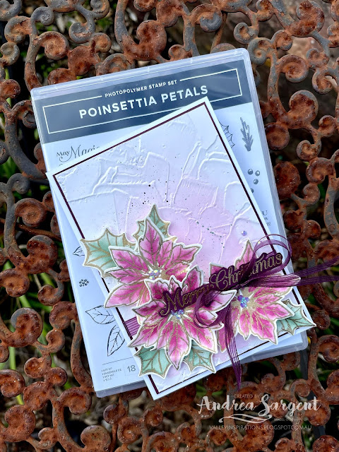
 Blackberry Bliss with Poinsettia Petals

Hi. Welcome to Valley Inspirations with Andrea and the Art with Heart 2021-2022 Colour Creations Blog HopWe are continuing to progress through colours starting with "B" as we work our way through all the Stampin' Up! colours.

This week we are focusing on Blackberry Bliss, a deep red/purple. It is a lovely colour and is included in the Regal's Colour Family and is a strong and rich colour, as you can see in the floral graphic below. 

Blackberry Bliss has been produced in Stampin' Up!'s card-stock, both A4 & 12"x12"Classic Stampin' inks (ink pads & re-inkers); Stampin' Write Markers; Stampin' Blends, Rainbow Glimmer Paper, Pansy Petals & Regals Designer Series Papers (DSP) as well as some products that are retiring tonight, ie 30 June 2021. Even though it is retiring tonight I couldn't resist using the Blackberry Bliss ribbon - it is so soft, beautiful to work with and was perfect for the card's design.

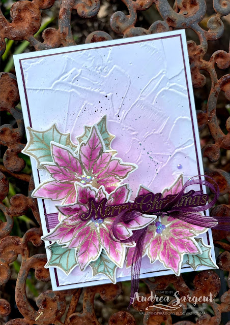
Water-coloured poinsettias in Blackberry Bliss herald a Merry Christmas for 2021.

In preparing my Blackberry Bliss project for tonight's Blog Hop, I decided to explore experimentation with the colour and further my watercoloring experience. I had numerous ideas but as often happens time ran out and I could only create one project. As I pondered on Blackberry Bliss I thought about poinsettias, so decided to create my first Christmas card for 2021. The colour combination for this Christmas card is Blackberry Bliss, Fresh Freesia and Soft Succulent with a touch of Evening Evergreen and some gold embossing.

Water-coloured poinsettias in Blackberry Bliss herald a Merry Christmas for 2021.

Firstly, the poinsettia flower from the Poinsettia Petals stamp set was stamped in Versamark ink on Fluid 100 Water-colour paper and heat embossed with Gold Emboss Powder and a Heat Gun. Both large and small holly leaves from the same stamp set were embossed in the same way. The flowers and holly leaves were water-coloured using a fine Water Painter and Classic Stampin' inks, that is Blackberry Bliss for the petals, Fresh Freesia for the flower centres and Soft Succulent with a touch of Evening Evergreen for the leaves.

Water-coloured poinsettias in Blackberry Bliss herald a Merry Christmas for 2021.

The background was formed by wet on wet water-colouring on Shimmery White card-stock with Fresh Freesia ink. When it was almost dry it was embossed with the Painted Texture 3D embossing folder. Blackberry Bliss and Soft Succulent Stampin Write Markers were used to add splattering over the background before it was mounted on to a slightly larger piece of Blackberry Bliss card-stock. A piece of Blackberry Bliss Striped ribbon was tied around the card front.

Water-coloured poinsettias in Blackberry Bliss herald a Merry Christmas for 2021.

The flowers and dies were cut out using the coordinating Poinsettia dies then shaped a little by hand. They were arranged and adhered in place with either Multipurpose Liquid Glue or Dimensionals. I just realised as I write this that I had intended to add some Gold Foil die cut sprays of berries - totally forgot this white I was creating the card. Ah well, I think it is fine without - what do you think?


A sentiment from the same stamp set was stamped in Versamark ink on Blackberry Bliss card-stock and also heat embossed with Gold Emboss Powder and a Heat Gun. The words were fussy cut out. Looking at the the sentiment in the photos, I am disappointed that it doesn't seem to show up as well as in real life. It was adhered in place with Dimensionals

Water-coloured poinsettias in Blackberry Bliss herald a Merry Christmas for 2021.

A piece of the Blackberry Bliss Striped ribbon was cut in half lengthwise and tied in a bow. The bow was tucked under the sentiment and some flower petals and adhered with Glue Dots. The card front was adhered directly to a card base of Thick Basic White card-stock. Fresh Freesia 2021-2023 In Colour Jewels were added to the poinsettia centres together with a couple of others as the finishing touch. I do love these delightful jewels. They shimmer beautifully.

Water-coloured poinsettias in Blackberry Bliss herald a Merry Christmas for 2021.

The card inner was decorated with a left over water-coloured poinsettia, a couple of holly leaves and a thin strip of Blackberry Bliss card-stock. A C6 Basic White envelope also was stamped with the poinsettia in Blackberry Bliss ink to link it to the card it will carry.

Water-coloured poinsettias in Blackberry Bliss herald a Merry Christmas for 2021.

Thank you for visiting Valley Inspirations with Andrea. I had fun experimenting further by water-colouring with Blackberry Bliss and creating this project to share. 
 
If you are in Australia, don't already have a Stampin' Up! demonstrator and would like your own copy of Stampin' Up's 2021-2022 Annual Catalogue then let me know and I will be delighted to send one to you. Please don't hesitate to make contact with any other queries about this project or Stampin' Up!. 

There is more Blackberry Bliss creativity. To continue with the blog hop, click on the "next" graphic to be taken to the lovely Diane Furniss' blog. I am looking forward to checking out Diane's creation and everyone else's. If you started part way through or if you missed someone there is a list below with all the names of those who are taking part in tonight's Colour Creation Blog Hop.

Hope to see you next week when we will be featuring Blushing Bride; and don't forget, the AWH Heart of Christmas Blog Hop is commencing next Monday. There is so much Christmas inspiration to share and Christmas in July is the right time to start card-making.

Stay well, stay safe and be kind to yourself and others.

Andrea 💕🐾

I am so appreciative of Catherine Proctor, our dedicated host of the Art with Heart Colour Creations Blog Hop. She is an amazing lady and so patient with us and the idiosyncraties that arise as we prepare for our blog hops. Thank you for your coordination Cathy.

I always love seeing everyone's creations and their interpretation of the amazing Stampin' Up! colours. I am sure there will be inspiring Blackberry Bliss projects on show. 

Here are all the participants for the Colour Creations Blog Hop launching 30 June 2021:


#colourcreationsbloghop

Wednesday, 23 June 2021

AWH Colour Creations #4 Bermuda Bay

Bermuda Bay with Sailing Home

Hi. Welcome to Valley Inspirations with Andrea and the Art with Heart 2021-2022 Colour Creations Blog HopWe are currently progressing through colours starting with "B" as we work our way through all the Stampin' Up! colours, focussing on one of the colours each week.

This week we are focusing on Bermuda Bay, a bright green/blue. Bermuda Bay is one of the Bright's Colour Family and is a strong 'colour, as you can see in the floral graphic below. 


Bermuda Bay has been produced in Stampin' Up!'s card-stock, both A4 & 12"x12"Classic Stampin' inks (ink pads & re-inkers); Stampin' Write Markers; Stampin' Blends, Watercolour Pencils, & Rainbow Glimmer Paper, Brights Designer Series Papers (DSP) as well as the soon to be retiring Ice cream Corner and Snail Mail DSPs, and You Are Amazing project kit.

Set Sail in the Direction of Your Dreams is the message this card brings with the alcohol blended background and featuring Stampin' Up!'s Sailing Home stamp set and created by Andrea Sargent.

Last week I watched Paula Dobson, a New Zealand Stampin Up Demonstrator and previous Artisan, demonstrate a technique with Velum, Stampin' Up!'s Alcohol Blends and Isopropyl Alcohol in a spray bottle. I wanted to give it a go so thought I would use the technique with the Bermuda Bay Blends Combo and some other colours. Must admit it wasn't as easy as it looked to get the results I was after. The first one I tried didn't look that great. My second go came out well but then I thought I would add some gold to attain a similar look to Stampin' Up's gorgeous DSP - it was a disaster! The panel you see on this week's project was my third go - it didn't turn out as I had hoped so I added extra layers of colour. I still need more practice  to improve my outcomes. However, I need to add that I still enjoyed trying the technique and look forward to playing further with it. It is worth giving a go!

Set Sail in the Direction of Your Dreams is the message this card brings with the alcohol blended background and featuring Stampin' Up!'s Sailing Home stamp set and created by Andrea Sargent.

I started with a piece of Vellum and coloured (well scribbled) it with my blends in 3 different sections. One section used Light & Dark Crumb Cake Blends and touches of Light Soft Suede Blend - to be reminiscent of sand/ground. Another section used Light and Dark Bermuda Bay Blends and Dark Pool Party - for the sea; and the third used Light and Dark Balmy Blue and some Light Misty Moonlight to give a sense of sky. The Isopropyl Alcohol, in one of Stampin' Up!'s Misters, was sprayed over one section at a time, with enough alcohol to run over the Vellum. Each section was allowed to dry before working on the next section. At the end, I misted a little alcohol from a height to get the bubbles effect. (Don't do what I did - as when misting from a height my aim seemed quite off ...)

Set Sail in the Direction of Your Dreams is the message this card brings with the alcohol blended background and featuring Stampin' Up!'s Sailing Home stamp set and created by Andrea Sargent.

The coloured vellum was attached at the edges to a piece of Basic White card-stock with Seal +. It was then trimmed to size and mounted onto a piece of Bermuda Bay card-stock. Some Linen Thread was wrapped around this panel twice and tied in a bow. 

Set Sail in the Direction of Your Dreams is the message this card brings with the alcohol blended background and featuring Stampin' Up!'s Sailing Home stamp set and created by Andrea Sargent.

A Basic White card-stock frame was cut using dies from the Rectangle Stitched dies. A second frame was die cut and adhered to the first to give it more stability. Strips cut from the edges of sheets of Dimensionals were used to adhere the frame in place.

Set Sail in the Direction of Your Dreams is the message this card brings with the alcohol blended background and featuring Stampin' Up!'s Sailing Home stamp set and created by Andrea Sargent.

In terms of a sentiment, I wanted something long and thin but the Sailing Home stamp set didn't have sentiments formatted that way. I wanted to use "Set Sail in the Direction of your Dreams" but its shape didn't suit what I had in mind so I decided to add it to the card inner. I stamped the Many Messages stamp on Bermuda Bay card-stock with Versamark and heat embossed it with White Stampin' Emboss Powder and a Heat Gun. The many messages were cut out with the coordinating Messages die. I so love this bundle - it is a great 'go to' when you are stuck for a sentiment, especially when you can fossick through a bowl of already prepared sentiments to find just the right one. I'm looking forward to playing with the new stamp set of sentiments from the new Annual Catalogue that also coordinated with the Messages die. The sentiment was popped up on Dimensionals, alongside the twine

Set Sail in the Direction of Your Dreams is the message this card brings with the alcohol blended background and featuring Stampin' Up!'s Sailing Home stamp set and created by Andrea Sargent.

A small sail boat from the Sailing Home stamp set was stamped in Crumb Cake Classic Stampin' ink and coloured with Crumb Cake, Bermuda Bay and Pool Party Blends Combos. It could have been die cut with the coordinating dies, but as I had Gemma (my fur family) on my lap, I fussy cut the little sail boat. The sail boat was added with Dimensionals.

Set Sail in the Direction of Your Dreams is the message this card brings with the alcohol blended background and featuring Stampin' Up!'s Sailing Home stamp set and created by Andrea Sargent.

The decorated card front was adhered directly to the Basic White Thick card-stock base and 3 gorgeous In Colour Jewels provided the finishing touch. I am in love with these embellishments - they have a beautiful sparkle and can be used alongside other colours and still look right.

Set Sail in the Direction of Your Dreams is the message this card brings with the alcohol blended background and featuring Stampin' Up!'s Sailing Home stamp set and created by Andrea Sargent.

Apart from stamping the sentiment from the Sailing Home stamp set in Bermuda Bay Classic Stampin' ink on the Basic White card inner, the compass from the same stamp set was also added. A strip of coloured Vellum (cut from my first attempt) was adhered to the base of the inner. This was then mounted on a slightly larger piece of Bermuda Bay card-stock and adhered directly inside the card. The compass was also stamped in Bermuda Bay ink on a C6 Basic White Envelope.

Set Sail in the Direction of Your Dreams is the message this card brings with the alcohol blended background and featuring Stampin' Up!'s Sailing Home stamp set and created by Andrea Sargent.


Thank you for visiting Valley Inspirations with Andrea. I enjoyed trying a new technique and  creating this project to share. I need to practice more to perfect the technique - but that is half the fun, isn't it?
 
If you are in Australia, don't already have a Stampin' Up! demonstrator and would like your own copy of Stampin' Up's 2021-2022 Annual Catalogue then let me know and I will be delighted to send one to you.

There is more Bermuda Bay creativity. I am the last on the list of participants for tonight so to go back to the beginning, click on the "next" graphic to be taken to the lovely Michele Taylor's blog. I am looking forward to checking out Michele's creation and everyone else's. If you started part way through or if you missed someone there is a list below with all the names of those who took part in tonight's Colour Creation Blog Hop.

Hope to see you next week when we will be featuring Blackberry Bliss.

Stay well, stay safe and be kind to yourself and others.

Andrea 💕🐾

Catherine Proctor is our dedicated host of the Art with Heart Colour Creations Blog Hop and is an amazing lady. Thanks for your coordination Cathy.

I always love seeing everyone's creations and their interpretation of the amazing Stampin' Up! colours. I am sure there will be inspiring Bermuda Bay projects on show. 

Here are all the participants for the Colour Creations Blog Hop launching 23 June 2021:


#colourcreationsbloghop

Wednesday, 16 June 2021

AWH Colour Creations #3 Basic Gray

Basic Gray with Handsomely Suited

Hi. Welcome to Valley Inspirations with Andrea and the Art with Heart 2021-2022 Colour Creations Blog Hop. We are working our way through all the Stampin' Up! colours and focussing on one of the Stampin' Up! colours each week.  We are currently progressing through the colours starting with "B". With this new round we are using a more traditional Blog Hop style, where we move to the next participant on the list. Just click on the "next" graphic near the end of this blog to go to the next participant. At the end of the blog there is a list of all of the participants in this week's blog hop where clicking on a name will take you to their particular blog.

This week we are focusing on Basic Gray, that is described perfectly by its name. Basic Gray is one of the Neutral's Colour Family and is a strong 'true' grey, as you can see in the floral graphic below. Basic Gray seems to go with nearly every colour and can be used instead of Black if you want something a little more subtle or softer. 

Basic Gray has been produced in Stampin' Up!'s card-stock, both A4 & 12"x12"Classic Stampin' inks (ink pads & re-inkers); Stampin' Write Markers; Watercolour Pencils, & Simply Elegant, In Good Taste and Neutral's Designer Series Papers (DSP) as well as the soon to be retiring Well Suited Twine Combo and Well Suited DSP. Just before this blog went live I checked the Stampin' Up! Aussie website and found that the Well Suited DSP is sold out. I was going to say "get in quick if you want this discounted DSP" but it's too late! It's all gone.


I had numerous ideas when designing the Basic Gray projects. Is it quite a change, as I used to think of grey as an accompaniment to other colours but not a focal colour. More recently I have realised how lovely grey is to hero with another colour, for example yellow or pink. However, I decided to use some DSP incorporating Basic Gray with the Handsomely Suited bundle to create a gift bag/card and an easel card. I had been asked to incorporate a "male" card in one of next months card classes so decided to design it as part of this blog. Here are my projects:

The Suit and Tie Gift bag with single card, plus an Easel Card were created for that special fella in your life, by Andrea Sargent at Valley Inspirations. Copyright Stampin' Up!


PROJECT 1: GIFT BAG WITH CARD INCORPORATED

The Suit and Tie Gift bag with single card were created for that special fella in your life, by Andrea Sargent at Valley Inspirations. Copyright Stampin' Up!

The gift bag was designed around a standard card front size.  Two pieces of Basic Gray card-stock were cut with the addition of enough for the bag bottom. The bag sides (or gussets) were cut from a piece of the In Good Taste DSP that is reminiscent of woven fabric made with Basic Gray and a lighter brown. The DSP was cut wider than the needed gusset to include seams for adhering to the card-stock.

The Suit and Tie Gift bag with single card were created for that special fella in your life, by Andrea Sargent at Valley Inspirations. Copyright Stampin' Up!

For the Bag/Card front, the DSP was cut with the dies from the Suit & Tie die set to form the suit and buttons were cut from Basic Gray card-stock. The card (Shirt front) was cut slightly smaller than the bag front from Very Vanilla card-stock and the collar was cut from the same card-stock. The tie was die cut from the Simply Elegant Speciality DSP and 2 tie ends were also cut from the same DSP to be reminiscent of coordinating hankies in the Jacket pocket.

The Suit and Tie Gift bag with single card were created for that special fella in your life, by Andrea Sargent at Valley Inspirations. Copyright Stampin' Up!

The jacket front was cut in 2 pieces so one side would fold over the other, however, I'm not sure if it was worth the extra calculations and effort to attempt to give the Jacket a more realistic look. It's not that visible in the photos. Seams were added to adhere the 'jacket' to the gift box and enable the seperate 'shirt' card to slide in and out. 

The Suit and Tie Gift bag with single card were created for that special fella in your life, by Andrea Sargent at Valley Inspirations. Copyright Stampin' Up!

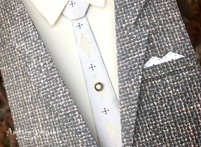
The shirt collar, jacket lapels and pocket tab and the tie were adhered with a mix of Multipurpose Liquid Glue and Mini Dimensionals. Prior to adding the tie, a really light application of Basic Gray ink was added to the edge with a Sponge Dauber to give the tie greater definition. I think Smoky Slate ink would have been a better choice for sponging the edge. The buttons were popped up on small pieces of Dimensional

The Suit and Tie Gift bag with single card were created for that special fella in your life, by Andrea Sargent at Valley Inspirations. Copyright Stampin' Up!

The sentiment, that came from the Handsomely Suited stamp set was stamped in Basic Gray Classic Stampin' ink. Yes, the sentiment was die cut using one of the smallest Stitched Rectangle dies - this only was required as the sentiment was first stamped directly onto the Very Vanilla card-stock but ... you guessed it ... it wasn't quite straight (and really annoyed me) so the sentiment was stamped again on a scrap of card-stock, die cut and adhered directly to the card. A Gilded Gem was added to the tie as a "tie pin".

The Suit and Tie Gift bag with single card were created for that special fella in your life, by Andrea Sargent at Valley Inspirations. Copyright Stampin' Up!

Above is a close up of the jacket, showing some dimension achieved at the lapels and the pocket placard. I love the added touch, though oh so small, of the SDSP hankies.

The Suit and Tie Gift bag with single card were created for that special fella in your life, by Andrea Sargent at Valley Inspirations. Copyright Stampin' Up!

I had so much fun designing & creating this bag with slip in card (your message is to be written on the back). I used some retiring Clever Clasps to close the gift back at the top. They are discounted and will be discontinued, so get in before the end of the month, or even sooner if they sell out. Don't delay as there are no similar clasps in the 2021-2022 Annual Catalogue.


PROJECT 2: Handsomely Suited Easel Card

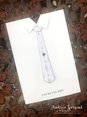
The Suit and Tie Easel Card was created for that special fella in your life, by Andrea Sargent at Valley Inspirations. Copyright Stampin' Up!

The card base and card front was cut from Basic Gray card-stock. The card base was scored in half and then the front section in half again. The folds were burnished with a Bone Folder. The seperate card front was adhered to the bottom half of the front of the card base - thus forming the the basic easel mechanism.

The Suit and Tie Easel Card was created for that special fella in your life, by Andrea Sargent at Valley Inspirations. Copyright Stampin' Up!

The suit jacket was die cut from a piece of Well Suited DSP (as mentioned, this has just sold out). I will need to re-create this card for my coming class and will use the In Good Taste DSP so participants are able to access more DSP if they so choose. I will use the twill design, which will work well for a suit jacket. The shirt was cut from Basic White card-stock and the tie and hanky from the Simply Elegant Speciality DSP.

The Suit and Tie Easel Card was created for that special fella in your life, by Andrea Sargent at Valley Inspirations. Copyright Stampin' Up!

The 'suit' DSP was adhered directly to the shirt card-front and then the shirt collar was adhered with liquid glue and Mini Dimensionals. The jacket lapel was similarly adhered and 2 die cut Basic Gray buttons were added with little pieces of Dimensionals. The tie was tucked under the shirt collar and also under the bottom of the suit jacket. I added it at that point so it would sit neatly and centralised - the trick was to not adhere the jacket in that area, so the tie could tuck in. The die cut pocket with the touch of the SDSP for the hanky was adhered in place.

The Suit and Tie Easel Card was created for that special fella in your life, by Andrea Sargent at Valley Inspirations. Copyright Stampin' Up!

The shirt card front was snipped at the neck along the inside collar to indicate the neck line and then this "Suit" card front was adhered to the Basic Gray card-stock easel front.

The Suit and Tie Easel Card was created for that special fella in your life, by Andrea Sargent at Valley Inspirations. Copyright Stampin' Up!

To enable the easel front to stand, a piece of the suit DSP was adhered to a strip of Basic White card-stock that was the width of the card base. A thin strip of the SDSP to match the tie was adhered to the top of the strip - this could be reminiscent of a cumber bun. A birthday sentiment from the Handsomely Suited stamp set was heat embossed to a piece of Basic Gray card-stock using Versamark, White Emboss Powder and a Heat Gun. This was die cut with a small Stitched Rectangle die. This label was adhered directly in the centre of the suited DSP. This whole panel was popped up on Dimensionals, which provides a great stopper for the easel section.

The Suit and Tie Easel Card was created for that special fella in your life, by Andrea Sargent at Valley Inspirations. Copyright Stampin' Up!

As a finishing touch a white Elegant Faceted Gem was added to the tie. Ties from the same stamp set were stamped in Basic Gray ink on a C6 Basic White Envelope. As you know by now, I love small touches of the design added to the envelope to coordinate with the card.

The Suit and Tie Easel Card was created for that special fella in your life, by Andrea Sargent at Valley Inspirations. Copyright Stampin' Up!


Thank you so much for visiting Valley Inspirations with Andrea. I really had fun creating these projects to share. I love the Suit Gift Bag with slip in card and the Easel card. As mentioned, a slight variation of this Easel card will be used in a coming card class in response to a request for a card for a fella. 
 
If you are in Australia, don't already have a Stampin' Up! demonstrator and would like your own copy of Stampin' Up's 2021-2022 Annual Catalogue then let me know and I will be delighted to send one to you.

There is more Basic Gray creativity. Click on the "next" graphic to be taken to the lovely Rosa Leyten's blog. I am looking forward to checking out Rosa's creation and everyone else's. If you started at the beginning with Michele Taylor you are getting close to the end of the hop but if you missed someone there is a list below with everyone who is part of tonight's Colour Creation Blog Hop.

Hope to see you next week when we will be featuring Bermuda Bay.

Stay well, stay safe and be kind to yourself and others.

Andrea 💕🐾


A big thank you to Catherine Proctor who is our dedicated host of the Art with Heart Colour Creations Blog Hop. She is an amazing lady and very good at keeping us in line.

Checking out everyone's creations and their interpretation of the amazing Stampin' Up! colours is always a treat and I am sure there will be inspiring Basic Gray projects on show. I feel so blessed to share with such talented Creatives.

Here are all the participants for the Colour Creations Blog Hop launching 16 June 2021: