Shaded Spruce with Artfully Layered and Water-colour
Hello. Welcome to Valley Inspirations with Andrea and the Art with Heart Colour Creations Blog Hop. We are continuing to work though all the Stampin' Up! colours in alphabetical order. Having started mid 2021 currently we are working through colours starting with "S", with only 4 more Blog Hops in the 2021-2022 round of Stampin' Up! colours.
This week’s Blog Hop is focussing on a rich green (that has a touch of blue) called Shaded Spruce. Shaded Spruce is part of the Regals Colour Family and is a delightful green. This colour is gorgeous on its own or when used with other greens such as Pool Party and Mint Macaron.
Shaded Spruce is produced in Stampin' Up!'s card-stock, both A4 & 12"x12"; Classic Stampin' inks (ink pads, Spots & re-inkers); Stampin' Write Markers; Stampin' Blends, Regals Designer Series Papers, Sequins for Everything and Holiday Rhinestone Basic Jewels. The cards below have used Shaded Spruce Classic Stampin' ink (both re-inker and Stamp Pad) and Card-stock plus a range of other non-PP bits and pieces.
I have created 2 cards to showcase Shaded Spruce:
Isn't Shaded Spruce a lovely colour.
CARD 1:
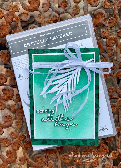
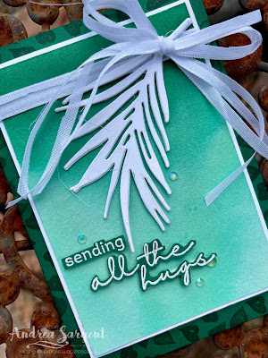
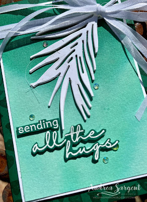
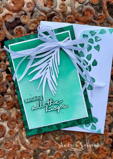
This card shows the beauty of Shaded Spruce through a water-coloured ombre panel.
A half panel of Fluid 100 Watercolor Paper was watered down and then ink from a Shaded Spruce Re-inker was applied to the top of the panel with a mid-sized Water Painter, allowing the ink to run/drip down to the bottom. I had recently seen Emma Goddard, a UK Stampin' Up! Demonstrator and previous Artisan Team member, demonstrate this technique with Pacific Point. As I watched Emma, I thought of this coming blog hop and decided to try it out with Shaded Spruce. I had so much fun and ! love the effect. I ended up with green ink on my fingers - the only time I could genuinely say I had green fingers! The water-coloured panel was mounted to slightly larger piece of Basic White card-stock. A Shaded Spruce card-stock card base was stamped on the front panel with the tiny leaves stamp from the Artfully Layered stamp set in Shaded Spruce ink.
The card front was finished with a sentiment from the same stamp set that had been White heat embossed on Shaded Spruce card-stock. Some Iridescent Rhinestone Basic Jewels added some shimmer, together with a little Wink of Stella (its so hard to capture in the photos).
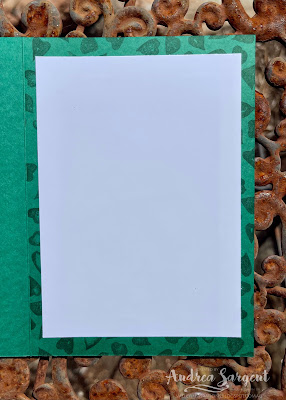
A piece of Basic White card-stock was adhered into the inner card base that had been similarly stamped with the little leaves. The back flap of a Basic White C6 Envelope was stamped with the tiny leaves stamp in Shaded Spruce ink. As those who follow my cards know, I love to coordinate the envelope with the card inner, with both coordinating with the card front design.
CARD 2:
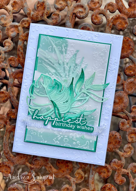
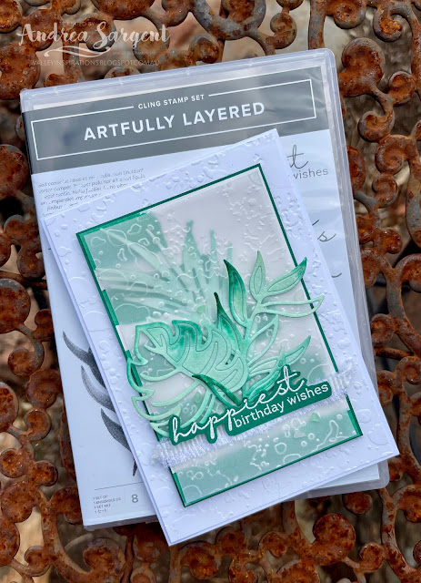
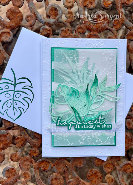
This second card features more water-coloured Shaded Spruce including Water-coloured stripes and die cut leaves coloured with Pool Party, Mint Macaron and touches of Shaded Spruce.
A piece of Shimmery White card-stock was painted with Shaded Spruce ink in stripes using the largest wide-brush Water Painter. The trimmed down striped panel was mounted on a slightly larger piece of Shaded Spruce card-stock. Three different leaf dies from the Tropical Layers die set were used to cut leaves from a piece of Fluid 100 Watercolor paper. As was mentioned, the leaves were water-coloured with Pool Party, Mint Macaron and Shaded Spruce Classic inks.
A piece of Basic White card-stock was embossed with the Splatters Embossing Folder from the 3D Stripes & Splatters Embossing Folders. A piece of Vellum card-stock was similarly embossed. The water-coloured Palm leaf was added onto the striped panel and the embossed Vellum adhered over. The other 2 water-coloured leaves were adhered in place and a piece of White Frayed ribbon was cut in half lengthwise and further frayed before being adhered directly to the Vellum.
A sentiment from the Artfully Layered stamp set was White heat embossed on Shaded Spruce card-stock, fussy cut and added with Mini Dimensionals over the White Frayed ribbon. Faux Sea Glass Shapes were sprinkled around for that touch of very subtle bling.
The Basic White card inner had a thin strip of stripes adhered to the LHS together with a die cut Basic White sprig of leaves. A Basic White C6 Envelope was stamped with a leaf from the same stamp set in Shaded Spruce.
Thank you so much for dropping by. I do value the time you spent with me.
If you live in Australia, don't already have a Stampin' Up! demonstrator and would like your own copy of Stampin' Up's 2021-2022 Annual Catalogue or the coming 2022-2023 Annual Catalogue and or the January - June 2022 Mini Catalogue then let me know and I will be delighted to send them to you. Please don't hesitate to make contact with any other queries about these projects or Stampin' Up!.
There is more Shaded Spruce creativity. To continue with the blog hop, click on the "next" graphic below to be taken to the blog of the lovely, Tina Gellespi. I always look forward to checking out Tina's creation (I wonder what she has in store this week - she is amazing). I do love seeing everyones' projects - always so many ideas.
Hope to see you next week when we will be featuring another versatile colour, Smoky Slate, as we continue the weekly 2021-2022 Colour Creations blog hops.
Stay well, stay safe and be kind to yourself and others.
Andrea 💕🐾
If you find a broken link or have come to this blog hop from a different entry point, you can view the full list of participants on Catherine Proctor’s blog, our wonderful Art With Heart Team Colour Creations Coordinator. I so appreciate all Cathy does in coordinating this blog hop each week. She is such a special lady. Check out her wonderful creation while you are there.
#colourcreationsbloghop #colourcreationsbloghop2022 #stampinup #stampinupdemo #artwithheartteam #handmadecards #makeacardsendacard #artfullylayered #stampinupdemonstrator






I like the contrast, on your first card, between the softly watercoloured Shaded Spruce panel, and the bold stamped card base, Andrea. The embossing of both card and vellum, with the Splatter embossing folder, on your second card looks great. Two lovely cards that really make this green shine. x
ReplyDeleteBoth your cards are simply wonderful, Andrea. Ha ha on the green fingers comment! Love the ombre effect and your watercolouring.
ReplyDeleteAndrea both your cards are very artistically put together and love the watercolour wash, particularly on the leaves.
ReplyDeleteLovely cards, Andrea. I love the first one with that stunning Ombre background and the crisp white die cut leaf in pride of place tied up with a ribbon bow. The next card has so many wonderful layers, I keep going back to take them all in!
ReplyDeleteBoth your cards are lovely Andrea. I think you take the crown for the water colouring Queen of our group. Your results are always beautiful, and so lovely to look at. I’m particularly drawn to card no.2 with all those layers and the embossed vellum.
ReplyDelete