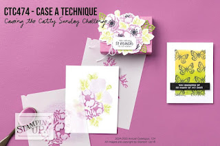
A Technique meets Citrus Blooms
Hello, Welcome to Valley Inspirations with Andrea and #474 Challenge with CASEing the Catty. You may have just come from Julia Quinn's Blog or perhaps another way. At the end of this post just click on the next graphic to be taken to Peta Stephen’s blog.
The Stampin’ Up! Annual Catalogue includes much information useful for paper-crafting, such as various techniques. This week the Challenge is to CASE a Technique.
I have CASEd a couple of the water-colouring techniques shown on the Catalogue’s pages 118-119, specifically the “Spritz Bliss” and “Paint with Water” techniques. Combining these techniques can result in a technique known as “Loose Water-colouring”.
I coloured the larger rubber stamp from the Citrus Blooms stamp set with Stampin’ Write Markers and stamped on Fluid 100 Watercolor Paper. To do this I used a positioning tool (my retired Stamparatus) so I could ink a section of the stamp and stamp it on the paper before the ink dried on the stamp. It is possible to colour a stamp with different coloured markers and then “huff” on it to breathe moisture onto the stamp so the ink is dampened. Since COVI|D, I have hesitated to “huff” on the stamp, finding stamping with a positioning tool extremely effective.
As mentioned, the red rubber stamp from the Citrus Blooms set was markered with Stampin’ Up!’s Stampin’ Write Markers, ie Pumpkin Pie, Daffodil Delight, Lost Lagoon and touches of Early Expresso. A Mister that was filled with tap water and water was spritzed over the inked image then left to allow the ink to bleed (see above). As the stamped image is only an outline image, it was coloured in using the “Paint with Water” technique. While water-colouring the image, I wanted to maintain the softness of the spritzed ink and so encouraged the colours to ooze over the image’s outlines. This can be known as “Loose Water-colouring”.
Water and more ink was applied with the fine tip Water Painter. The image was coloured with Stampin’ Up!s water-based Classic inks, ie Peach Pie & Pumpkin Pie for the oranges, Lemon Lolly and Daffodil Delight for the blossoms, Lost Lagoon and Garden Green for the leaves, touches of Early Expresso for the twigs and Balmy Blue ink for the background. Once dry the outline image was stamped again, but this time with Versamark ink and then heat embossed with Gold Emboss Powder and a Heat Tool to give definition to the image.
The image was die cut with the large outline die from the Citrus Blooms dies. A second piece was cut out with the same die from Balmy Blue card-stock to layer behind the water-coloured panel.
A background piece of Basic White card-stock was dry embossed with the Exposed Brick 3D Embossing Folder.
Some gorgeous Iridescent Striped Trim was tied around the front panel and into a bow. A sentiment from the Unbounded Love stamp set was white heat embossed onto Balmy Blue card-stock and fussy cut. I had wanted to use one of the coordinating label dies from the Unbounded Love dies, but in this instance it wasn’t right. Having said that, the numerous labels in the set of dies are so gorgeous and well worth checking out. The final touch - a few of the delightful 2024-2026 In Color Shimmer Gems.
Thank you so much for spending time with me. I so appreciate it.
Don’t miss any of the inspiration from all the participating Crew. The next blog Crew Member in the hop is the lovely Peta Stephen. Just click on the "next" graphic below to be taken to her blog. I am sure her project will be wonderful.


.jpeg)
.jpeg)
.jpeg)
.jpeg)
.jpeg)
.jpeg)
.jpeg)
.jpeg)
.jpeg)


Fabulous techniques Andrea and your card is gorgeous. Love the loose watercolouring.
ReplyDeleteWhat a truly beautiful card. I can’t wait to try this technique.
ReplyDeleteOH MY GIDDY AUNT - this is sublime!! I totally love this !! And I would love to try this...... but I don't think I'm quite game enough!! OH WOW - this is amazing. Thankyou so much for your amazing inspiration!
ReplyDelete