Poppy Parade with Sweet Ice Cream and Under My Umbrella
Hello. Welcome to Valley Inspirations with Andrea and the 36th 2020/2021 Colour Creations Showcase by members of the Art with Heart Team.
This week we are focussing on a vibrant clear red called Poppy Parade. Poppy Parade can be found in the Stampin' Up! Bright's collection. While its a great red, it is not a colour I reach for frequently, but do love the colour when the design requires it, such as when colouring poppies. Poppy Parade can be found in Stampin' Up!s card-stock, both A4 & 12"x12"; Classic Stampin' inks (ink pads, re-inkers); Stampin' Write Markers; Stampin' Blends, a number of Designer Series Papers, including the Flowers for Every Season Designer Series Paper and Memories and More Card pack.
I've created two different cards again this week. Apart from both featuring Poppy Parade, I have also used water-colouring in some form for the background, plus a little Petal Pink, a centre panel die cut using a ... scalloped rectangular die and the Many Messages bundle for the sentiment, bringing some consistency between the two cards. Both cards have also been inspired by two talented crafters who I respect, that is Susan Wong, a Stampin' Up! Artisan and member of the #CraftyCarrotCollective; and Emma Goddard, of Coastal Crafter, past Stampin' Up Artisan and amazing lady.
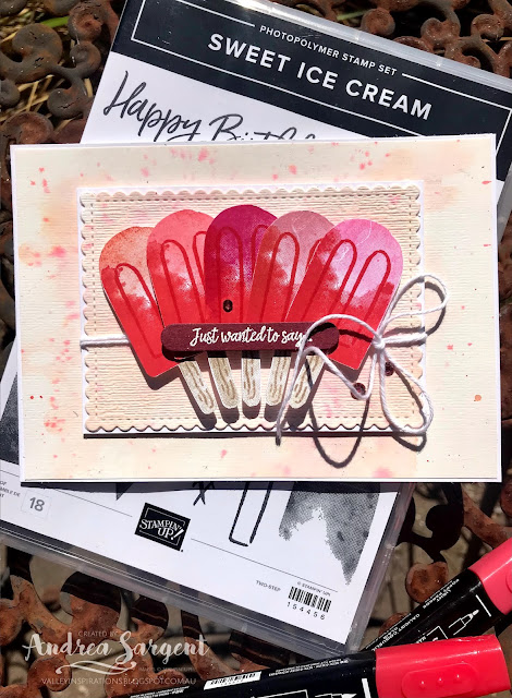
CARD 1: This first play with the Sweet Ice Cream stamp set has been inspired by watching Susan Wong create with the Sweet Ice Cream stamps during the Crafty Carrot Collective Birthday Bash in January. Susan talked about colour theory and her cards reflected complimentary colour combinations. Working from memory and intentionally making a number of changes, I decided to have a harmonious colour scheme, that is primary & secondary colours that are adjacent to each other on the 'colour wheel'.
I started by stamping the base of the ice-block (or icy-pole or popsicle or whatever you call it) in Poppy Parade Classic Stampin' ink. I stamped it numerous times so I could experiment with different colours for the top of the ice block. Each ice-block requires 5 different stamps, ie the base and top of the ice-block, the stick, plus some woodgrain texture and the rounded long thin stamp representing indentations in the ice-block. I then stamped the top of the ice block overlapping the base and tried 6 different colours, ie Blushing Bride, Petal Pink, Melon Mambo, Flirty Flamingo, Calypso Coral and Mango Melody. The pop sticks were stamped in Sahara Sand and Crumb Cake. It was such fun playing with the colour combinations and seeing the effects of each combo. Rather than having the ice blocks the same I decided to use 5 of the different colour combos (dropping the one with Mango Melody) - as they harmonised together.
I gathered a number of potential colours of card-stock and laid the fussy cut ice-blocks on each card-stock colour. I decided on the harmonious choice of Petal Pink and prepared the base and the central panel - the latter being die cut using the second largest scolloped rectangular die from the Stitched So Sweetly die set. But I wasn't 100% happy. In the end I decided to water-colour the background using Fluid 100 Water-colour paper with Petal Pink Classic Stampin' Refill and a splatter of Poppy Parade Classic Stampin' Refill. I also think the water-coloured paper would have been great for a strawberry ice cream creation - may try that another time.
When the watercolour paper was dry, I die cut the label from the centre. Then both pieces were passed through the Stampin' Cut & Emboss machine with the Subtles 3D embossing folder. I so love the added gentle texture and practically, the slight buckle in the watercolour paper was flattened. The outer piece was adhered directly to the Thick Basic White card base.
I have a bowl of sentiments prepared from the Many Messages bundle. This is a "must have" bundle. There is a great range of messages that can be stamped in one go using your Stamparatus and then die cut with the coordinating die. It's amazing. You easily end up with a range of prepared sentiments that can sit on your desk ready for you to craft. I had previously stamped the sentiments in Momento ink on Basic White card-stock as well as a set that had been heat embossed with Versamark on Basic Black card-stock and using White Stampin' Emboss Powder. The white on black sentiment was a tad stark so instead I heat embossed on Merry Merlot card-stock with Versamark ink and White Stampin' Emboss Powder. The label was popped up with Mini Dimensionals and 3 Rhinestone Basic Jewels that had been coloured with a Dark Poppy Parade Stampin' Blend were added to finish off the card front.
The card inner was stamped with an ice-block using Poppy Parade, Flirty Flamingo, Sahara Sand and Crumb Cake and a tiny heart from the Many Messages bundle was added. A C6 Basic White Envelope was also stamped with the same colour combo ice-block.
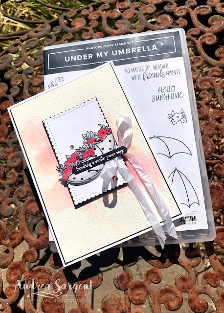
CARD 2: When I first thought of featuring Poppy Parade I was concerned that it would become a project that was "heavy" with red, however, featuring a colour doesn't mean that it is used more than any other colour - it may be that a touch of a colour is actually the most powerful use. This reminded me of a set of gorgeous cards created by Emma Goddard, featuring Poppy Parade and Night of Navy. With that in mind, I thought I would create a black and white card with highlights of Poppy Parade. That was my initial concept but it evolved along the way.
I thought I would feature a black and white umbrella holding Poppy Parade flowers. I stamped the umbrella from the Under My Umbrella stamp set on a couple of the geometric sides of the True Love DSP. The little flowers were stamped in Momento Ink on Basic White card-stock. These flowers were coloured with Dark & Light Poppy Parade Stampin' Blends with a touch of Dark Daffodil Delight in the centre. The leaves were coloured with a Dark Soft Seaside Spray Stampin Blend (they were too small to play around with blending). The flowers and the umbrellas were all fussy cut.
The central label was die cut using one of the rectangular dies from the Stitched So Sweetly set of dies and it was mounted on a slightly larger Basic Black card-stock mount. Some White Crinkled Seam Binding Ribbon was tied around the central panel ending with a bow.
Hmm. The umbrella and flowers would sit on this central panel but what were the options for the background? I decided to play with water-colour just using Poppy Parade Classic Stampin' Refill but water the colour down a bit. I used wet on wet water-colouring with drops of Poppy Parade Classic Stampin' Ink Refill applied with a mid-sized Water Painter. When dry the background was stamped with the floral stamps in Petal Pink. I chose Petal Pink as I didn't want the water-coloured panel overpowered, however, it was so delicate that is hardly shows - in fact the camera doesn't pick them up. The water-coloured paper was embossed with the Subtle 3D Embossing folder. It was also mounted on a slightly larger piece of Basic Black card-stock and then onto the Thick Basic White card base.
I positioned all the pieces and realised that the mainly black umbrella was too dark so choose the white with black dots umbrella. (The blacker umbrella was trimmed and added to the card inner so it didn't go to waste.) The umbrella was lightly shaded with Smoky Slate Stampin' blends and positioned with Mini Dimensionals. The flowers were arranged and adhered in place with Tombow Multipurpose Liquid Glue. The central panel was positioned to the background with Dimensionals.
I checked out my bowl of pre-prepared Many Messages sentiments and found this greeting that seems perfect for the card. It was adhered directly to the umbrella. Rhinestone Basic Jewels were coloured with a Dark Poppy Parade Stampin' Blend and added to finish the card.
As mentioned, the darker umbrella was adhered to the Basic White card inner and 3 remaining sets of flowers were added poking out from the umbrella. The card inner was mounted on Basic Black card-stock and adhered inside the card. A Basic White C6 envelope was stamped with flower stamps in Petal Pink.
I really enjoyed playing with water-colouring and creating these Poppy Parade cards. As mentioned, I was tentative that the cards would be overpowered with red, but I'm pleased with the results - I hope you are as well.
Thank you so much for spending time with me. 😘
Catherine Proctor is the brilliant host of the Art with Heart Colour Creations Showcase. If you haven't finished visiting all of the team's colour creations, you can visit/revisit Catherine's page at What Cathy Made, where she hosts all the links to the participating blogs so you can find everyone's Poppy Parade creations. Checking out everyone's creations and their interpretation of the amazing Stampin' Up! colours is always inspiring.
I hope to see you again next week when members of the team share projects that hero Pretty Peacock, a gorgeous deep blue green.
Stay well, stay safe and be kind to yourself and others as these strange times continue ...
Andrea 💕🐾


Andrea your watercolour techniques are so different on each card and they look equally amazing! I love the soft, almost apricot background you have created. Thank you for providing some Poppy Parade Inspiration this week!!
ReplyDeleteLove both cards Andrea, I can’t choose a favourite
ReplyDeleteBoth of your cards are beautiful, Andrea. I especially love the first one, and that you called them ice blocks! Growing up in NZ, that's what we called them, but they're icy poles here in Victoria. Lovely creations.
ReplyDeleteYour cards are both wonderful, Andrea! I have learned something tonight - I thought that the indent stamp for the icy poles was an outline for the stick! I need to pay more attention - clearly it is far too big!
ReplyDeleteOh I love both of your cards they are gorgeous. I don't know which one to choose. Maybe on this hot day the icy poles so I can get cool! Yum!
ReplyDeleteLovely cards Andrea, I adore your beautiful soft watercolour effects. And the umbrella set is one of my favourites. I must use it more!
ReplyDeleteGoodness, what stunning cards, Andrea. I adore every element on both cards and I can imagine the hype of the kids (or adults) after eating those red icypoles!!!!! The soft background is so pretty.
ReplyDeleteTwo fabulous cards Andrea. I love the fun ice block themed card and the absolute sweetness of your umbrella card, especially with the classic black contrast. Just gorgeous.
ReplyDeleteA couple of beautiful cards Andrea but I think the upside down umbrella one is my favourite but both backgrounds are so lovely and soft.
ReplyDelete