Art with Heart Wow Tutorials

Wednesday, 28 April 2021

Art with Heart Colour Creations Showcase - #46 Shaded Spruce

Shaded Spruce with Quiet Meadows

Hello. Welcome to Valley Inspirations with Andrea and the 46th 2020/2021 Colour Creations Showcase by members of the Art with Heart Team.

This week we are showcasing a lovely colour, Shaded Spruce. It is a deep rich green. It is a gorgeous colour that is great for leaves, grass or other green 'things'. Of course artistic licence provides many other opportunities as well. Having said that, I decided to stay with the more traditional usage of leaves & stems. 


Shaded Spruce has been produced in Stampin' Up!'s card-stock, both A4 & 12"x12"Classic Stampin' inks (ink pads, spots & re-inkers); Stampin' Write Markers; Stampin' Blends, Designer Series Paper including the Forever Greenery DSP; Hello Dear Friend and Gorgeous Posies Card Kits; and Sequins For Everything.

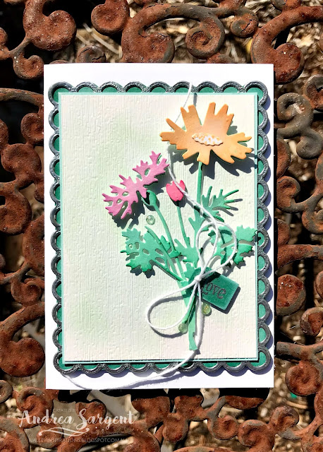
A personally designed and created card featuring Shaded Spruce and the Quiet Meadows bundle by Stampin' Up!, made by Andrea Sargent, Australia.

As mentioned, in designing a project around Shaded Spruce, I decided to watercolour a piece of Fluid 100 Water-colour Paper with Shaded Spruce Classic Stampin' ink and then die cut leaves from it. The design I had in my mind was completely different than the final project. Numerous aspects changed along the way as things didn't work on paper as envisaged in my mind. It was one of those projects where I tried numerous options and chopped and changed so many aspects. There was so much faffing around this time.

A personally designed and created card featuring Shaded Spruce and the Quiet Meadows bundle by Stampin' Up!, made by Andrea Sargent, Australia.

After water-colouring with Shaded Spruce, I also lightly water-coloured a piece of Shimmery White card-stock with Pool Party Classic Stampin' ink for the background. When almost dry it was embossed with the retiring Subtles 3D embossing folder. This was mounted on a slightly larger piece of Pool Party card-stock.

A personally designed and created card featuring Shaded Spruce and the Quiet Meadows bundle by Stampin' Up!, crafted by Andrea Sargent, Australia.

A large scolloped rectangle was die cut using the Scalloped Contour dies from Shaded Spruce card-stock. This set of dies is from the new 2021-2022 Annual Catalogue only available to SU Demonstrators in April, but will bye available to all from the 4th May. One of the design changes was to heat emboss the scolloped edge with Silver Emboss Powder and a Heat Gun. There were two layers of silver heat embossing. The mounted card background was layered on the scolloped piece, which in turn was layered on another piece of Shaded Spruce card-stock so that this lovely green could be seen through the scollops. All these layers were popped up on Dimensionals onto a card base of Thick Basic White card-stock.

A personally designed and created card featuring Shaded Spruce and the Quiet Meadows bundle by Stampin' Up!, crafted by Andrea Sargent, Australia.

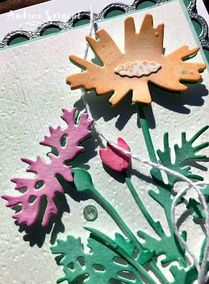
Two flowers on stems and a leaf spray using the Meadows Dies (another new set) were cut from the Shaded Spruce water coloured paper. I had some water-coloured paper that I had water-coloured with 3 of the new In Colours - Pale Papaya, Fresh Freesia and Polished Pink. They are beautiful colours. A flower head was die cut from each colour and I cut a flower centre from un-died scrap of Shimmery White card-stock. As there are 4 dies in this shape, I suspect that the shape may represent little buds or elongated flowers to go with the long small leaf die, but it also works as a flower centre. It was dotted using the Pale Papaya Stampin' Write Marker. The flower heads were popped up on 
Mini Dimensionals.

A personally designed and created card featuring Shaded Spruce and the Quiet Meadows bundle by Stampin' Up!, crafted by Andrea Sargent, Australia.

The die cut flowers/stems were arranged with pieces of the leaf spray and adhered in place with a mix of Multipurpose Liquid Glue and Mini Dimensionals.

A personally designed and created card featuring Shaded Spruce and the Quiet Meadows bundle by Stampin' Up!, crafted by Andrea Sargent, Australia.

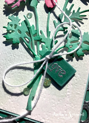
A little tag from made from the Meadows dies with Shaded Spruce card-stock. It was stamped with the word "Love" from the Quiet Meadows Stamp Set using Versamark ink and heat embossed with Silver Stampin' Emboss Powder and a Heat Gun. The tag was positioned with a Dimensional; and a piece of White Twine from the Snail Mail Combo Pack was tied in a bow and adhered with a Glue Dot. To finish the card front design, 3 Genial Gems were added. They are so gorgeous and also come from the new 
2021-2022 Annual Catalogue. New products will be available to all from 4 May. 

A personally designed and created card featuring Shaded Spruce and the Quiet Meadows bundle by Stampin' Up!, crafted by Andrea Sargent, Australia.

A piece of Basic White card-stock was mounted on a slightly larger piece of Pool Party card-stock and adhered inside the card. A piece of the water-coloured leaf was added as an understated design element. Another leaf will be adhered to a C6 Basic White envelope to tie the envelope in with the card. A second leaf was hiding underneath something at the time of photographing the card, so the decorated envelope is not pictured here.

A personally designed and created card featuring Shaded Spruce and the Quiet Meadows bundle by Stampin' Up! shown with Gemma, crafted by Andrea Sargent, Australia.

For once Gemma let me photograph her with the card. She had a hair cut a few days ago and is feeling the cold. Just as well the sun was out.

Thank you for visiting. While this card did not fall into place easily, it is always good to persist with a challenge.

Catherine Proctor is our gorgeous host of the Art with Heart Colour Creations Showcase. If you haven't finished visiting all of the team's colour creations, you can visit/revisit Catherine's page at What Cathy Made, where she hosts the links to the participating blogs so you can find everyone's Shaded Spruce creations. Checking out everyone's creations and their interpretation of the amazing Stampin' Up! colours is always a treat and I am sure there will be inspiring Shaded Spruce projects on show.

I hope to see you again next week when members of the team share projects that hero Smoky Slate from the SU Neutrals Colour family.

Stay well, stay safe and be kind to yourself and others.

Andrea 💕🐾

Saturday, 24 April 2021

Social Stamping - #23 Neutrals

Neutrals with Playful Pets & In Good Taste

Hello. Welcome to Valley Inspirations with Andrea and the April 2021 Social Stamping Blog Host. Currently, we are focussing on each of Stampin' Up!'s Colour families.


This month the nominated colours form the Stampin' Up! Neutrals family. The Neutrals range from light to dark and include greys and browns as well as 3 fantastic colours - Night of Navy, Mossy Meadow and Merry Merlot. The latter colours have an amazing ability to coordinate with many other colours, just like neutrals. Apart from the 3 colours just mentioned, Stampin' Up!s' Neutrals include: Sahara Sand, Crumb Cake, Soft Suede and Early Expresso (browny tones); and Smokey Slate, Grey Granite and Basic Grey (grey tones)


In thinking of the Neutrals colour family my mind went to some of Stampin' Up!s Designer Series Papers, particularly the In Good Taste DSP. I so love this DSP and its earthy neutral tones and their use in woodgrains, tiles and textural fabrics. Also, I needed to test out something I had seen and wanted to create for a class - so I decided to combine the two. I have seen some examples of a decorated set of 3 photo frames hanging on a lovely ribbon and needed to work out how to create it so I could demonstrate the process to a craft group of lovely ladies. I don't have good photos to share so I have decorated the frames using the Playful Pets DSP and ... stamp sets.


The frames were built on Thick Basic White card-stock cut in 4 inch squares together with 5 inch woodgrain DSP. The frame backing is Thick Basic White cut at 3 15/16 inches. The 4" Basic White square is centralised on the 5" DSP and the largest square die from the Stitched Shapes dies is used to cut a square hole in the centre. The Basic White and DSP die cut frames are adhered together and after trimming the corners, the excess DSP is folded back onto the back of the frame and adhered in place.


Foam Adhesive Strips are added to 3 sides of the slightly smaller Thick Basic White card-stock squares. The 4th side is for the insertion of photos so no Dimensionals are added on this side. The frame backs are adhered to the frame fronts.


Dogs and a couple of cats were fussy cut from the Playful Pets DSP. (Balloons were stamped in Stazon on Shimmery White card-stock using the Hot Dog stamp set. A dog bowl from the Pampered Pets bundle was stamped in Stazon ink on Shimmery White card-stock and coloured - I had started my blog before finishing the project. As numerous things inhibited me from crafting I haven't been able to get to this stage, but hope to later in the day. When I do I will re-load photos with the finished product. I hope you understand.)


I tried numerous things for the background, finally lightly applying Night of Navy and Mossy Meadow with Blending Brushes onto Shimmery White card-stock. To add some texture some water was flicked over the backgrounds. I was going to emboss the backgrounds or partially emboss them but my morning completely changed so I ended up just slipping them in the frames. The dogs & cats were positioned. They are only adhered to the frames as I feel I need to do something else with the project - but time has disappeared. A couple of bones and a heart trinket from the Playful Pets Trinkets have been added.

A length of the Vanilla Open Weave Ribbon from the Forever Greenery Trim Combo Pack was adhered to the back of the frames using Tear n Tape, ensuring the ribbon was centred and the frames evenly spaced and at the right angle. It's now ready to hang. Of course, instead of decorating the frames it would be lovely to slip precious photos in and have some tastefully added decor - depending on the nature of the photos.

I've loved creating this project using some of the SU's Neutral colours. Neutrals usually support other colours, so it was great to hero this colour family. 

That's it from me this month. I hope you are enjoying the NeutralsSocial Stamping Blog Hop for April. If you started at the beginning with our amazing Social Stamping Host, Kelly Kent, then you have progressed through all the talented crafters and can now return to Kelly Kent at My Papercraft Journey. Either click on Kelly's name or click on the "next" graphic to be taken to her blog.

To see the full list of participants, click on this link and be taken to Kelly Kent's Host Blog Post at My Papercraft Journey - its a different post where you will find all the individual links that can take you to each person's blog.

I hope to see you again next month, when we will be focussing on the Neutral colour family

Do look after yourself and your loved ones. Stay well, stay safe and be kind to yourself and others in these strange times.

Andrea 😘

Wednesday, 21 April 2021

Art with Heart Colour Creations Showcase - #45 Seaside Spay

Seaside Spay with "Friends Are Like Seashells"

Hi. Welcome to Valley Inspirations with Andrea and the 45th 2020/2021 Colour Creations Showcase by members of the Art with Heart Team.

This week we are showcasing a beautiful colour, Seaside Spray. It is one of Stampin' Up!'s retiring In Colours for 2019-2021. It is a pale blue that can be used in so many ways. I have really loved working with this gorgeous colour and am sad that it is retiring - however, I do love the new In Colours that will be available from 4 May. It is part of life that we may be sad saying 'Goodbye' but will soon become invested in the 'New'. 


Seaside Spray has been produced in Stampin' Up!'s card-stock, both A4 & 12"x12"Classic Stampin' inks (ink pads & re-inkers); Stampin' Write Markers; Stampin' Blends, Designer Series Paper including the Sand & Sea DSP and the Hydrangea Hill DSP; Seaside Shells, Pastel Pearls and Woven Threads Sequin Assortment.

As mentioned, two gorgeous current designs of Designer Series Paper that include Seaside Spray is the Sand & Sea DSP and the Hydrangea Hill DSP - both so beautiful. The card for this blog has been designed around the Sand and Sea DSP. I have started creating a simple fancy fold with the Hydrangea Hill DSP, but ...  I won't bore you with the numerous issues that delayed the completion of the second card but will try to finish it off and add it here in the not too distant future. Here is the card that has been finished:

A number of sea shells and a focus on Stampin' Up!s Seaside Spray combine to say 'how unique & amazing' you are on an especially designed card by Valley Inspirations with Andrea Sargent.

Building onto the Seaside Spray card-stock base, two designs from the Sand & Sea DSP were added on the card front. One is reminiscent of sand and the other features Seaside Spray and its lighter shades - the latter piece of DSP was torn at an angle at the bottom, giving a sense of sea foam rolling onto the sand. 

A number of sea shells and a focus on Stampin' Up!s Seaside Spray combine to say 'how unique & amazing' you are on an especially designed card by Valley Inspirations with Andrea Sargent.

A smaller rectangular card front of Seaside Spray card-stock was cut, ensuring the background DSP could be seen and would frame this centre piece. A thin layer of Frost White Shimmer Paint (another retiring item) was applied with a Blending Brush giving it a light shimmer. Once dry, this piece was embossed using the Seashells 3D Embossing Folder and then mounted onto a slightly larger piece of the sandy look design DSP. This was popped up on Dimensionals and centred on the card background

A number of sea shells and a focus on Stampin' Up!s Seaside Spray combine to say 'how unique & amazing' you are on an especially designed card by Valley Inspirations with Andrea Sargent.

A piece of Braided Linen Trim (also retiring) was adhered across the card front with each end being frayed a little. A piece of Basic White card-stock was coloured with a number of Stampin' Blends in patches. The coloured patches were prepared using Seaside Spray & Misty Moonlight Stampin' Blends Combos; Petal Pink, a little Light Flirty Flamingo & Light Crumb Cake; Crumb Cake and a little Petal Pink. [TIP: If you don't have a specific colour of card-stock and do have that colour in Stampin' Blends or if you want a brighter or lighter shade or a mix of colours (as I did) then a section of Basic White card-stock can be coloured with Blends and then stamped and or die cut, etc - this is another way of using your Blends.] I stamped shells using the Friends are Like Sea Shells stamp set in Versamark and then heat embossed using a Heat Gun and White Emboss Powder. Even though the coordinating die could cut some of the shells, it couldn't cut the star fish, so I decided to fussy cut all the shells - they were simple shapes.

A number of sea shells and a focus on Stampin' Up!s Seaside Spray combine to say 'how unique & amazing' you are on an especially designed card by Valley Inspirations with Andrea Sargent.

The shells were then embossed with the coordinating Seashells 3D Embossing Folder to give them amazing extra texture. The shells were positioned and adhered with a mix of Dimensionals and Multipurpose Liquid Glue

A number of sea shells and a focus on Stampin' Up!s Seaside Spray combine to say 'how unique & amazing' you are on an especially designed card by Valley Inspirations with Andrea Sargent.

I love the sentiment from the same stamp set "You are unique and completely amazing" and heat embossed it on both Seaside Spray and Misty Moonlight card-stocks with Versamark and White Emboss Powder. The Seaside Spray sentiment was fussy cut and divided in two. The words "unique" and "amazing" were fussy cut from the Misty Moonlight card-stock. These words were layered over the same Seaside Spray words using thin strips of Dimensionals. The sentiment was positioned with a mix of Dimensionals and Multipurpose Liquid Glue. Basic Pearl Jewels were added as the finishing touch.

A number of sea shells and a focus on Stampin' Up!s Seaside Spray combine to say 'how unique & amazing' you are on an especially designed card by Valley Inspirations with Andrea Sargent.

As usual I have simply decorated the card inner to link it with the card front design. Some shells were stamped on a Basic White card inner using the ink rolling technique to add touches of a different colour. The colours used were similar to the Stampin' Blends colours used for the colour patches. A thin strip of the sandy DSP was overlaid at the bottom.

A number of sea shells and a focus on Stampin' Up!s Seaside Spray combine to say 'how unique & amazing' you are on an especially designed card by Valley Inspirations with Andrea Sargent.

A C6 Basic White envelope also was similarly stamped.

A number of sea shells and a focus on Stampin' Up!s Seaside Spray combine to say 'how unique & amazing' you are on an especially designed card by Valley Inspirations with Andrea Sargent.

As I designed this card initially, I realised I was unconsciously basing the design on a card which I had used for a Stamparatus class that was held a couple of months ago. I still had a kit left over from that class so was able to use some of those pieces. The cards are similar but different. This card added Shimmer Paint and mounted the card front; the shells used different colouring techniques - with the class card using the 'marker to stamp technique'; also different embellishments and sentiments were added. The two cards are photographed together.

A number of sea shells and a focus on Stampin' Up!s Seaside Spray combine to say 'how unique & amazing' you are on especially designed cards by Valley Inspirations with Andrea Sargent.


Thank you for visiting. I really enjoyed creating these cards to share with you.

Catherine Proctor is our amazing host of the Art with Heart Colour Creations Showcase. If you haven't finished visiting all of the team's colour creations, you can visit/revisit Catherine's page at What Cathy Made, where she hosts the links to the participating blogs so you can find everyone's Seaside Spray creations. Checking out everyone's creations and their interpretation of the amazing Stampin' Up! colours is always a treat and I am sure there will be inspiring Seaside Spray projects on show.

I hope to see you again next week when members of the team share projects that hero another delightful colour, Shaded Spruce from the SU Regals Colour family.

Stay well, stay safe and be kind to yourself and others.

Andrea 💕🐾

Wednesday, 14 April 2021

Art with Heart Colour Creations Showcase - #44 Sahara Sand

Sahara Sand with Wrapped Bouquet and Kangaroo & Company

Hi. Welcome to Valley Inspirations with Andrea and the 44th 2020/2021 Colour Creations Showcase by members of the Art with Heart Team.


This week we are showcasing a great colour, Sahara Sand. It is one of Stampin' Up!'s Neutrals family of colours. It is a light sandy colour and can be combined with so many coloursSahara Sand has been produced in Stampin' Up!'s card-stock, both A4 & 12"x12"Classic Stampin' inks (ink pads & re-inkers); Stampin' Write Markers; Designer Series Paper including the Sand & Sea DSPand the Love You Always Foil Sheets. While the Linen Thread is just described as natural it is brilliant with Sahara Sand.


I love Sahara Sand but my creativity has not flowed easily this week - more to do with other factors than the choice of focal colour. Given time constraints I won't be providing as much detail as I usually do. If you have any queries, please don't hesitate to make contact.


I have created 2 quite different cards to share tonight. Both had an element of inspiration from Emma Goddard, an amazing UK Stampin' Up! Demonstrator and a beautiful person. Emma recently held a Facebook Live where she used watercolour pencils on Sahara Sand card-stock after having painted a layer of White Craft Ink over the stamped images. I haven't painted a layer of Craft Ink but did use Stampin' Up!'s Water-colour Pencils on Sahara Sand card-stock on one project. The other project is based on a layout Emma used but is different in numerous ways - colours, stamp set, colouring tools and embellishments. While my cards are different from Emma's, her inspiration was a solid basis at the start. Thanks So much Emma. 


CARD 1: While inspired by Emma Goddard, with this card I decided to colour the white embossed bouquets using Stampin' Blends. When colouring with Blends over a coloured card-stock the card-stock colour impacts on the final colour. When using neutrals like Sahara Sand or Crumb Cake, colouring with Blends results in a more muted effect. The Blends Combos used were Petal pink, Calypso Coral, Poppy Parade (on the open flower) and Balmy Blue for the tiny sprays of flowers. The leaves were fully embossed so no green was needed.


The card front had a light blending of White Craft ink using a Blending Brush. 
Blushing Bride twine from the Snail Mail Twine Combo Pack was wrapped around the card front and tied in a bow near the top. Three fussy cut floral sprays were arranged to the right of the card front and then adhered in place with a mix of Dimensionals and Multipurpose Liquid Glue. The right edge of the card front was fussy cut, aligning with the edges of the floral arrangement. The card was adhered directly to the Sahara Sand card base. Again the right edge was fussy cut to align with the floral arrangement.


A strip of Fine Art Floral DSP was mounted on Petal Pink card-stock and this was adhered directly to the right inner card edge leaving a thin border of Sahara Sand. A piece of Basic White card-stock was stamped top and bottom with the some of the same bouquet in Sahara Sand Classic Stampin' ink. This was adhered inside the card abutting the Petal Pink mount edge for writing a personal message.


The fussy cut edge sits over the mounted DSP inside the card and so when the card is closed the edge of the patterned DSP adds to the design of the front of the card. In thinking of a sentiment, one of the sentiments from the Many Messages bundle suited perfectly. While it was longer than I was initially thinking of I was wanting to wish my friend a special day. The full sentiment stamp was stamped in Versamark on to Petal Pink card-stock and then heat embossed using White Stampin' Emboss Powder. A thin strip of the DSP peaks out underneath the sentiment card-stock. Using the Petal Pink card-stock and DSP for the sentiment brought this colour card-stock/DSP up from just showing on the right edge of the card.


Something else was needed so the other bouquet was stamped in Versamark and heat embossed with white emboss powder on Sahara Sand card-stock in the same way as the original floral sprays. The 3 flowers were coloured with Petal Pink and Calypso Coral Stampin' Blends and then fussy cut out. These flowers were added with Dimensionals. The Petal Pink Elegant Facetted Gems were perfect for adding a little sparkle.


The Basic White C6 envelope was stamped with the floral spray using Sahara Sand ink to link it with the design of the card.


CARD 2:  Kangaroos come in various shades of pale brown, to rust red and grey. I decided to build the colour of my Kangaroos on a basic of Sahara Sand using Stampin' Up!'s Water-Colour Pencils. I have both sets. Ever since seeing the cute Kangaroo & Company stamp set, I had in mind having the cute Joeys' and Mother Roo's heads poking out from die cut holes. Now was the time to give it a go.

A card front of Shimmery White card-stock was lightly coloured with Balmy Blue, Pear Pizzaz and Sahara Sand Classic Stampin' inks using Blending Brushes. A little water was sprinkled over that add textural drops. The leaf Meadows Moments Embossing folder was used at the base to add some subtle interest. (In hind site I probably could have omitted this process.)


Four circular holes were die cut using the 3 smallest Layering Circles dies. A piece of Forever Greenery DSP was layered at an angle onto the Sahara Sand card base. It was a bit strong in colour when it was seen through the holes in the card front so some White Craft Ink was added using a Blending Brush where the DSP was to be seen through the holes.


The Kangaroo, little Joeys and the flowers were stamped in Sahara Sand ink onto Sahara Sand card-stock. They were coloured with Watercolour Pencils, ie the pencil colours used for the Kangaroos were Whisper White, Early Expresso with touches of Cajun Craze. The different shades of brown were gained through different degrees of shading and addition of white. The flowers & leaves were coloured with Flirty Flamingo, Calypso Coral, Daffodil Delight, Melon Mambo and Old Olive. They were die cut using the Kangaroo dies.


The blended card front was popped up with Dimensionals and Mother Kangaroo and the Joeys were tucked in so they peaked out from the die cut holes. They are so cute and happy.


The floral sprays were added again using a mix of Dimensionals and some liquid glue. The sentiment also was stamped on some Shimmery White card-stock and it was die cut with the smallest circular die. So it blended more subtlety with the background a little ink was added to the edges. 


The Kangaroo and some little butterflies were stamped in Sahara sand ink on to Basic White card-stock to coordinate the card inner with the card design. A C6 Basic White envelope was similarly stamped. To add some extra character, I crumpled the lower left corner of the card front. We'll see if the recipient tries to straighten it out or recognises it as part of the design. Finally some self adhesive Artistry Blooms Sequins were added as the finishing touch.


I wasn't sure how my projects would go this week but after much faffing, I was pleased with the end results. I hope you like them.


Thank you for visiting. I really enjoyed creating these cards to share.
Catherine Proctor is the fantastic host of the Art with Heart Colour Creations Showcase. If you haven't finished visiting all of the team's colour creations, you can visit/revisit Catherine's page at What Cathy Made, where she hosts the links to the participating blogs so you can find everyone's Sahara Sand creations. Checking out everyone's creations and their interpretation of the amazing Stampin' Up! colours is always a treat. 

I hope to see you again next week when members of the team share projects that hero Seaside Spray, a delightful light blue from the soon to retire In Colours for 2019-2021.

Stay well, stay safe and be kind to yourself and others.

Andrea 💕🐾

Wednesday, 7 April 2021

Art with Heart Colour Creations Showcase - #43 Terracotta Tile

Terracotta Tile with Today's Tiles and Soar Confidently 

Hello. Welcome to Valley Inspirations with Andrea and the 43rd 2020/2021 Colour Creations Showcase by members of the Art with Heart Team.


This week we are showcasing a lovely colour, Terracotta Tile. It is one of the soon to retire In Colours for 2019-2021, with it's last day as a Stampin' Up In Colour being 3 May 2021. I haven't used this colour often, but when I do I realise how lovely it is. Having said that,  my examination of the new In Colours for 2021-2023 has me excited and looking forward to playing with them.

Terracotta Tile is a softer rusty tan. It has been produced in Stampin' Up!'s card-stock, both A4 & 12"x12"Classic Stampin' inks (ink pads & re-inkers); Stampin' Write Markers; Designer Series Paper including the Ornate Garden DSPand a number of embellishments - Woven Threads Sequins, Butterfly Gems & Scalloped Ribbon.


I have had one of those days that hasn't gone to plan - how has your day been? I have two different cards to share tonight; one using a retiring bundle (that I will miss) and the other card uses a stamp set from the January - June Mini Catalogue plus a die from another retiring set of dies. They retiring products are still available but if you are wanting one - don't delay too long as they are only available till sold out. Many Items have already gone.


CARD 1: 

For the first card I decided it was only appropriate to use the Today's Tiles bundle to show Terracotta Tile. As mentioned, this bundle is retiring soon. It stamps the tiles brilliantly as a group of 8 tiles. This go me thinking and I decided to create a Stable Door fold. I''m not sure if it is actually called a Stable Door fold - but that is what I always think of with this fold. The set of 8 tiles fits perfectly on both the top and bottom sections, forming a visual square of 8 x 8 tiles.


The card base was cut larger but after stamping and trimming the tiles, the Thick Basic White card base was trimmed down to form a 5 x 5 inch card. Sorry about inches - it ended up being easier with this card. The front of the card was cut in half horizontally using the Stampin' Trimmer and then cut up along the fold line to the top - thereby completely removing the top half of the front of the card.


The more filled in tile stamp was attached to my Stamparatus - so love this positioning tool. It was inked with Petal Pink Classic Stampin' ink and then Calypso Coral ink was added randomly in patches with a Sponge Dauber. A second stamping was required to give it good coverage. The Stamparatus Plate was moved 2 steps down, reinked and re-stamped. The second tile stamp adds to the design by adding highlights. This stamp was laid over the stamped tiles and positioned so that it would stamp over white sections. As the stamps are photopolymer it was easy to see through the stamp to position it correctly. The stamp was inked with Terracotta Tile Classic Stampin' ink and stamped over both sets of tiles. I love the effect of the mottled tile background.


The stamped tiles were trimmed down the edges of the set of 8 tiles. Each set of tiles were mounted on Basic White card-stock leaving a boarder about the same as the gap between the tiles (representing mortar between tiles). It was then mounded on Calypso Coral card-stock leaving a fine boarder and then onto Petal Pink card-stock with a wider mount. One mounted set of tiles was adhered directly to the exposed card inner on the top half. The other set of mounted tiles had the Petal Pink and calypso Coral boarders trimmed of on one of the long sides. The trimmed edge was adhered at the cut edge of the remaining card front.


The coordinating Field Tiles dies have a couple of detailed dies that could be layered over the stamped design. The more detailed die was used to cut 3 detailed tile pieces from Terracotta Tile card-stock. The 3 were adhered together, one directly over the other to give this feature greater depth as well as strength to hold itself unsupported. a small square of Petal Pink cardstock was stamped with a sentiment from the stamp set, "Namaste". It is a Sanskrit phrase that means "I bow to you". One usually puts their hands together and bows as it s said.


Given the style of card the card inner doesn't need further decoration as the top section of tiles is seen, however, I added a small strip of Petal Pink card-stock at the bottom.


As the finishing touch, 4 Artistry Blooms Sequins were added at the inner corners of the detailed die cut - except looking at this photo I just realised that one of the sequins had jumped nearer to the sentiment.  Oops. I made an envelope using the In Good Taste Designer Series Paper (DSP) - a different tile design.

CARD 2: 

I recently acquired a fantastic holder for my crafting tools. A fellow crafter's father created it out of rectangular tubing cut at different heights. I am so delighted with it and wanted to say "Thank You" so I created this card with this in mind. 


I recently saw a Jennifer Mc Quire uTube where she talked about creating different shaped cards, that is different from the usual rectangular cards. My take on this technique was to use the balloons from the Sour Confidently stamp set to extend past the cut down card base.


A Thick Basic White card base was cut down using a curvy die for the Happy die set. The curves in this die are reminiscent of clouds. The card front and card back were die cut separately to give a perception of more clouds. Two additional pieces of card-stock were also cut so they could be layered to indicate numerous clouds at the front. Each of the pieces were coloured using a Blending Brush with Balmy Blue classic Stampin' ink. The blue was added at the base so the top of the clouds were white and fluffy.


The large balloon and the smaller one from the stamp set were stamped in Terracotta Tile Classic Stampin' ink. The balloons were coloured with Stampin' Blends, ie Calypso Coral, Petal Pink, So Saffron, Crumb Cake and touches of Soft Suede. The balloons were fussy cut as there were no coordinating dies. To give both extra dimension and strength they were adhered to another piece of Basic White card-stock and fussy cut again. This also neatened the back of them so the Blends ink that seeps through the card-stock could not be seen from the back.


A small cloud was die cut to fill an area that looked a bit sparse. To add some extra interest a little water was flicked over the "clouds" and then some Balmy Blue ink was splattered using a Stampin' Write Marker.


The larger balloons were positioned and the top one adhered at the basket with the balloon popped up on a couple of Dimensionals. The other large ballon was adhered directly to the back inner of the card, with most of the balloon hanging off the top edge of the clouds - flying freely in its own sky.


I love the sentiment in the stamp set "Soar confidently in you own sky". I tried stamping it in Terracotta Tile and then Soft Suede. Neither seemed quite right, so I decided to ink the sentiment with both colours using the Stampin' Write Markers and a huff. The sentiment was then fussy cut and adhered directly to the clouds. The card was finished with some white Elegant Faceted Gems - I'm so glad they are carrying over - they are often just the right bit of sparkle!


Again, the card inner didn't need further decoration. But ... I couldn't help myself and added some blue sky, another layer of clouds near the bottom and I couldn't waste the smaller elongated balloon (I can't remember the special name of this shape of flying device). The C6 Basic White envelope was also stamped with some balloons in Terracotta Tile ink.


I really like this different style of card and will try it again with different images. The more I use Terracotta Tile, the more I like it - but now it is time to say goodby.

Thank you for visiting. I really enjoyed creating these cards to share.

Catherine Proctor is the amazing host of the Art with Heart Colour Creations Showcase. If you haven't finished visiting all of the team's colour creations, you can visit/revisit Catherine's page at What Cathy Made, where she hosts the links to the participating blogs so you can find everyone's Terracotta Tile creations. Checking out everyone's creations and their interpretation of the amazing Stampin' Up! colours is always a treat. 

I hope to see you again next week when members of the team share projects that hero Sahara Sand, a light colour from the Neutral family.

Stay well, stay safe and be kind to yourself and others. Hopefully life with settle to an improved normality before too long. 

Andrea 💕🐾

AWH Colour Creations Blog Hop #34 Melon Mambo

Melon Mambo with Memorable Blooms Hello. Welcome to  Valley Inspirations with Andrea  and the  Art with Heart Colour Creations Blog Hop.  We...