Art with Heart Wow Tutorials

Showing posts with label Embossing Paste. Show all posts

Wednesday, 2 August 2023

AWH Colour Creations Blog Hop #14 Blueberry Bushel

Blueberry Bushel with Seaside Bay & Beauty of the Deep, plus a Christmas Cottage Wreath

Hello. Welcome to Valley Inspirations with Andrea and the Art with Heart Colour Creations Blog Hop. We are working though the Stampin' Up! colours in alphabetical order, focussing on one colour each week.
This week’s Blog Hop is focussing on a junior blue colour called Blueberry Bushel. Blueberry Bushel is one of the Regals Colour Family and is a rich mid blue. This colour was previously an In Colour and has been returned to the Stampin’ Up! colour range this year.


Blueberry Bushel is produced in Stampin' Up!'s card-stock, both A4 & 12"x12"; Classic Stampin' inks (ink pads & re-inkers); Stampin' Write Marker; Stampin' Blends Combo; Regals Designer Series Paper as well as Stargazing, Glorious Gingham, Bright & Beautiful DSPs; Bright & Beautiful Memories & More Card Pack and Cards & Envelopes, plus Tinsel Gems Four Pack and Confetti Card Kit.


Blueberry Bushel card-stock, ink, Stampin’ Write Marker, Stampin’ Write Marker and Stampin’ Blends combo have been used in the creation of this project plus a range of non-Blueberry Bushel bits and pieces.


When thinking of Blueberry Bushel, the first thing I thought of was berries but then blue sea came to mind. I’d just heard of a friend who had recently hurt her shoulder and is out of action for a month. She loves sea themed cards so that decided my Blueberry Bushel project would be a sea theme. I’d created a spanner fun fold recently and thought it could work well with the sea theme.


A sea plant from the Beauty of the Deep stamp set was white heat embossed onto Basic White card-stock. The background panel was ombré blended using Crumb Cake, Balmy Blue, Blueberry Bushel and some Night of Navy Classic Stampin inks. I love the way the white embossed image resisted the application of inks - its a beautiful effect - although looking at the photo - only a little is easily seen. A little bit of White Embossing Paste was applied with a spatula on the area between sand and sea to be reminiscent of white sea foam. Some water droplets were sprinkled over the blending to add extra interest and a splattering of White Craft ink and Light Blueberry Bushel Stampin’ Blend. The background panel was cut into 3 and all pieces were mounted onto Basic White card-stock. In turn, they were mounted onto a Blueberry Bushel card base that had been cut as required for a spanner card. An extra piece of card-stock was blended for the strip that spanned the card.


Sea plants from Beauty of the Deep stamp set and from Botanical Layers stamp set were white heat embossed on Vellum card-stock using Versamark ink, White Emboss Powder, the Embossing Additions kit and a Heat Tool. Both fish stamps were stamped in either Petal Pink or Calypso Coral inks on Basic White card-stock. Shells from Seaside Bay stamp set were stamped in Crumb Cake ink and the large bird from Seaside Bay stamps was stamped in Blueberry Bushel ink. Extra colouring was added with Stampin’ Blends Combos. Coordinating dies from Beauty of the Deep & Seaside Bay cut out images, although I also did some fussy cutting of the Botanical Layers plant and detailing some bits here and there. Coral (from the Beauty of the Deep dies) was die cut from Basic White card-stock and very lightly coloured with Petal Pink ink.


As you can see when you lift the spanner section, the centre part of the card front is seperate. It was designed to show hidden fish swimming in the deep around the coral and shells can be seen more clearly.


All the images were arranged and adhered with either Multipurpose Liquid Glue or a few Dimensionals. The spanner strip was adhered to both edge panels with Liquid Glue. A sentiment from the Marvellous Nature stamp set was white heat embossed onto Blueberry Bushel card-stock. It was fussy cut and adhered with Mini Dimensionals. A number of Flat Adhesive-backed Pearls add a little shimmer both on the spanner section and hidden under on the centre panel. But then when you lift up the centre panel …


… The scene changes on the inside of the card to a beach scene with small shells and the larger Oyster Shell stamped in Crumb Cake ink. The Oyster shell was coloured on the inside with White Craft ink and Wink of Stella. A personal message is to be written on the centre panel. A C6 Basic White Envelope was stamped with the longer sea plant from the Beauty of the Deep stamps.


Here is a different angle of the Blueberry Bushel Seaside Bay Spanner card.


Christmas Card - A monochromatic Cottage Wreath


Here is a monochromatic Blueberry Bushel Cottage Wreath card. 
I had planned and started a different Christmas card but “stuff happened”. Recognising that I may not have time to complete my planned design. I then created a simpler card using Blueberry Bushel and Basic White.


There is more Blueberry Bushel creativity so continue with the blog hop. Just click the "next" graphic below to be taken to the blog of the special Christine Blain. I am looking forward to checking out Christine’s creation. I do love seeing everyones' projects - there is always so much inspiration.

I do hope to see you next week when we will be featuring Cajun Craze as we continue the weekly 2023-2024 Colour Creations Blog Hop series. 

Also, we are commencing the Heart of Christmas Blog Hop next Monday night - there will be lots of Christmas creating ideas to help us all start preparing for the festive season.

Stay well, stay safe and be kind to yourself and others.

Andrea 💕🐾

If you find a broken link or would like to view the full list of participants go to Catherine Proctor’s blog @ What Cathy Made. Cathy is our brilliant Art With Heart Team Colour Creations Coordinator.  She is a wonderful lady. Check out her delightful creation while you are there.

If you live in Australia, don't already have a Stampin' Up! demonstrator and would like your own copy of the Stampin' Up 2023-2024 Annual Catalogue and the coming September-December 2023 Mini Catalogue then let me know and I will be delighted to send it to you.  Please don't hesitate to make contact with any other queries about these projects or Stampin' Up!. 


#colourcreationsbloghop  #stampinup #stampinupaustralia #stampinupsouthpacific #stampinupdemo  #handmadecards #makeacardsendacard #stampinupdemonstrator #papercrafting #artwithheartteam  #papercrafter  #valleyinspirations   #seasidebay  #beautyofthedeep  #botanicallayers   #cottagewreaths


Wednesday, 12 July 2023

AWH Colour Creations Blog Hop #11 Basic Gray

Basic Gray with Sweet & Precious

Hello. Welcome to Valley Inspirations with Andrea and the Art with Heart Colour Creations Blog Hop. We are working though the Stampin' Up! colours in alphabetical order, focussing on one colour each week.


This week’s Blog Hop is focussing on a deep grey called Basic Gray. Basic Gray is part of the Neutrals Colour Family and is a dark steel grey. This neutral can be used for earthen pots, animals, instead of black for a slightly softer look and with white & pops of colour for striking effect. I love grey with pink or yellow but have used it in this project with blues and a touch of yellow.


Basic Gray is produced in Stampin' Up!'s card-stock, both A4 & 12"x12"; Classic Stampin' inks (ink pads, spots & re-inkers); Stampin' Write Marker; Watercolor Pencils Assortment 1; Neutrals Designer Series Papers as well as Timeless Greeting, The Best Remedy, Kindness Card and Christmas Whimsy Card Kits; plus Classic Matte Dots.

A watercoloured background with Basic Gray Sweet & Precious penguins creates a gorgeous scenic card and add some embossing paste for a little extra flourish.

Basic Gray card-stock, ink, Stampin’ Write Marker and Watercolor Pencil have been used in the creation of this project plus a range of non-Basic Gray bits and pieces.

A watercoloured background with Basic Gray Sweet & Precious penguins creates a gorgeous scenic card and add some embossing paste for a little extra flourish.

Basic Gray is an essential neutral in a colour range, yet initially I struggled as to how I would hero this colour, but then … I remembered the gorgeous Sweet & Precious stamp set, with the delightful parent/child penguins. Initially, I was thinking of a gray & white card with a possible pop of colour. As often happens the design evolved along the way.

A watercoloured background with Basic Gray Sweet & Precious penguins creates a gorgeous scenic card and add some embossing paste for a little extra flourish.

A friend traveled to Antarctica in January and so I had his holiday and photos in mind as I created. I thought of the bright blue skies and expanse of white ice. This led to a blue water-colour background using Azure Afternoon and Blueberry Bushel Classic Stampin’ inks on Fluid 100 Watercolor Paper with the wide Water Painter brush. Once dry this panel was to be mounted on a slightly larger piece of Basic Gray card-stock and a Basic White Thick card base.

A watercoloured background with Basic Gray Sweet & Precious penguins creates a gorgeous scenic card and add some embossing paste for a little extra flourish.

The Mother & Child penguin image was stamped on Basic White card-stock using Basic Gray ink. The image was fussy cut with Stampin’ Up!s brilliant Snips. I felt it was important to trim out the white space between the 2 penguins and the new hobby blade attachment was perfect for this. The hobby blade is part of the new Take Your Pick Crafter Tips. A little Crushed Curry and Basic Gray was added to the image with Watercolour Pencils. Very carefully a little water was added with the fine tip Water Painter to blend the Crushed Curry colouring. Some Shimmery White Embossing Paste was applied over one of the Foursquare Decorative Masks with a Palette Knife. When I went to apply the paste I realised I didn’t have any Matte Paste (it’s now on my list). If I was to create something similar I would change the way I applied the paste to have it look more ‘ice’ like.

A watercoloured background with Basic Gray Sweet & Precious penguins creates a gorgeous scenic card and add some embossing paste for a little extra flourish.

A number of finishing touches included some splattering using the Basic Gray Stampin’ Write Marker. The sentiment (from the same set of stamps) was stamped in Basic Gray ink on Basic White card-stock and fussy cut. I saw a piece of trimmed-in-half Balmy Blue & White Variegated Ribbon on my workspace from another project. A number of lengths were frayed off, circled around my fingers and adhered behind the penguins. The penguins and sentiment were positioned with Dimensionals. A number of Loose Silver Sequins were scattered around and adhered with a tiny dot of Multipurpose Liquid Glue.

A watercoloured background with Basic Gray Sweet & Precious penguins creates a gorgeous scenic card and add some embossing paste for a little extra flourish.

The card inner was simply decorated with another stamped image of the penguins and a thin strip of Basic Gray card-stock. A C6 Basic White envelope was partially stamped with the same image in Basic Gray ink.

A watercoloured background with Basic Gray Sweet & Precious penguins creates a gorgeous scenic card and add some embossing paste for a little extra flourish.

Thank you for dropping in. I do so appreciate your visit to my Blog for the Colour Creations Blog Hop.

A watercoloured background with Basic Gray Sweet & Precious penguins creates a gorgeous scenic card and add some embossing paste for a little extra flourish.

There is 
more Basic Gray creativity so continue with the Blog Hop. Just click the "next" graphic below to be taken to the blog of the lovely Aime McIlroy. I am looking forward to checking out Aime’s creation(s). I do love seeing everyones' projects - there is always so much inspiration.

I do hope to see you next week when we will be featuring Berry Burst, one of Stampin’ Up!s Brights, as we continue the weekly 2023-2024 Colour Creations Blog Hop series. 

Stay well, stay safe and be kind to yourself and others.

Andrea 💕🐾

If you find a broken link or would like to view the full list of participants go to Catherine Proctor’s blog @ What Cathy Made. Cathy is our wonderful Art With Heart Team Colour Creations Coordinator.  She is an amazing lady. Check out her delightful creation while you are there.

If you live in Australia, don't already have a Stampin' Up! demonstrator and would like your own copy of the Stampin' Up 2023-2024 Annual Catalogue, then let me know and I will be delighted to send it to you.  Please don't hesitate to make contact with any other queries about this project, Stampin' Up! or becoming a Stampin’ Up! Demonstrator. 


#colourcreationsbloghop  #stampinup #stampinupaustralia #stampinupsouthpacific #stampinupdemo  #handmadecards #makeacardsendacard #stampinupdemonstrator #papercrafting #artwithheartteam  #papercrafter  #valleyinspirations   #sweet&precious  

Sunday, 3 July 2022

Bron’s Birthday Blog Hop #4

Theme #4: CASE the Catty from a page numbered in the 60s

Hello. Welcome to Valley Inspirations with Andrea and the fourth blog hop celebrating Bronwyn Eastly. We're a group of stamping friends that are recognising Bron's 60th Birthday in 2022 with six blog hops, over six months, with six fun themes! 


The theme for this blog hop is to CASE a page numbered in the 60's from Stampin' Up!s  2022-2023 Annual Catalogue. The picture above shows the cards illustrated on page 66 featuring the Awash in Beauty Suite. The card I am CASEing is the card at the top centre with the So Saffron card-base. Here is my version:

Christmas is coming and so it is time to start creating special cards to wish special people a Merry Christmas.

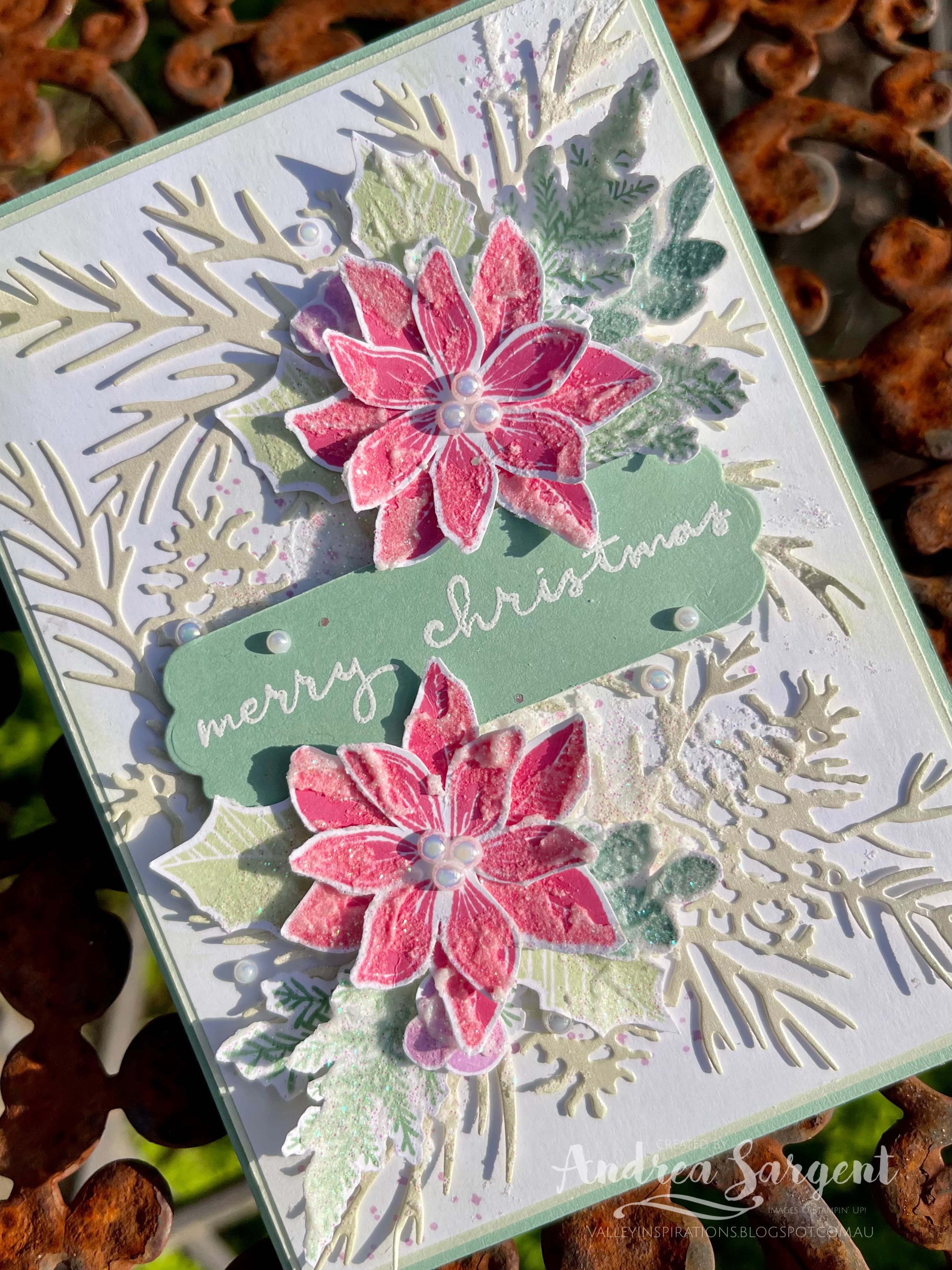
I CASEd the CATTY's card layout and that there was a die cut as background to the design. I so love the background die from the Organic Beauty dies, but it hasn't made its way to my homes as yet, so I needed to find another background die. Prior to making this card I had just created my first Christmas card for 2022, so as I was starting to get into the Christmas groove my eyes fell on the Christmas Pinecone dies. That decision completely changed the mood of this CASE. I had something different in mind.

Christmas is coming and so it is time to start creating special cards to wish special people a Merry Christmas.

I started by die cutting the finer pine/pinecone background from some Pearlescent Speciality Paper. After being partially adhered down onto a piece of Basic White card-stock that had some splatters randomly stamped in Fresh Freesia ink; some Soft Sea Foam Classic ink was very lightly blended over the background with a brilliant Stampin' Up! Blending Brush.

Christmas is coming and so it is time to start creating special cards to wish special people a Merry Christmas.

Next - some stamping on Basic White card-stock using the Merriest Moments stamp set. The poinsettias were stamped in Polished Pink, holly in Soft Sea Foam, Pine fronds in Mint Macaron and the rounder leaves in Soft Succulent. They were all fussy cut and I couldn't resist adding some Shimmery White Embossing Paste. It's such a pity the camera doesn't show the shimmer. The flowers and leaves were arranged with a sense of the layout of the card I was CASEing.

Christmas is coming and so it is time to start creating special cards to wish special people a Merry Christmas.

The card was finished with a white heat embossed sentiment from the Christmas to Remember stamp set on Mint Macaron card-stock. The sentiment was die cut with a coordinating label die from the Seasonal Labels dies. The label was trimmed a little narrower with my Trimmer. Some Iridescent Pearl Basic Jewels added that final touch to the centres of the poinsettias and were scattered on the label and background. I don't know what came over me - using so much shimmer - ah well it's for Christmas.

Christmas is coming and so it is time to start creating special cards to wish special people a Merry Christmas.

An extra poinsettia and leaves were adhered to a Basic White card inner. Some extra poinsettias were adhered to the back flap of a Basic White C6 Envelope. I do love, in some simple way, to link the card inner and envelope to the card front design.

Christmas is coming and so it is time to start creating special cards to wish special people a Merry Christmas.

Thank you so much for dropping in and helping to celebrate Bron's coming birthday. While it would have been so disappointing for Bron to give up the dream of celebrating with an overseas holiday, it is so much fun to celebrate with monthly blog hops and there are still more to come over the next 2 months. We will be here again on the 3rd of August, launching the blog hop at 7.00pm EST.

Christmas is coming and so it is time to start creating special cards to wish special people a Merry Christmas.

Hop on over to the next blog by the lovely Elizabeth Gross and check out her delightful creation. Just click on Elizabeth's name or the Next graphic below to be taken to her Blog, Lillybet's Papers.


If you come across a broken link or want to head back to Bron's blog just click on this link 

Apart from this Blog Hop there is also an Instagram Hop starting with Bron at @addinktivedesigns. Check it out too - there is more creativity to find.

#bronsbdaybloghops #stampinup #stampinupsouthpacific #stampinupdemo  #handmadecards #makeacardsendacard #merriestmoments #christmastoremember #stampinupdemonstrator #papercrafting


Wednesday, 1 June 2022

AWHT Colour Creations #5 Tahitian Tide

Tahitian Tide with Let's Set Sail, Watercolour and Paste 

Hello. Welcome to Valley Inspirations with Andrea and the Art with Heart Colour Creations Blog Hop. We are continuing to work though the new Stampin' Up! In Colours before focussing on all the other Stampin' Up! colours in alphabetical order. 


This week’s Blog Hop is focussing on a bright Turquoise called Tahitian Tide. Tahitian Tide is part of the In Colour Family for 2022-2024 and is a bright & happy colour. This colour is gorgeous when used with other blues such as Balmy Blue and Pacific Point. I am looking forward to exploring other colour combos.  


Tahitian Tide is produced in Stampin' Up!'s card-stock, both A4 & 12"x12"; Classic Stampin' inks (ink pads & re-inkers); Stampin' Write Markers; Stampin' Blends, In Colour Designer Series Papers, Glimmer Paper, In Colour Matte Decorative Dots & In Colour Twine. The card below has used Tahitian Tide Classic Stampin' ink (both re-inker and Stamp Pad), Card-stock, Stampin' Write Marker, Stampin' Blends, Glimmer Paper & In Colour Matte Decorative Dots  plus a range of other non-TT bits and pieces.

Here is my card to showcase Tahitian Tide:

Send that special friend personally created sentiments for the Best Day Ever using Let's Set Sail stamps and the Boat Builder Punch.

Isn't Tahitian Tide a bright & happy colour.  


CARD 1:

This card demonstrates the beauty of Tahitian Tide through a water-coloured section depicting the sea. Given the colour's name, I decided my project needed to have a sea theme.

Send that special friend personally created sentiments for the Best Day Ever using Let's Set Sail stamps and the Boat Builder Punch.

A half panel of Fluid 100 Watercolor Paper was watered down and then ink from a Balmy Blue  Re-inker was applied to the top of the panel, with the larger flat Water Painter, to represent sky.  Similarly, the bottom of the panel was coloured with Crumb Cake ink to represent sand. The centre section was coloured with Tahitian Tide ink with tiny touches of Pacific Point ink to give a little extra depth to the sea. The water-coloured panel was mounted to a slightly larger piece of Tahitian Tide card-stock.  A Basic White card-stock card front was splattered with a Light Tahitian Tide Blend and dry embossed with the Splatters embossing folder from the Stripes & Splatters 3D Embossing Folders set. This card front was mounted directly on a Tahitian Tide card base. 

Send that special friend personally created sentiments for the Best Day Ever using Let's Set Sail stamps and the Boat Builder Punch.

I initially was going to add ink to White Shimmer Embossing Paste to create faux sand - as I had recently seen this demonstrated by Krista Frattin of the Crafty Carrot Co. However, I just decided to add paste to the waters edge indicative of sea foam and also a little to the sky for clouds. Krista's layout inspired the placement of the focal point. The larger round die from the Beautiful Shapes dies cut a label from the Tahitian Tide Glimmer sheet and Vellum. A Dark Tahitian Tide Stampin' Blend darkened the lower section of the Glimmer label. The Vellum label was trimmed close to the stitching lines and added over the Glimmer label. A sail boat was punched out of Basic White card-stock using the Sailboat Builder Punch. This was layered on to the label with Dimensionals. My quirky nature was spiked as I was crafting and I thought about adding a whale in the sea. It didn't seem to work so I punched a whale's tail with the Whale Punch and tucked it poking out from the central panel on the RHS. Looking at the photos as a write my blog I am not keen that it communicates what I had intended. I will probably take the white tail off before giving the card. not enough light to re photograph the project now.

Send that special friend personally created sentiments for the Best Day Ever using Let's Set Sail stamps and the Boat Builder Punch.

The card front was finished with a sentiment from the Let's Set Sail stamp set that had been stamped on Basic White card-stock with a darker blue, Starry Sky ink. The sentiment was cut into two and fussy cut with the first line added over the boat. Some In Colour Matte Decorative Dots were adhered around the sentiment and boat, together with a little knotted Linen Twine.

Send that special friend personally created sentiments for the Best Day Ever using Let's Set Sail stamps and the Boat Builder Punch.

A piece of Basic White card-stock was adhered into the inner card base. The Basic White card-stock had been stamped with the little birds in Crumb Cake ink. A strip from the water-coloured panel was adhered to a thin strip of Tahitian Tide card-stock and then added at the side of the card inner. A Basic White C6 Envelope was splattered with Tahitian Tide ink from a Stampin Write Marker and stamped with the tiny birds stamp in Crumb Cake ink. 

Send that special friend personally created sentiments for the Best Day Ever using Let's Set Sail stamps and the Boat Builder Punch.


Thank you so much for dropping by. I do value the time you spent with me.

If you live in Australia, don't already have a Stampin' Up! demonstrator and would like your own copy of Stampin' Up's 2022-2023 Annual Catalogue and or the January - June 2022 Mini Catalogue then let me know and I will be delighted to send them to you.  Please don't hesitate to make contact with any other queries about these projects or Stampin' Up!. 

There is more Tahitian Tide creativity. To continue with the blog hop, click on the "next" graphic below to be taken to the blog of the lovely, Tina Gellespi. I always look forward to checking out Tina's creation (I wonder what she has in store this week - she is absolutely amazing). I do love seeing everyones' projects - always so much inspiration.

Hope to see you next week when we will be featuring a delightful colour, Balmy Blue, as we continue the weekly 2022-2023 Colour Creations blog hops.

Stay well, stay safe and be kind to yourself and others. 

Andrea 💕🐾


If you find a broken link or have come to this blog hop from a different entry point, you can view the full list of participants on Catherine Proctor’s blog, our very special Art With Heart Team Colour Creations Coordinator.  I so appreciate Cathy and all she does in coordinating this blog hop each week. Check out her wonderful creation while you are there.

#colourcreationsbloghop  #stampinup #stampinupaustralia #stampinupsouthpacific #stampinupdemo  #handmadecards #makeacardsendacard #stampinupdemonstrator #papercrafting #artwithheartteam  #papercrafter #letssetsail #stamper 

Wednesday, 2 February 2022

AWHT Colour Creations #34 Pear Pizazz

Pear Pizazz with Dahlia Days

Hello. Welcome to Valley Inspirations with Andrea and the Art with Heart Colour Creations Blog Hop. We are continuing to work though all the Stampin' Up! colours in alphabetical order. Having started mid 2021 we are now in the midst of "P". 


This week’s Blog Hop is focussing on a muted yellow green called Pear Pizazz.  Pear Pizazz is part of the Subtles Colour Family and is a delightful green that is lighter and brighter than Old Olive. I love using it for leaves and would be great for depicting other "green things".  This colour is delightful with Flirty Flamingo and Pale Papaya, and there are many other lovely combos as well.


Pear Pizazz is produced in Stampin' Up!'s card-stock, both A4 & 12"x12"; Classic Stampin' inks (ink pads & re-inkers); Stampin' Write Markers; and the Subtles Designer Series Papers as well as Artfully Composed, You’re a Peach, Daffodil Afternoon, Flowering Fields, Expressions in Ink Designer Series Papers & the Notes of Cheer Card Kit.  The card below has used Pear Pizazz Classic Stampin' ink (ink pad & re-inker), Stampin' Write Marker and a tad of You're A Peach DSP plus a range of other non-PP bits and pieces.

Here's the card I created to showcase Pear Pizazz:


I had so many ideas for projects, but ran out of time, so my inspiration started with a bundle already on my desk from a previous project, the colour combo from a picture seen this morning and I wanted to use some of the Pear Pizazz design from the Sweet As a Peach DSP.

CARD 1:


Starting with a piece of Basic White card-stock, the large intricate die from the Detailed Dahlias dies cut a mask to be used with Shimmery White Embossing Paste. A blob of paste was dropped on a Silicone Mat together with a drop of Pear Pizazz Re-inker. Only a little of the ink was mixed into the paste, before it was spread over the mask onto a Basic White card-front. If I had more time I would have tried to use the mask to create a second card. It looks great - I must create with it   ... (The photo doesn't show the shimmer - its beautiful.)


While the embossing paste was drying, I stamped a range of elements. The large dahlia was inked with Pale Papaya and then Flirty Flamingo ink was dabbed on the edges with a Sponge Dauber. The label stamp was coloured with Stampin' Write Markers - Old Olive, Flirty Flamingo & Pale Papaya, the little flowers were inked in either Flirty Flamingo or Pale Papaya and a couple of the leafy stamps were stamped in Pear Pizazz, one of which was stamped off first. They were all die cut with the coordinating Detailed Dahlias dies. Gotta love Stampin' Up!s coordination.


A strip of the Old Olive design within the Sweet As a Peach DSP was cut on my SU Trimmer as well as a thinner shorter strip of Mother of Pearl Speciality paper. You have to see this speciality paper to appreciate how gorgeous it is. I played with the design selecting the pieces to be arranged and adhered either with Tombow Multipurpose Liquid Glue or Dimensionals.


A bow of White Crinkled Seam Binding was tucked under the larger dahlia and a sentiment from the same stamp set was stamped in Mossy Meadow ink on Basic White card-stock and fussy cut. The final touch was the addition of a few of the delightful Iridescent Rhinestone Basic Jewels.


A thin strip of the Pear Pizazz Sweet As a Peach DSP was added to one edge of the Basic White card inner and a left over Dahlia and leaves were also added. The C6 Basic White Envelope had a thin strip of the DSP adhered to the left side together with a few remaining little flowers. 


Thank you so much for dropping by. I do appreciate you.

If you live in Australia, don't already have a Stampin' Up! demonstrator and would like your own copy of Stampin' Up's 2021-2022 Annual Catalogue and or the January - June 2022 Mini Catalogue & Saleabration Catalogue then let me know and I will be delighted to send them to you.  Please don't hesitate to make contact with any other queries about this project or Stampin' Up!. 

There is more Pear Pizazz creativity. To continue with the blog hop, click on the "next" graphic below to be taken to the blog of the delightful Kate Morgan. As always, I am looking forward to checking out Kate's creation and everyone else's. I do love seeing everyones' projects - so many ideas and such great inspiration.

Hope to see you next week when we will be featuring a lovely colour, Petal Pink as we continue the weekly 2021-2022 Colour Creations blog hops.

Stay well, stay safe and be kind to yourself and others. 

Andrea 💕🐾

If you find a broken link or have come to this blog hop from a different entry point, you can view the full list of participants on Catherine Proctor’s blog, our amazing Art With Heart Team Colour Creations Coordinator.  I so appreciate all Cathy has done and she continues to do an amazing job in coordinating this blog hop each week. She is such a special lady. Check out her wonderful creation(s) while you are there.

#colourcreationsbloghop  #colourcreationsbloghop2022  #stampinup  #artwithheartteam  #handmadecards #dahliadays 

AWH Heart of Christmas - #7

Christmas with Shining Stars  Hello. Welcome to  Valley Inspirations with Andrea  and the seventh  Art with Heart Team Heart of Christmas Bl...