Art with Heart Wow Tutorials

Showing posts with label Rich Razzleberry. Show all posts

Wednesday, 8 March 2023

AWHT Colour Creations #43 Rich Razzleberry

Rich Razzleberry with Desert Details, including Just Add Ink #642

Hello. Welcome to Valley Inspirations with Andrea and the Art with Heart Colour Creations Blog Hop. We are working though the Stampin' Up! colours in alphabetical order, focussing on one colour each week.


This week’s Blog Hop is focussing on a deep red purple called Rich Razzleberry. It is part of the Regals Colour Family and is a rich colour. This colour is lovely when used for flowers, autumn, and so much more. 


Rich Razzleberry
 is
 produced in Stampin' Up!'s card-stock, both A4 & 12"x12"Classic Stampin' inks (ink pads re-inkers); Stampin' Write Markers; Watercolor Pencils; Regals Designer Series Paper as well as Pretty Prints DSP; plus a couple of DSPs on the Clearance Rack.

Rich Razzleberry card-stock, ink and a Stampin' Write Marker have been used in both projects plus a range of non-Rich Razzleberry bits and pieces. Here are my cards:

A personally crafted card using Stampin’ Up!s Desert Details is a beautiful way to show someone you care.

While Rich Razzleberry is a beautiful colour, it is not one of my regular go to colours, so I needed to ponder a little to decide on design elements. The gorgeous Desert Details bundle recently made its way to me and I was excited to use this bundle. Also, having Googled desert flowers, I was delighted to see some desert roses with deep purple centres. Where to from there …

CARD 1:

As I was thinking of design elements for my Rich Razzelberry project I saw the current challenge for Just Add Ink - a delightful sketch, so I decided to create a card for the JAI #642 Challenge. Here is the sketch:


This is the project I created for the JAI #642 Challenge, incorporating Rich Razzelberry and some water-colour resist. To check out the other projects just click on the graphic above. Later edit: So delighted - I just noticed that I received an Honourable Mention for this project. 

A personally crafted card using Stampin’ Up!s Desert Details is a beautiful way to show someone you care.

One of the geometric stamps from the Desert Details stamp set was stamped down one side of a panel of Shimmery White card-stock in Versamark ink and then it was heat embossed with White Emboss Powder and a Heat Tool. A wet on wet water-colour wash was applied using Rich Razzelberry and Fresh Freesia Classic Stampin’ inks, with the darker Rich Razzelberry ink running into Fresh Freesia at the base. To maintain the off-white base tone of Shimmery White the lovely label die cut a label from Shimmery White card-stock. This was mounted on a slightly larger piece of Rich Razzelberry card-stock and splattered with a Rich Razzelberry Stampin’ Write Marker. The mounted label was then cut to size so the left edge would align with the heat embossed stripe. It was positioned with Dimensionals.

A personally crafted card using Stampin’ Up!s Desert Details is a beautiful way to show someone you care.

A die cut strip of Pearlescent Paper was positioned over the label and aligned along the embossed stripe. The two flowers from the Desert Details stamp set were placed in a Stamparatus and inked with Fresh Freesia ink. Before being stamped, Rich Razzelberry ink was applied with the Mini Blending Brush. It was the perfect size. More Rich Razzelberry ink was added and stamped a couple of extra times to ensure the flower centres had depth of colour. The flowers were die cut with coordinating dies from the Desert Details dies. Some spikey “leaves” were also cut from Shimmery White card-stock, with two sets of leaves water-coloured with Evening Evergreen ink

A personally crafted card using Stampin’ Up!s Desert Details is a beautiful way to show someone you care.

Flowers and leaves were all arranged, using a variety of Dimensionals, Multipurpose Liquid Glue and Glue Dots. A piece of Fresh Freesia Open Weave ribbon was cut in half lengthwise and the edge stripe of the ribbon was coloured with a Rich Razzleberry Marker. This ribbon was tied in a bow and tucked under the large desert flower with a Glue Dot. A sentiment was white heat embossed onto Rich Razzelberry card-stock and fussy cut. A few Iridescent Basic Rhinestone Jewels were the final touch. 

A personally crafted card using Stampin’ Up!s Desert Details is a beautiful way to show someone you care.

A Basic White card-stock panel had an off-cut strip of the water-coloured front panel, together with a thin strip of Rich Razzelberry card-stock adhered near the bottom. A remaining small desert flower and some leaves were also added. A Basic White C6 Envelope was stamped with the flowers. They were coloured the same way as described above.

A personally crafted card using Stampin’ Up!s Desert Details is a beautiful way to show someone you care.

CARD 2:

As I was designing for this Blog, a number of ideas came to mind. Not wanting the inspiration to go to waste, this second card was created.

A personally crafted card using Stampin’ Up!s Desert Details is a beautiful way to show someone you care.

Rich Razzelberry goes beautifully with Gold, so a piece of the Like an Animal Speciality Designer Series Paper was coloured using Stampin’ Up!s beautiful Blending Brushes in Rich Razzleberry and Fresh Freesia inks. (I thought the snake print fitted well with the desert theme.) Once coloured it was adhered directly to a Fresh Freesia card base (to differ from the Rich Razzelberry card base of the first card). Dies from the Desert Details dies were used to create a Brushed Gold frame and the smaller die cut the inner section from Pearlescent Paper. “Leaves” were also die cut from Pearlescent Paper

A personally crafted card using Stampin’ Up!s Desert Details is a beautiful way to show someone you care.

The desert flowers were stamped as described above and die cut with coordinating dies. The Brushed Gold die cut frame was positioned using Adhesive Strips - they were perfect for this task. The Pearlescent inner had some Rich Razzelberry and Fresh Freesia inks lightly applied with Blending Brushes in two corners and splatter was added using a Rich Razzelberry Marker. The flowers and leaves were positioned with either Dimensionals or Multipurpose Liquid Glue.

A personally crafted card using Stampin’ Up!s Desert Details is a beautiful way to show someone you care.

Bows tied from Rich Razzleberry coloured Fresh Freesia Open Weave Ribbon and Gold Elegant Trim were tucked under the large desert flower with Glue Dots. A sentiment from the Desert Details Stamp set was white heat embossed on Rich Razzelberry card-stock. The sentiment ends were die cut using the frame die so the ends coordinated with the die cut frame.  Iridescent Pastel Gems added the final touch. The pinky tone adapted to the colour surrounding it. These gems are so beautiful.

A personally crafted card using Stampin’ Up!s Desert Details is a beautiful way to show someone you care.

Basic White card-stock panel had some off-cut strips of the blended Like an Animal SDSP front panel adhered near top and bottom. A couple of remaining small desert flowers and leaves were also added with a Rich Razzleberry stamped and fussy cut sentiment. A Basic White C6 Envelope was stamped with the flowers on the envelope front and back flap. 

A personally crafted card using Stampin’ Up!s Desert Details is a beautiful way to show someone you care.

Thank you so much for dropping by. I hope you are enjoying the Blog Hop and finding inspiration as you ”hop” along.

A personally crafted card using Stampin’ Up!s Desert Details is a beautiful way to show someone you care.

There is more Rich Razzleberry creativity. To continue with the blog hop, click the  "onto the next" graphic below and be taken to the blog of the lovely Diane FurnissI always look forward to checking out Di’s creations - I wonder if her project will be a fancy fold? I do love seeing everyones' projects - there is always inspiration.

I hope to see you next week when we will be featuring Sahara Sand, one of the Neutrals Colour family as we continue the weekly 2022-2023 Colour Creations Blog Hops.  

Stay well, stay safe and be kind to yourself and others. 

Andrea 💕🐾


If you find a broken link or have come to this blog hop from a different entry point, you can view the full list of participants on Catherine Proctor’s blog @ What Cathy Made. Cathy is our  Art With Heart Team Colour Creations Coordinator.  She is an wonderful lady. Check out her delightful creation while you are there.

If you live in Australia, don't already have a Stampin' Up! demonstrator and would like your own copy of Stampin' Up's 2022-2023 Annual Catalogue and or the new January - April 2023 Mini Catalogue then let me know and I will be delighted to send them to you.  Please don't hesitate to make contact with any other queries about this project or Stampin' Up!. 

#colourcreationsbloghop  #stampinup #stampinupaustralia #stampinupsouthpacific #stampinupdemo  #handmadecards #makeacardsendacard #stampinupdemonstrator #papercrafting #artwithheartteam  #papercrafter  #stamper  #valleyinspirations   #desertdetails

Wednesday, 16 March 2022

AWHT Colour Creations #40 Rich Razzleberry

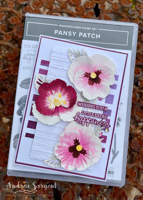
Rich Razzleberry with Pansy Patch 

Hello. Welcome to Valley Inspirations with Andrea and the Art with Heart Colour Creations Blog Hop. We are continuing to work though all the Stampin' Up! colours in alphabetical order. Having started mid 2021 we are finishing colours starting with "R". 


This week’s Blog Hop is focussing on a deep red with a touch of purple called Rich Razzleberry. Rich Razzleberry is part of the Regals Colour Family and is a delightful colour. While playing with it for this blog hop I have wondered why I don't use it more. Rich Razzlebury is lovely with Highland Heather and Smoky Slate and as seen in various pansies it is lovely with a bright yellow, eg Daffodil Delight. 


Rich Razzleberry is produced in Stampin' Up!'s card-stock, both A4 & 12"x12"Classic Stampin' inks (ink pads re-inkers); Stampin' Write Markers; Watercolor Pencils; Regals and Flowering Fields Designer Series Papers and Artistry Blooms Adhesive-Backed Sequins. The cards below have used Rich Razzleberry Classic Stampin' ink, Card-stock, Flowering Fields DSP and the Razzlebury Artistry Blooms Adhesive-backed Sequins, plus a range of other non-PP bits and pieces.

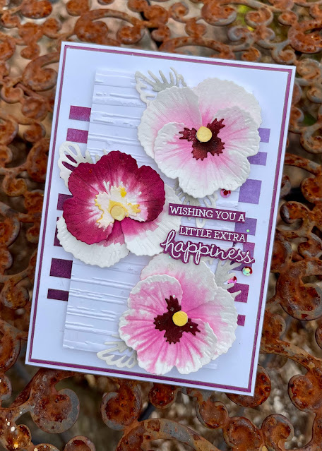
I have created 2 cards showcasing Rich Razzleberry with water-colour:


Isn't Rich Razzleberry a great colour. Both cards show the beauty of Rich Razzlebury using the wet on wet water-colour technique.


CARD 1:

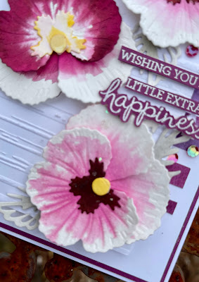
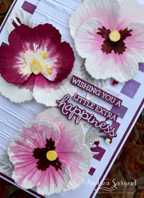
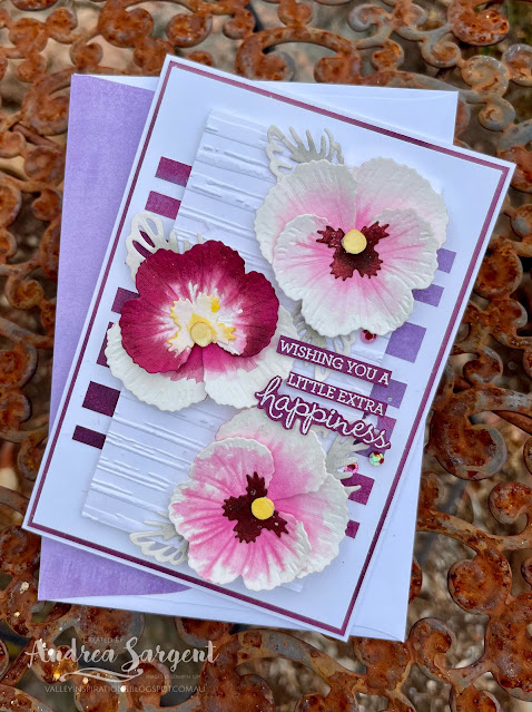
Water-coloured pansies are delightful when wanting to send a note or tell someone you are thinking of them.

Pansy pieces from the Pansy dies were cut from Fluid 100 Watercolor Paper. Having researched pansy colours - checking a friend's pansies and a number of photographs, I then played with a mid-sized Water Painter and some Rich Razzlebury ink using the wet on wet water-colour technique. The flower centres were coloured with Daffodil Delight Classic ink and the leaf die cuts with Smoky Slate ink.

Water-coloured pansies are delightful when wanting to send a note or tell someone you are thinking of them.

Basic White and Rich Razzlebury card-stocks were mounted on a Thick Basic White card-base. A piece of Flowering Fields Designer Series Paper (the piece that looks like water-coloured Rich Razzlebury and Highland Heather) was randomly trimmed into strips and then adhered to the white card front layer.

Water-coloured pansies are delightful when wanting to send a note or tell someone you are thinking of them.

Another piece of Basic White card-stock was embossed with the Stripe embossing folder from the Stripes and Splatters 3D Embossing Folders.

Water-coloured pansies are delightful when wanting to send a note or tell someone you are thinking of them.

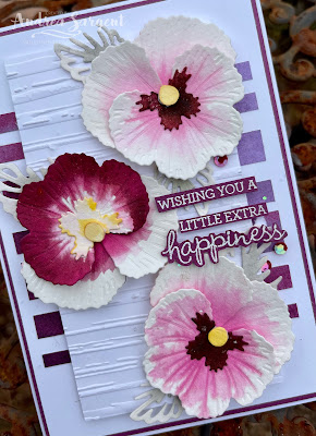
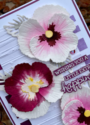
The water-coloured pansy pieces were adhered together to form the pansies. I so love the way the wet colour channelled along the embossed pansy veins.

Water-coloured pansies are delightful when wanting to send a note or tell someone you are thinking of them.

The pansies were positioned in place and a number of Smoky Slate water-coloured leaves were tucked under the pansies. The leaf die used is actually a part leaf die to be used on top of a open leaf die. I chose this die to help the leaves stay in the background.

Water-coloured pansies are delightful when wanting to send a note or tell someone you are thinking of them.

The card front was finished with a sentiment from the same stamp set, Pansy Patch, that had been White heat embossed on Rich Razzlebury card-stock and fussy cut into pieces. The first 3 lines of the sentiment were added individually with Mini DimensionalsSome Artistry Blooms Adhesive-Backed Sequins added a little shimmer, together with a sprinkling of Wink of Stella. I did try hard to add ribbon or trim but it didn't add anything so I decided to let the pansies shine.


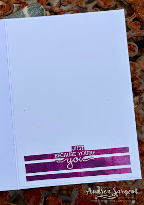
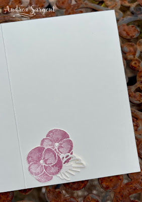
The Basic White card inner was decorated with some extra Flowering Fields DSP strips and the 2nd half of the heat embossed sentiment. Some of the same DSP was adhered to the Basic White C6 Envelope flap to tie it in with the card. 

Water-coloured pansies are delightful when wanting to send a note or tell someone you are thinking of them.

I so love the effect of water-colouring with Rich Razzlebury Classic ink on the pansy die cut pieces. How about you?


CARD 2:

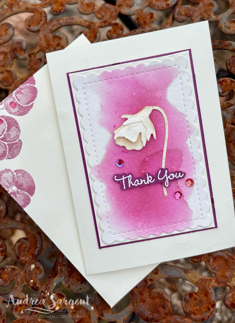
With the second card,  I thought I would challenge myself and try to create a more minimalist card. I recently saw this challenge on one of the Facebook/Blog Challenges that I follow and thought it was time to challenge myself to create some clean and simpler cards. This was my first try. I know, the centre panel has been double mounted - read below to find out why...

Water-coloured pansies are delightful when wanting to send a note or tell someone you are thinking of them.

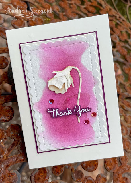
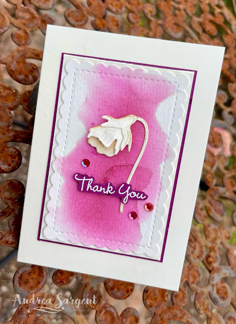
Some Rich Razzlebury Classic ink was wet on wet water-coloured on a piece of Fluid 100 Watercolor Paper. It was cut with a mid-sized die from the Scalloped Contour dies

Water-coloured pansies are delightful when wanting to send a note or tell someone you are thinking of them.

The 3 bud dies from the Pansy dies were used to cut Very Vanilla card-stock. The bud was formed and adhered on the water-coloured panel. 

Water-coloured pansies are delightful when wanting to send a note or tell someone you are thinking of them.

A sentiment from the same stamp set was White heat embossed on Rich Razzlebury card-stock, fussy cut and added with Mini DimensionalsA few Artistry Blooms Adhesive-Backed Sequins were sprinkled around for that touch of bling. 

Water-coloured pansies are delightful when wanting to send a note or tell someone you are thinking of them.

This front panel was adhered directly to a Very Vanilla Notecard. You may be thinking " but that's not what is pictured". Quite right - that's because the front panel was accidentally adhered slightly askew. I found it annoying but kept going and stamped some pansies inside the notecard. A couple didn't stamp well so I decided to cut off the card front; trim it down slightly and adhere it to a new card front. HOWEVER, it was one of those days when I couldn't cut straight; so I trimmed ... and trimmed ... and trimmed ... Eventually, it seemed straight but by then it was quite close to the scallops. In frustration with myself, I decided to mount it onto a slightly larger piece of Rich Razzlebury card-stock and adhere this to the card front. I know, it isn't quite so minimalist now.

Water-coloured pansies are delightful when wanting to send a note or tell someone you are thinking of them.

A couple of fussy cut stamped pansies (cut from the original inner stamping) and a small die cut leaf were adhered to the Very Vanilla card inner.  A few pansies were stamped onto the front of the coordinating Very Vanilla Notecard Envelope.

Water-coloured pansies are delightful when wanting to send a note or tell someone you are thinking of them.


Thank you so much for dropping by. I do value the time you spent with me.

If you live in Australia, don't already have a Stampin' Up! demonstrator and would like your own copy of Stampin' Up's 2021-2022 Annual Catalogue and or the new January - June 2022 Mini Catalogue then let me know and I will be delighted to send them to you.  Please don't hesitate to make contact with any other queries about these projects or Stampin' Up!. 

There is more Rich Razzleberry creativity. To continue with the blog hop, click on the "next" graphic below to be taken to the blog of the lovely, Diane Furniss. I always look forward to checking out Diane's creation (I wonder what she has in store this week). I do love seeing everyones' projects - so many ideas and such great inspiration.

Hope to see you next week when we will be featuring an extremely versatile colour Sahara Sand as we continue the weekly 2021-2022 Colour Creations blog hops.

Stay well, stay safe and be kind to yourself and others. 

Andrea 💕🐾

If you find a broken link or have come to this blog hop from a different entry point, you can view the full list of participants on Catherine Proctor’s blog, our wonderful Art With Heart Team Colour Creations Coordinator.  I so appreciate all Cathy does in coordinating this blog hop each week. She is such a special lady. Check out her wonderful creation while you are there.

#colourcreationsbloghop  #colourcreationsbloghop2022  #stampinup #stampinupdemo  #artwithheartteam  #handmadecards #makeacardsendacard #pansypatch


Wednesday, 24 March 2021

Art with Heart Colour Creations Showcase - #41 Rich Razzleberry

Rich Razzleberry with Fancy Phrases

Hello. Welcome to Valley Inspirations with Andrea and the 41st 2020/2021 Colour Creations Showcase by members of the Art with Heart Team.

The week we are showcasing a deep rich colour, Rich RazzleberryRich Razzleberry is part of Stampin' Up! Regals colour collection and it is a strong red purple. Rich Razzleberry is produced in Stampin' Up!'s card-stock, both A4 & 12"x12"Classic Stampin' inks (ink pads, re-inkers & ink spot); Stampin' Write Markers; Stampin' Blends, Watercolour pencils; Designer Series Paper including the Artistry Blooms DSP; and the Artistry Blooms Sequins.


Rich Razzleberry has not been a highly used colour for me, however, as I played with it for this blog hop it has found its way into my heart. It is amazing how water-colouring gives me a deeper understanding of the colour. For this week's card I water-coloured the flowers and leaves with a fine Water Painter. This technique requires a higher level of detail & I need to practice more.

I started by stamping the large floral arrangement from the Fancy Phrases stamp set in Grey Granite Classic Stampin' ink onto Shimmery White card-stock. This card-stock is an off white, that is not as bright a white as Basic White and not as cream as Very Vanilla. It has a delicate shimmer throughout. It is great for water-colouring where there is not an abundance of water. As I was water-colouring the image, I needed to do something to stop the stamped Classic ink from bleeding into the colouring.  I stamped in Versamark ink directly over the Classic ink stamped image (my trusty Stamparatus was brilliant for this) and heat embossed it with Clear Stampin' Emboss powder. This trapped the Grey Granite ink under the clear embossing.


The floral image was stamped four times - one for practicing and 3 for use on the card. I decided on a colour scheme of Rich Razzelberry for the roses, Flirty Flamingo for the open flowers and stayed with Grey Granite for the leaves/stems. As mentioned, I used the fine tipped Water Painter to colour the image, keeping the tip wet and just picking up colour from a large Block where I had added a light layer of ink by pressing my stamp pads on the block. I refined my colouring technique as I progressed. So glad I had stamped an extra image to practice the technique! When dry, the floral arrangements were fussy cut - as the stamp set has no coordinating dies.


For the background, I prepared a card front size of Shimmery White card-stock and laid a light water-colour wash using Seaside Spray Classic Stampin' ink. I didn't want the background wash to compete with the flowers so it was very light - so light in fact that you can hardly see it. Oops! (If you squint, you may be able to see a little of the water-colour wash in the photo below.) When almost dry, this background was embossed using a Painted Texture 3D Embossing folder.


The embossed background was mounted on a piece of Rich Razzleberry card-stock. Linen twine was wrapped around this background twice and tied in a bow. The water-coloured flowers were arranged over the background, with focal flowers being popped up on Dimensionals and other flowers adhered directly to the background. The arrangement needed something, so extra central flowers and some leaves were fussy cut out and layered on top with Dimensionals.


As I was thinking about the sentiment, I saw my bowl holding pre-prepared sentiments using the Many Messages bundle. This is such a handy bundle with a great range of sentiments. I decided to use the "Happy Birthday" sentiment which I had previously heat embossed with White Stampin' Emboss powder on Merry Merlot card-stock. While a different colour, it seemed to coordinate well with the overall colour scheme & design. The sentiment was mounted on a piece of Vellum that had been die cut using a small scolloped rectangle from the So Sentimental dies. I couldn't find my Artistry Blooms Sequins, so added some clear Elegant Faceted Gems as the finishing touch. So love these embellishments.


To coordinate the inside panel of the card with the front, some remaining small pieces from the water-coloured floral sprays were adhered to the card inner. After adhering another 2 floral images to a C6 Basic White envelope, there were only a few little leaves remaining. It was just the right amount although, I also used the "practice" water-coloured flowers.


Gemma, my companion & fur family, stayed close by as I photographed the card for the blog. Today she even let me take a photo of her with the card - she normally moves away.


I had fun creating this card and experimenting further with water-colouring. Time disappeared so ideas for a second card didn't come to fruition. I am sure the concepts will be used later. Thank you for calling by.


Catherine Proctor is the wonderful host of the Art with Heart Colour Creations Showcase. If you haven't finished visiting all of the team's colour creations, you can visit/revisit Catherine's page at What Cathy Made, where she hosts the links to the participating blogs so you can find everyone's Rich Razzleberry creations. Checking out everyone's creations and their interpretation of the amazing Stampin' Up! colours is always a treat. 

I hope to see you again next week when members of the team share projects that hero Rococo Rose, one of the retiring In Colours for 2019-2021.

Stay well, stay safe and be kind to yourself and others as these strange times continue. Hopefully life with settle to an improved normality before too long. 

Andrea 💕🐾

CASEing the Catty #578 - Case July On-line Exclusives

CASE Stampin’ Up!s July On-line Exclusives meets Butterfly Flight Hello, welcome to Valley Inspirations with Andrea &  #578 Challenge wi...