Art with Heart Wow Tutorials

Wednesday 30 March 2022

AWHT Colour Creations #42 Shaded Spruce

Shaded Spruce with Artfully Layered and Water-colour

Hello. Welcome to Valley Inspirations with Andrea and the Art with Heart Colour Creations Blog Hop. We are continuing to work though all the Stampin' Up! colours in alphabetical order. Having started mid 2021 currently we are working through colours starting with "S", with only 4 more Blog Hops in the 2021-2022 round of Stampin' Up! colours. 

This week’s Blog Hop is focussing on a rich green (that has a touch of blue) called Shaded Spruce. Shaded Spruce is part of the Regals Colour Family and is a delightful green. This colour is gorgeous on its own or when used with other greens such as Pool Party and Mint Macaron.  


Shaded Spruce is produced in Stampin' Up!'s card-stock, both A4 & 12"x12"Classic Stampin' inks (ink pads, Spots re-inkers); Stampin' Write Markers; Stampin' Blends, Regals Designer Series Papers, Sequins for Everything and Holiday Rhinestone Basic Jewels. The cards below have used Shaded Spruce Classic Stampin' ink (both re-inker and Stamp Pad) and Card-stock plus a range of other non-PP bits and pieces.

I have created 2 cards to showcase Shaded Spruce:

Show how much you care with a simple white palm frond over water-colour.

Send happiest birthday wishes to a special friend.

Isn't Shaded Spruce a lovely colour.  

CARD 1:

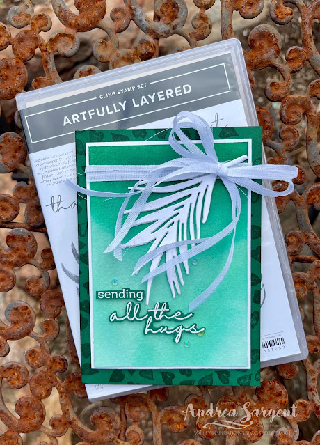
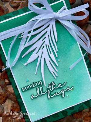
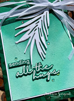
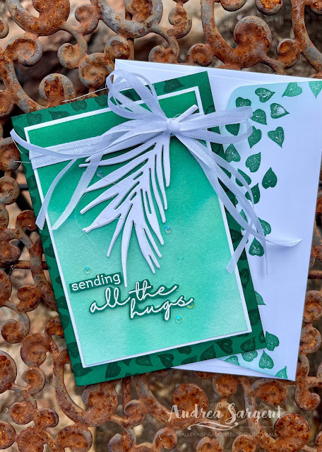
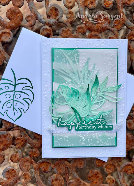
This card shows the beauty of Shaded Spruce through a water-coloured ombre panel.

Show how much you care with a simple white palm frond over water-colour.

A half panel of Fluid 100 Watercolor Paper was watered down and then ink from a Shaded Spruce Re-inker was applied to the top of the panel with a mid-sized Water Painter, allowing the ink to run/drip down to the bottom. I had recently seen Emma Goddard, a UK Stampin' Up! Demonstrator and previous Artisan Team member, demonstrate this technique with Pacific Point. As I watched Emma, I thought of this coming blog hop and decided to try it out with Shaded Spruce. I had so much fun and ! love the effect. I ended up with green ink on my fingers - the only time I could genuinely say I had green fingers!  The water-coloured panel was mounted to slightly larger piece of Basic White card-stock.  A Shaded Spruce card-stock card base was stamped on the front panel with the tiny leaves stamp from the Artfully Layered stamp set in Shaded Spruce ink. 

Show how much you care with a simple white palm frond over water-colour.

A piece of
 gorgeous soft White Faux Linen Ribbon (from the Flowers for Every Season Combo Pack) was cut into three lengthwise, wrapped around the mounted water-coloured panel and tied into a bow. Three palm leaf die-cuts were adhered together, one on top of the other, to give the leaf some dimension. The white palm leaf was adhered in place with the stem tucked under the ribbon. This centre panel was added to the card base with Dimensionals.

Show how much you care with a simple white palm frond over water-colour.

The card front was finished with a sentiment from the same stamp set that had been White heat embossed on Shaded Spruce card-stock. Some Iridescent Rhinestone Basic Jewels added some shimmer, together with a little Wink of Stella (its so hard to capture in the photos).

Show how much you care with a simple white palm frond over water-colour.

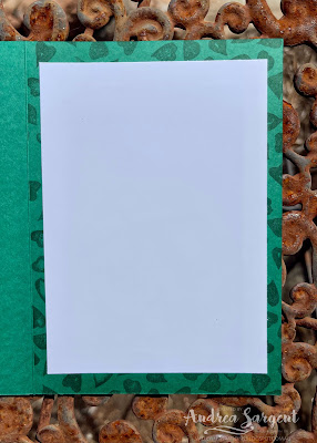
A piece of Basic White card-stock was adhered into the inner card base that had been similarly stamped with the little leaves.  The back flap of a Basic White C6 Envelope was stamped with the tiny leaves stamp in Shaded Spruce ink. As those who follow my cards know, I love to coordinate the envelope with the card inner, with both coordinating with the card front design.

Show how much you care with a simple white palm frond over water-colour.


CARD 2:

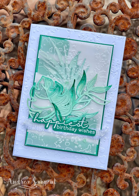
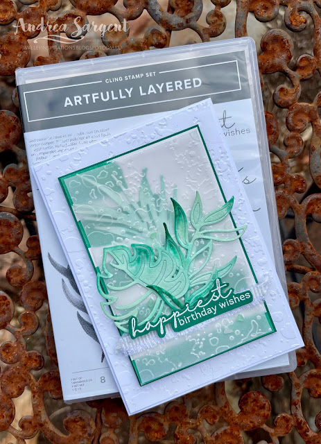
This second card features more water-coloured Shaded Spruce including Water-coloured stripes and die cut leaves coloured with Pool Party, Mint Macaron and touches of Shaded Spruce.

Send happiest birthday wishes to a special friend.

A piece of Shimmery White card-stock was painted with Shaded Spruce ink in stripes using the largest wide-brush Water Painter. The trimmed down striped panel was mounted on a slightly larger piece of Shaded Spruce card-stock. Three different leaf dies from the Tropical Layers die set were used to cut leaves from a piece of Fluid 100 Watercolor paper. As was mentioned, the leaves were water-coloured with Pool Party, Mint Macaron and Shaded Spruce Classic inks.

Send happiest birthday wishes to a special friend.

A piece of Basic White card-stock was embossed with the Splatters Embossing Folder from the 3D Stripes & Splatters Embossing Folders. A piece of Vellum card-stock was similarly embossed. The water-coloured Palm leaf was added onto the striped panel and the embossed Vellum adhered over. The other 2 water-coloured leaves were adhered in place and a piece of White Frayed ribbon was cut in half lengthwise and further frayed before being adhered directly to the Vellum.

Send happiest birthday wishes to a special friend.

A sentiment from the Artfully Layered stamp set was White heat embossed on Shaded Spruce card-stock, fussy cut and added with Mini Dimensionals over the White Frayed ribbon. Faux Sea Glass Shapes were sprinkled around for that touch of very subtle bling.

Send happiest birthday wishes to a special friend.

The Basic White card inner had a thin strip of stripes adhered to the LHS together with a die cut Basic White sprig of leaves.  A Basic White C6 Envelope was stamped with a leaf from the same stamp set in Shaded Spruce.

Send happiest birthday wishes to a special friend.


Thank you so much for dropping by. I do value the time you spent with me.

If you live in Australia, don't already have a Stampin' Up! demonstrator and would like your own copy of Stampin' Up's 2021-2022 Annual Catalogue or the coming 2022-2023 Annual Catalogue and or the January - June 2022 Mini Catalogue then let me know and I will be delighted to send them to you.  Please don't hesitate to make contact with any other queries about these projects or Stampin' Up!. 

There is more Shaded Spruce creativity. To continue with the blog hop, click on the "next" graphic below to be taken to the blog of the lovely, Tina Gellespi. I always look forward to checking out Tina's creation (I wonder what she has in store this week - she is amazing). I do love seeing everyones' projects - always so many ideas.

Hope to see you next week when we will be featuring another versatile colour, Smoky Slate, as we continue the weekly 2021-2022 Colour Creations blog hops.

Stay well, stay safe and be kind to yourself and others. 

Andrea 💕🐾

If you find a broken link or have come to this blog hop from a different entry point, you can view the full list of participants on Catherine Proctor’s blog, our wonderful Art With Heart Team Colour Creations Coordinator.  I so appreciate all Cathy does in coordinating this blog hop each week. She is such a special lady. Check out her wonderful creation while you are there.

#colourcreationsbloghop  #colourcreationsbloghop2022  #stampinup #stampinupdemo  #artwithheartteam  #handmadecards #makeacardsendacard #artfullylayered #stampinupdemonstrator


Wednesday 23 March 2022

AWHT Colour Creations #41 Sahara Sand

Sahara Sand with Waves of Inspiration and Artfully Layered

Hello. Welcome to Valley Inspirations with Andrea and the Art with Heart Colour Creations Blog Hop. We are continuing to work though all the Stampin' Up! colours in alphabetical order. 


This week’s Blog Hop is focussing on a soft faun called Sahara Sand. Sahara Sand is part of the Neutrals Colour Family and is a lovely sandy colour. It is another versatile Stampin' Up! colour. As with most neutrals, this colour is delightful when used with so many colours. I have combined it with sea colours, White and Early Expresso and it also works well with Petal Pink, Calypso Coral and White.  


Sahara Sand is produced in Stampin' Up!'s card-stock, both A4 & 12"x12"Classic Stampin' inks (ink pads re-inkers); Stampin' Write Markers; Neutrals Designer Series Papers as well as the Tidings of Christmas DSP. The cards below have used Sahara Sand Classic Stampin' ink, Card-stock, a Stampin' Write Marker and Linen Twine (which is the same colour), plus a range of other non-PP bits and pieces.

I have created 2 cards to showcase Sahara Sand in different ways. Here they are:


As you can see, Sahara Sand is a great colour to use. 

CARD 1:

This card features part of the Waves of Inspiration bundle which is an exciting early release from the coming 2022-2023 Annual Catalogue


A half piece of Fluid 100 Watercolor Paper was water-coloured with a range of colours indicative of sand, sea and sky. The colours used included Sahara Sand, Crumb Cake, Pool Party, Coastal Cabana and Balmy Blue Classic Stampin' inks, as well as a touch of White Craft ink to represent sea foam. This was die cut with a mid-sized Stitched Rectangle die and mounted on a slightly larger piece of Sahara Sand card-stock.


The background was created with a piece of Basic White card-stock that was mounted on a slightly larger piece of Sahara Sand card-stock. A number of die cut waves cut out of Basic White card-stock with the coordinating Waves dies were adhered directly to the Basic White layer. Linen Twine was wrapped around this background layer and tied in a bow to the side.


The pelican sitting on a wooden pole was stamped twice on Basic White card-stock with Sahara Sand ink and fussy cut. Seagulls were stamped directly on the water-colour panel. The clouds and shading pieces were cut from Basic White card-stock.


The card front was finished with a sentiment from the same stamp set that was White heat embossed on Sahara Sand card-stockClear Polished Dots added a little shimmer, together with a little Wink of Stella. It is disappointing that the Wink of Stella shimmer isn't picked up by the camera.


The Basic White card inner also was mounted on a piece of Sahara Sand card-stock. The white panel had been stamped with the pelican sitting on a pole. Similarly, a Basic White C6 Envelope was stamped with the pelican on a pole image in Sahara Sand ink


CARD 2:

This second card features Sahara Sand with White and a touch of Early Expresso. I started with the aim of a clean and simple card but couldn't resist the addition of vellum and ribbon and twine. 


I had a Thick Basic White card base sitting on my desk - it's different dimensions than I normally use, but couldn't remember why I first prepared it so thought I would use it for this card. It will fit within a standard C6 envelope.


The focal panel was cut from a piece of Sahara Sand card-stock with a mid-sized Stitched Rectangle die (though a smaller one than used in the card above). It was embossed with the splatters design from the Stripes and Splatters 3D Embossing Folder. I love this set of EFs. Some White Craft ink splatters were added using a Water Painter.


One of the leaf dies from the Tropical Layers dies cut 3 images of the same design from Basic White card-stock. The 3 pieces were adhered together to give the leaves some dimension. After it was adhered across the centre of the panel a piece of Linen Twine was wrapped around twice and tied in a bow to the side.


A sentiment from the Artfully Layered stamp set was White heat embossed on Early Expresso  card-stock, fussy cut and "Hey" was added with Mini Dimensionals. The sentiment was stamped again in Early Expresso ink on Sahara Sand card-stock and "there" was fussy cut and added with Mini Dimensionals. A few Clear Round Dots were added for that touch of bling. 


Some Layering Designs Vellum was added to the card base (I felt it just needed something). A piece of White Frayed Ribbon was cut in half and frayed a little more before being added over the Vellum. The centre panel was popped in the centre with Dimensionals.


The Basic White card inner had some stamping in Sahara Sand and a thin strip of Layering Designs Vellum was added near the bottom.  Similarly, a Basic White C6 Envelope also had some Sahara Sand stamping added across the back flap.


Thank you so much for dropping by. I do value the time you spent with me.

If you live in Australia, don't already have a Stampin' Up! demonstrator and would like your own copy of Stampin' Up's 2021-2022 Annual Catalogue or the coming 2022-2023 Annual Catalogue; and or the January - June 2022 Mini Catalogue Catalogue then let me know and I will be delighted to send them to you.  Please don't hesitate to make contact with any other queries about these projects or Stampin' Up!. 

There is more Sahara Sand creativity. To continue with the blog hop, click on the "next" graphic below to be taken to the blog of the lovely, Kate Morgan. I always look forward to checking out Kate’s creations (I wonder what she has in store this week). I do love seeing everyones' projects - so many ideas and such great inspiration.

Hope to see you next week when we will be featuring another colour starting with "S" - Shaded Spruce, as we continue the weekly 2021-2022 Colour Creations blog hops.

Stay well, stay safe and be kind to yourself and others. 

Andrea 💕🐾

If you find a broken link or have come to this blog hop from a different entry point, you can view the full list of participants on Catherine Proctor’s blog, our wonderful Art With Heart Team Colour Creations Coordinator.  Cathy is amazing and does a wonderful job in coordinating this blog hop each week. She is a special lady. Check out her wonderful creation while you are there.

#colourcreationsbloghop  #colourcreationsbloghop2022  #stampinup #stampinupdemo  #stampinupdemonstrator  #artwithheartteam  #handmadecards  #makeacardsendacard #papercrafting #wavesofinspiration #artfullylayered


Wednesday 16 March 2022

AWHT Colour Creations #40 Rich Razzleberry

Rich Razzleberry with Pansy Patch 

Hello. Welcome to Valley Inspirations with Andrea and the Art with Heart Colour Creations Blog Hop. We are continuing to work though all the Stampin' Up! colours in alphabetical order. Having started mid 2021 we are finishing colours starting with "R". 


This week’s Blog Hop is focussing on a deep red with a touch of purple called Rich Razzleberry. Rich Razzleberry is part of the Regals Colour Family and is a delightful colour. While playing with it for this blog hop I have wondered why I don't use it more. Rich Razzlebury is lovely with Highland Heather and Smoky Slate and as seen in various pansies it is lovely with a bright yellow, eg Daffodil Delight. 


Rich Razzleberry is produced in Stampin' Up!'s card-stock, both A4 & 12"x12"Classic Stampin' inks (ink pads re-inkers); Stampin' Write Markers; Watercolor Pencils; Regals and Flowering Fields Designer Series Papers and Artistry Blooms Adhesive-Backed Sequins. The cards below have used Rich Razzleberry Classic Stampin' ink, Card-stock, Flowering Fields DSP and the Razzlebury Artistry Blooms Adhesive-backed Sequins, plus a range of other non-PP bits and pieces.

I have created 2 cards showcasing Rich Razzleberry with water-colour:


Isn't Rich Razzleberry a great colour. Both cards show the beauty of Rich Razzlebury using the wet on wet water-colour technique.


CARD 1:

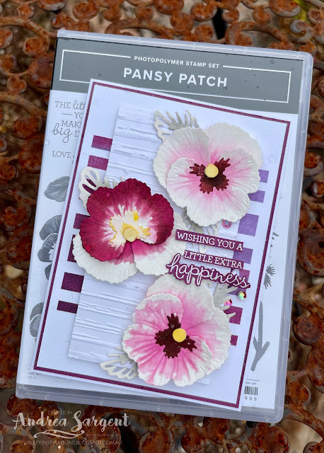
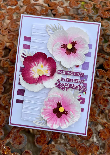
Water-coloured pansies are delightful when wanting to send a note or tell someone you are thinking of them.

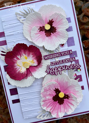
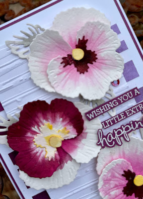
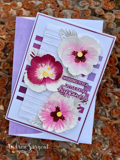
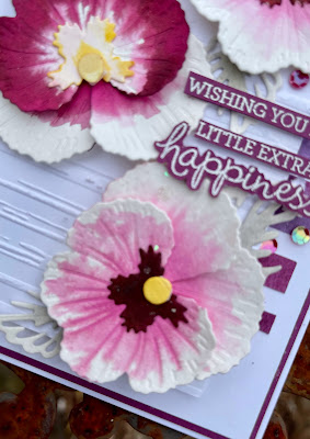
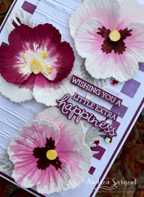
Pansy pieces from the Pansy dies were cut from Fluid 100 Watercolor Paper. Having researched pansy colours - checking a friend's pansies and a number of photographs, I then played with a mid-sized Water Painter and some Rich Razzlebury ink using the wet on wet water-colour technique. The flower centres were coloured with Daffodil Delight Classic ink and the leaf die cuts with Smoky Slate ink.

Water-coloured pansies are delightful when wanting to send a note or tell someone you are thinking of them.

Basic White and Rich Razzlebury card-stocks were mounted on a Thick Basic White card-base. A piece of Flowering Fields Designer Series Paper (the piece that looks like water-coloured Rich Razzlebury and Highland Heather) was randomly trimmed into strips and then adhered to the white card front layer.

Water-coloured pansies are delightful when wanting to send a note or tell someone you are thinking of them.

Another piece of Basic White card-stock was embossed with the Stripe embossing folder from the Stripes and Splatters 3D Embossing Folders.

Water-coloured pansies are delightful when wanting to send a note or tell someone you are thinking of them.

The water-coloured pansy pieces were adhered together to form the pansies. I so love the way the wet colour channelled along the embossed pansy veins.

Water-coloured pansies are delightful when wanting to send a note or tell someone you are thinking of them.

The pansies were positioned in place and a number of Smoky Slate water-coloured leaves were tucked under the pansies. The leaf die used is actually a part leaf die to be used on top of a open leaf die. I chose this die to help the leaves stay in the background.

Water-coloured pansies are delightful when wanting to send a note or tell someone you are thinking of them.

The card front was finished with a sentiment from the same stamp set, Pansy Patch, that had been White heat embossed on Rich Razzlebury card-stock and fussy cut into pieces. The first 3 lines of the sentiment were added individually with Mini DimensionalsSome Artistry Blooms Adhesive-Backed Sequins added a little shimmer, together with a sprinkling of Wink of Stella. I did try hard to add ribbon or trim but it didn't add anything so I decided to let the pansies shine.


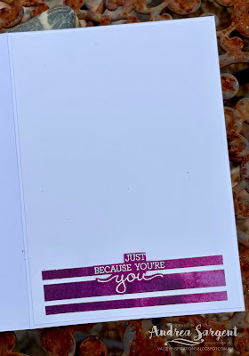
The Basic White card inner was decorated with some extra Flowering Fields DSP strips and the 2nd half of the heat embossed sentiment. Some of the same DSP was adhered to the Basic White C6 Envelope flap to tie it in with the card. 

Water-coloured pansies are delightful when wanting to send a note or tell someone you are thinking of them.

I so love the effect of water-colouring with Rich Razzlebury Classic ink on the pansy die cut pieces. How about you?


CARD 2:

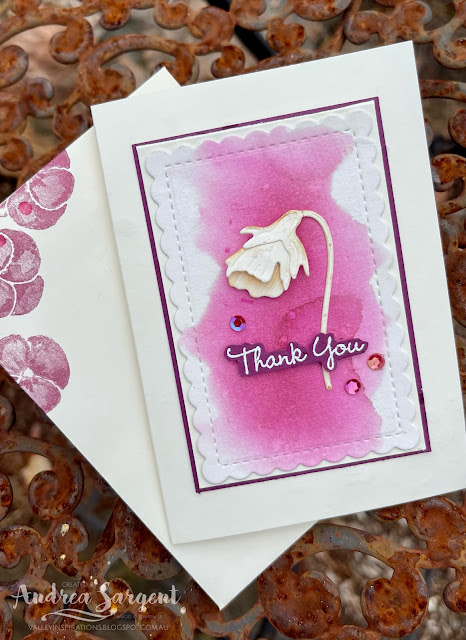
With the second card,  I thought I would challenge myself and try to create a more minimalist card. I recently saw this challenge on one of the Facebook/Blog Challenges that I follow and thought it was time to challenge myself to create some clean and simpler cards. This was my first try. I know, the centre panel has been double mounted - read below to find out why...

Water-coloured pansies are delightful when wanting to send a note or tell someone you are thinking of them.

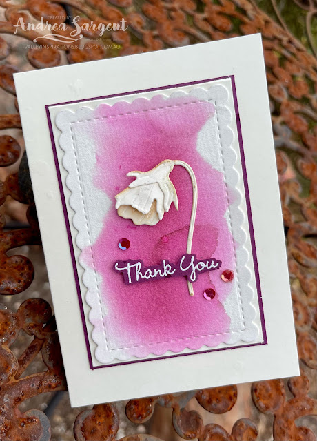
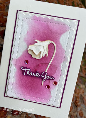
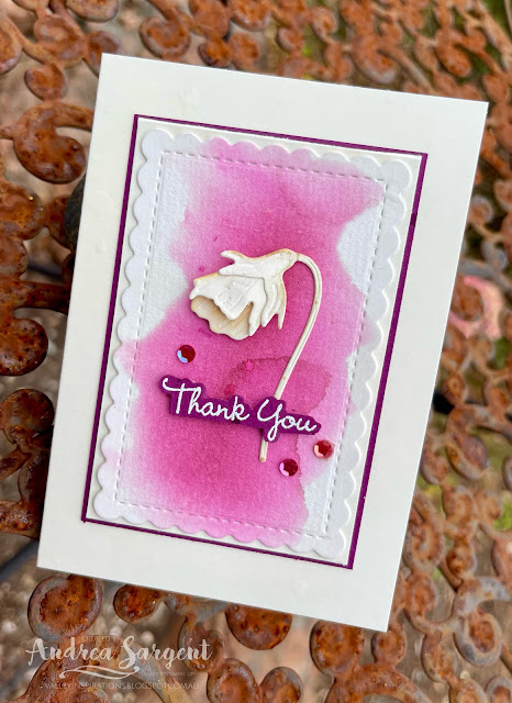
Some Rich Razzlebury Classic ink was wet on wet water-coloured on a piece of Fluid 100 Watercolor Paper. It was cut with a mid-sized die from the Scalloped Contour dies

Water-coloured pansies are delightful when wanting to send a note or tell someone you are thinking of them.

The 3 bud dies from the Pansy dies were used to cut Very Vanilla card-stock. The bud was formed and adhered on the water-coloured panel. 

Water-coloured pansies are delightful when wanting to send a note or tell someone you are thinking of them.

A sentiment from the same stamp set was White heat embossed on Rich Razzlebury card-stock, fussy cut and added with Mini DimensionalsA few Artistry Blooms Adhesive-Backed Sequins were sprinkled around for that touch of bling. 
Water-coloured pansies are delightful when wanting to send a note or tell someone you are thinking of them.

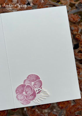
This front panel was adhered directly to a Very Vanilla Notecard. You may be thinking " but that's not what is pictured". Quite right - that's because the front panel was accidentally adhered slightly askew. I found it annoying but kept going and stamped some pansies inside the notecard. A couple didn't stamp well so I decided to cut off the card front; trim it down slightly and adhere it to a new card front. HOWEVER, it was one of those days when I couldn't cut straight; so I trimmed ... and trimmed ... and trimmed ... Eventually, it seemed straight but by then it was quite close to the scallops. In frustration with myself, I decided to mount it onto a slightly larger piece of Rich Razzlebury card-stock and adhere this to the card front. I know, it isn't quite so minimalist now.
Water-coloured pansies are delightful when wanting to send a note or tell someone you are thinking of them.

A couple of fussy cut stamped pansies (cut from the original inner stamping) and a small die cut leaf were adhered to the Very Vanilla card inner.  A few pansies were stamped onto the front of the coordinating Very Vanilla Notecard Envelope.

Water-coloured pansies are delightful when wanting to send a note or tell someone you are thinking of them.


Thank you so much for dropping by. I do value the time you spent with me.

If you live in Australia, don't already have a Stampin' Up! demonstrator and would like your own copy of Stampin' Up's 2021-2022 Annual Catalogue and or the new January - June 2022 Mini Catalogue then let me know and I will be delighted to send them to you.  Please don't hesitate to make contact with any other queries about these projects or Stampin' Up!. 

There is more Rich Razzleberry creativity. To continue with the blog hop, click on the "next" graphic below to be taken to the blog of the lovely, Diane Furniss. I always look forward to checking out Diane's creation (I wonder what she has in store this week). I do love seeing everyones' projects - so many ideas and such great inspiration.

Hope to see you next week when we will be featuring an extremely versatile colour Sahara Sand as we continue the weekly 2021-2022 Colour Creations blog hops.

Stay well, stay safe and be kind to yourself and others. 

Andrea 💕🐾

If you find a broken link or have come to this blog hop from a different entry point, you can view the full list of participants on Catherine Proctor’s blog, our wonderful Art With Heart Team Colour Creations Coordinator.  I so appreciate all Cathy does in coordinating this blog hop each week. She is such a special lady. Check out her wonderful creation while you are there.

#colourcreationsbloghop  #colourcreationsbloghop2022  #stampinup #stampinupdemo  #artwithheartteam  #handmadecards #makeacardsendacard #pansypatch


Wednesday 9 March 2022

AWHT Colour Creations #39 Real Red

Real Red with Flowering Tulips 

Hello. Welcome to Valley Inspirations with Andrea and the Art with Heart Colour Creations Blog Hop. We are continuing to work though all the Stampin' Up! colours in alphabetical order. Having started mid 2021 this blog hop features the a colour starting with "R". 


This week’s Blog Hop is focussing on a a bright red called Real Red. Real Red is part of the Regals Colour Family and is pretty close to a pure Red. It is a great Stampin' Up! colour although its not a colour I tend to reach for unless I'm preparing for Christmas or thinking of using a rainbow of colours. Real Red is dramatic when used with Basic Black and Basic White. And it goes well with a range of neutrals as well as with its complementary colour, green. I have used Real Red and Garden Green & Granny Apple Green with Smoky Slate and gold in this project.


Real Red is produced in Stampin' Up!'s card-stock, both A4 & 12"x12"Classic Stampin' inks (ink pads re-inkers); Stampin' Write Markers; Stampin' Blends, Water-colour Pencils,   Regals Designer Series Papers as well as Sweet Talk Designer Series Paper & Red Rhinestone Basic Jewels, From My Heart Faceted Gems, Sequins for Everything, Faux Linen Ribbon, Stitched Satin Ribbon, Mini Ruffles Trim, Playful Pets Trim Combo and the Christmas Whimsy Card Kit. The card below has used Real Red Classic Stampin' ink, a Stampin' Write Marker, plus a range of other non-RR bits and pieces.

Here is my card:


I love playing with water-colour and Real Red. The tulip flowers were only coloured using Real Red Classic Stampin' ink and water. Isn't the colour range gorgeous.

CARD 1:

I had been trying hard to resist the Flowering Tulips Bundle as I had already purchased the gorgeous Daffodil Daydream bundle. Even though I had decided to only have either the Daffodil Daydream bundle Or the Flowering Tulips bundle, I was convinced on how wonderful the tulips were thanks to a friend and colleague. I'm so glad I weakened and purchased the tulips. They are delightful. I love the dimension you can achieve.

Say Thank you with a personally created Flowering Tulips card.

Using off cuts of Fluid 100 Watercolor Paper that were just wide enough for the Tulip dies to fit, water was laid down and drops of Real Red ink was added. Some were to be really light and so became light pink, and there was areas of vanilla with patches of pink - so, so beautiful. Another off-cut became deeper red and an extra  piece became a bit lighter. A couple of off cuts were also coloured with Garden Green and Granny Apple Green for the leaves and stems

Here is the photo that inspired my colouring:


Tulip dies, in their various combinations, die cut the water-coloured paper and the flowers were assembled with a mix of Glue Dots & Mini Dimensionals. I so enjoyed water-colouring paper for the tulips and leaves.

Say Thank you with a personally created Flowering Tulips card.

A Basic White card front was lightly stamped in Smoky Slate ink with a little background stamp - stamping in the top left and bottom right. Then this panel was embossed with the Hive 3D Embossing Folder and a strip of the Crane of Fortune Speciality Designer Series Paper - ie a design using Smoky Slate, White and touches of Gold - was adhered across the centre. 

Say Thank you with a personally created Flowering Tulips card.

The second largest scolloped rectangle from the Scalloped Contour dies was used to cut a Basic White panel. Three tulips were arranged on the panel together with stems and leaves. I must admit that I had planned to sit the flower heads higher on the white panel and the leaves were to be arranged a little differently - I must have been in some form of daze, thinking of something else when I adhered the pieces in place. I'm only noticing it as I write the blog. Hmm, the mind has unknown depths. Some Gold Simply Elegant Trim was wrapped around the panel twice and adhered to the back, with a bow to be added later once the sentiment was in place.

Say Thank you with a personally created Flowering Tulips card.

The card front was finished with a sentiment from the same stamp set that was Gold heat embossed on Basic White card-stock, Gold Stampin' Emboss Powder and a Heat Gun. The "Thank you" was fussy cut and adhered with Mini Dimensionals. A few Brushed Brass Butterflies and Iridescent Rhinestone Basic Jewels were scattered around. I have just realised that I forgot to add the bow of Simply Elegant Trim over the wrapped trim and near the sentiment. Oops!!!  How embarrassing - it's too late to rephotograph as the light has changed outside. Check back tomorrow for the updated photos. No wonder I thought it was missing something, so I added some Real Red Splattering with a Real Red Stampin' Write Marker.

Say Thank you with a personally created Flowering Tulips card.

The card inner is a piece of Basic White card-stock with a couple of thin strips of the Symbols of Fortune Speciality Designer Series Paper and a half circle of the words "You are so thoughtful" from the same sentiment that "Thank You" had came from. The flap of a Basic White C6 Envelope was decorated with the same design of the Symbols of Fortune SDSP. A simple but effective way to decorate an envelope.

Say Thank you with a personally created Flowering Tulips card.

I had such fun water-colouring and creating the tulips for this card. I hope it's given you some ideas to mull over.

Thank you so much for dropping by. I appreciate the time you spent with me.
If you live in Australia, don't already have a Stampin' Up! demonstrator and would like your own copy of Stampin' Up's 2021-2022 Annual Catalogue and or the new January - June 2022 Mini Catalogue & Saleabration Catalogue then let me know and I will be delighted to send them to you.  There is only a short time of Sale-a-brations remaining as it finished on 16th March. Also, please don't hesitate to make contact with any other queries about this project or Stampin' Up!. 
There is more Real Red creativity. To continue with the blog hop, click on the "next" graphic below to be taken to the blog of the lovely, Kate Morgan. I always look forward to checking out Kate's creation (I wonder what she has in store this week). I do love seeing everyones' projects - so many ideas and such great inspiration.

Hope to see you next week when we will be featuring another versatile colour Rich Razzleberry as we continue the weekly 2021-2022 Colour Creations blog hops.

Stay well, stay safe and be kind to yourself and others. 

Andrea 💕🐾

If you find a broken link or have come to this blog hop from a different entry point, you can view the full list of participants on Catherine Proctor’s blog, our wonderful Art With Heart Team Colour Creations Coordinator.  I so appreciate all Cathy does in coordinating this blog hop each week. She is such a special lady. Check out her wonderful creation while you are there.

#colourcreationsbloghop  #colourcreationsbloghop2022  #stampinup #stampinupdemo  #artwithheartteam  #handmadecards #makeacardsendacard #floweringtulips #stampinupaustralia


AWH Colour Creations Blog Hop #50 Tahitian Tide

Tahitian Tide with Sweet Songbirds and Seaside Bay Hello. Welcome to  Valley Inspirations with Andrea  and the  Art with Heart Colour Creati...