Art with Heart Wow Tutorials

Showing posts with label Around the Bend. Show all posts

Wednesday, 21 February 2024

AWH Colour Creations Blog Hop #41 Poppy Parade

Poppy Parade with Around the Bend

Hello. Welcome to Valley Inspirations with Andrea and the Art with Heart Colour Creations Blog Hop. We are working though the Stampin' Up! colours in alphabetical order, focussing on one colour each week.


This week’s Blog Hop is focussing on a bright orange red called Poppy Parade. Poppy Parade is part of the Brights Colour Family and is a bright red that can coordinate strikingly with black & white’ or more softly with Petal Pink or Calypso Coral. This colour is lovely for flowers - consider its name sake - poppies.


Poppy Parade is produced in Stampin' Up!'s card-stock, both A4 & 12"x12"Classic Stampin' inks (ink pads re-inkers); Stampin' Write Marker; Stampin’ Blends Combo; Soft Pastels; Brights Designer Series Paper as well as the Trusty Toolbox, Just Kiddin’ & Sunny Days DSPs; the Saying Thanks Kit, Panda Friends Kit & Confetti Birthday Kit; plus Iridescent Adhesive-backed Discs. 

Poppy Parade ink, card stock, Stampin’ Write Marker and 2 designs from the Sunny Days DSP plus some Iridescent Adhesive Backed Discs have been used in the creation of this project plus a range of non-Poppy Parade bits and pieces.


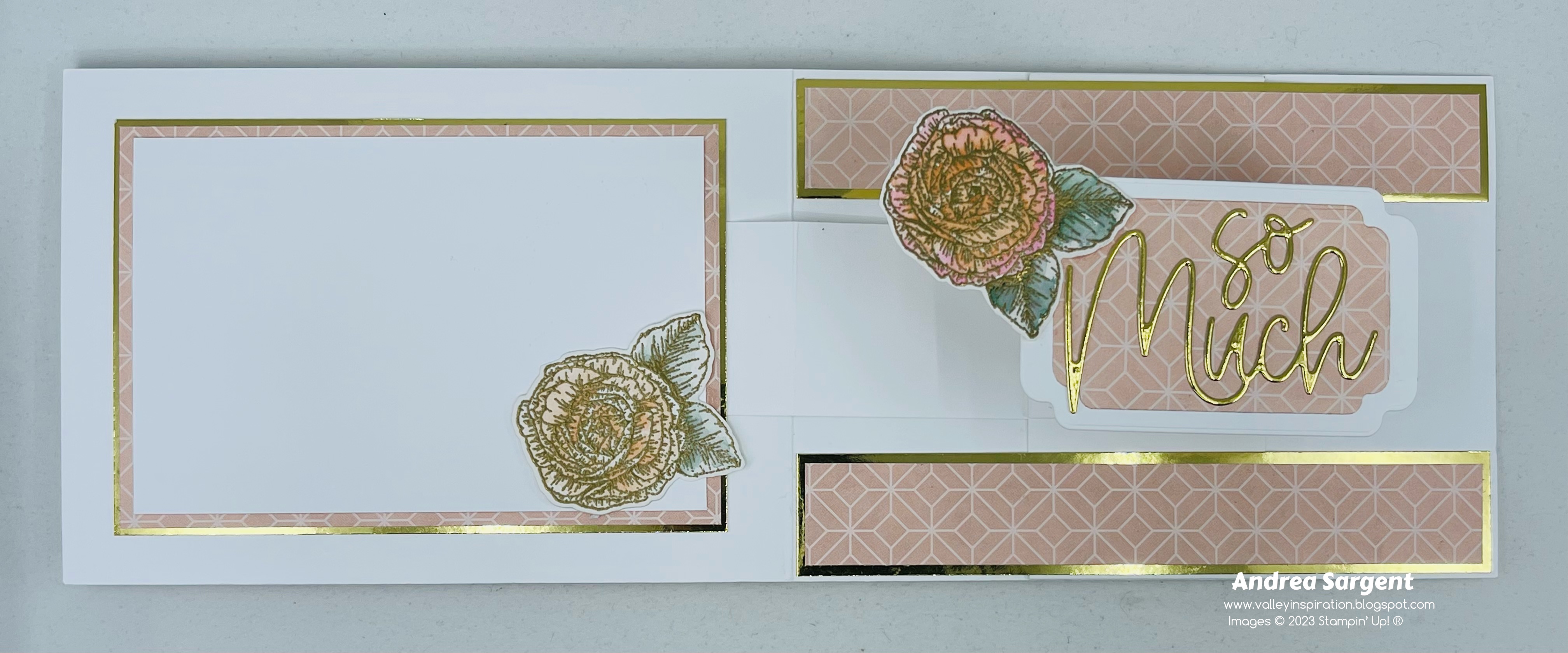
I created a fancy fold card that folds in from each side and has an added folded central DSP panel to combine with the Around the Bend bundle from the Annual Catalogue. The sentiments came from an Online Exclusive stamp set called Comforting Thoughts. This set will be wonderful for folk who are not well or needing comfort and support. As you can see in the following photos, 3 sentiments have been used and will be seen as the card is opened.


I played with the new breyer to unevenly colour the left side front panel using Basic White card-stock with Petal Pink and Poppy Parade inks and then misted the coloured area to soften the uneven-ness. Other pieces of Basic White card-stock were coloured with individual colours, ie Poppy Parade, Petal Pink or Old Olive inks. Once they had dried from the misting flowers were die cut from both Petal Pink and Poppy Parade. A series of leaves were cut from the Old Olive coloured panel. The flowers and leaves were all adhered with touches of Multipurpose Liquid Glue. Both Poppy Parade and white Iridescent Adhesive Backed Discs were added to the centre of the little flowers. Their beautiful shimmer hasn’t been picked up by the camera.


You may notice that I have less photos and process description this week. Both scheduled and out of the blue commitments and urgent family requirements seemed to explode to take up so much time and energy leaving very little creativity and preparation time.

As you can see the central panel was created in such a way to show both sides of the delightful Saleabration DSP. The Petal Pink grid sits well beneath the curved die cut leaves and then when the central panel is lifted to reveal the beautiful Poppy Parade floral design.


A panel for writing a personal message was adhered inside the lower section of the central panel. It is simply a Basic White panel stamped with another Comforting Thoughts sentiment in Poppy Parade ink.  A Basic White C6 envelope was stamped in Poppy Parade ink a couple of times with the corner leafy design from the Around the Bend stamps.


Thank you so much for dropping by on you way around the 41st Colour Creations Blog Hop for 2023-2024.  I am sure there will still be so much Poppy Parade inspiration. Don’t miss it.


To continue with the Poppy Parade blog hop just click the "next" graphic below to be taken to the blog of a lovely lady, Di FurnissI am looking forward to checking out Di’s creation(s). I wonder if she also will have a fun fold card??? I do love seeing everyone’s' projects - there is always so much inspiration.

I do hope to see you next week when we will be featuring Pretty Peacock as we move through the weekly 2023-2024 Colour Creations Blog Hop series

Stay well, stay safe and be kind to yourself and others.

Andrea 💕🐾

If you find a broken link or would like to view the full list of participants go to Catherine Proctor’s blog @ What Cathy Made. Cathy is our brilliant Art With Heart Team Colour Creations Coordinator.  She is a wonderful lady. Check out her delightful creation while you are there.

If you live in Australia, don't already have a Stampin' Up! demonstrator and would like your own copy of the Stampin' Up 2023-2024 Annual Catalogue and or the January-April 2024 Mini Catalogue & Saleabration Brochure, then let me know and I will be delighted to send them to you.  Please don't hesitate to make contact with any other queries about this project or Stampin' Up!. 


#colourcreationsbloghop  #stampinup #stampinupaustralia #stampinupsouthpacific #stampinupdemo  #handmadecards #makeacardsendacard #stampinupdemonstrator #papercrafting #artwithheartteam  #papercrafter  #valleyinspirations   #aroundthebend  #comfortingthoughts

Wednesday, 31 May 2023

AWH Colour Creations Blog Hop #5 Wild Wheat

Wild Wheat with Timeless Arrangements


Hello. Welcome to Valley Inspirations with Andrea and the Art with Heart Colour Creations Blog Hop. We are working though the Stampin' Up! colours in alphabetical order, focussing on one colour each week. First, we are showcasing the new colours, including the new 2023-2025 In Colours.


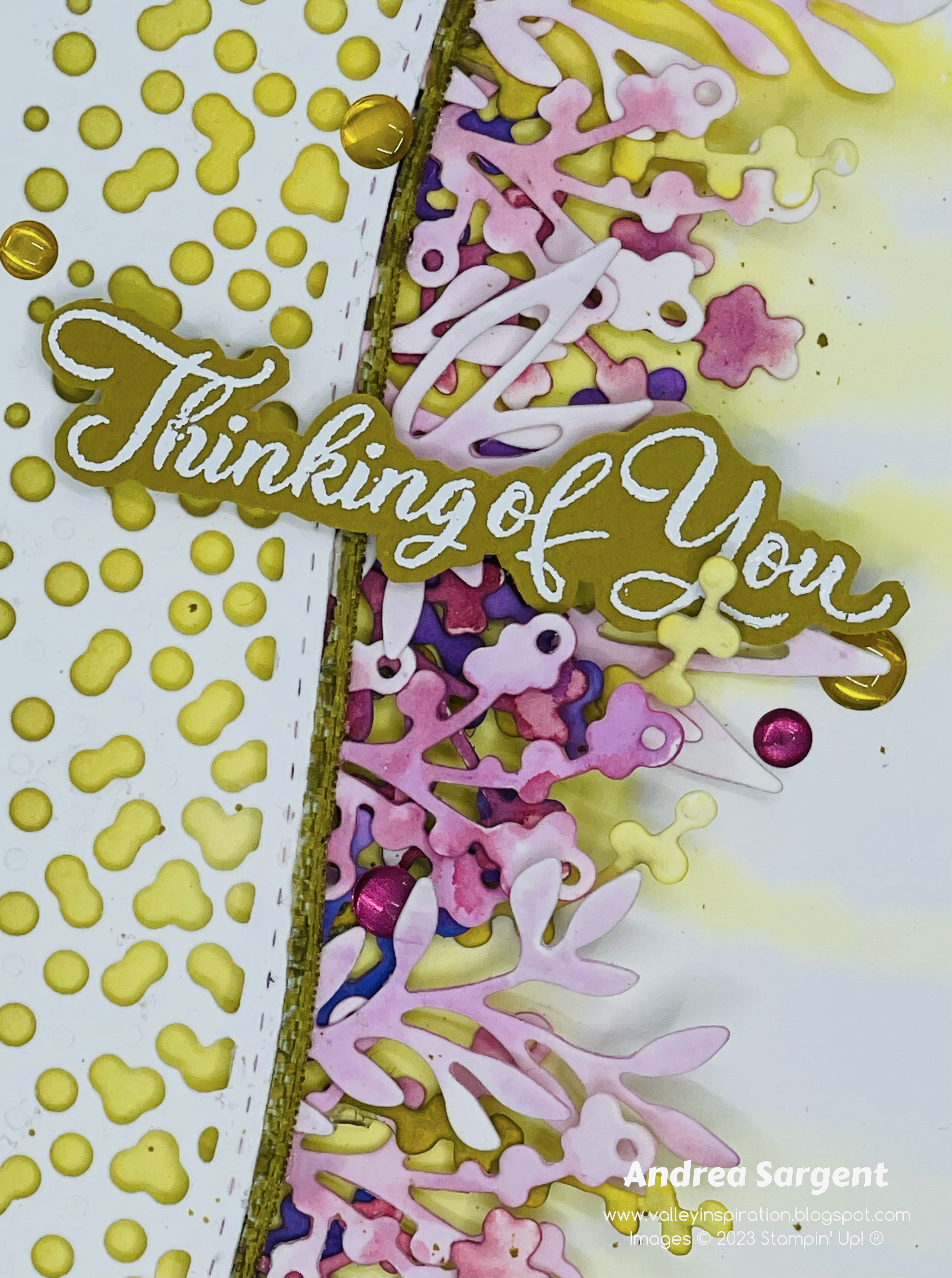
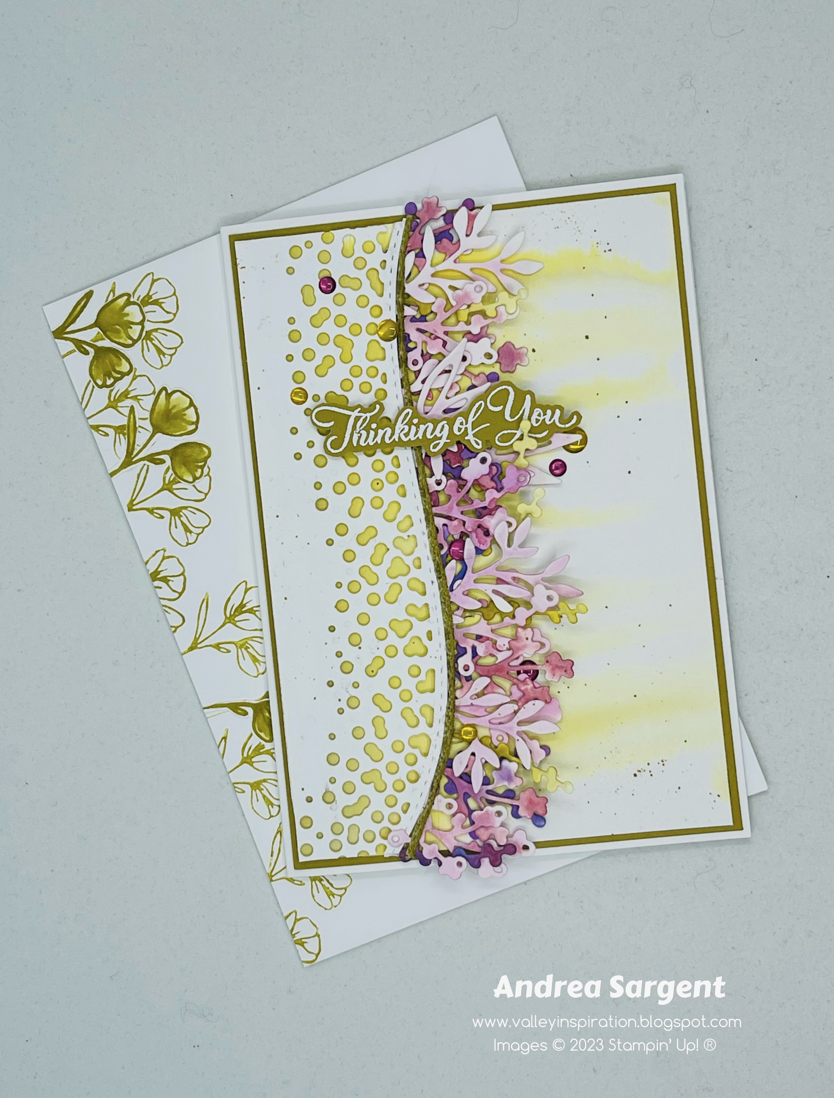
This week’s Blog Hop is focussing on a muted mustard colour called Wild Wheat. Wild Wheat is part of the new 2023-2025 In Colour Family and is an interesting colour. This colour would be lovely when used for grasses, autumn leaves, muted flowers and I also see the colour in tree lichen. I’m still exploring coordinating colours but I think it works well with complementary colours, eg mauves/purples (as used in the card below) and earthy tones as used last week.


Wild Wheat is produced in Stampin' Up!'s card-stock, both A4 & 12"x12"Classic Stampin' inks (ink pads re-inkers); Stampin' Write Marker; Stampin' Blends Combo; In Color Designer Series Paper as well as Fresh As A Daisy, Let’s Go Fishing DSPs; plus In Color Luster Speciality Paper & Treat Bags, In Color Textured Ribbon & Jute Trim; and In Color Dots.

Personally create a water-coloured card to let a special person know you are thinking of them.

Wild Wheat card-stock, ink, In Color Textured Ribbon
 and In Color Dots have been used in creating this project plus a range of non-Wild Wheat bits and pieces.

Personally create a water-coloured card to let a special person know you are thinking of them.

I loved Wild Wheat as part of last week’s card were I stamped feathery grasses in this ink. However, I struggled a little to showcase Wild Wheat this week. As I love to do, I started by creating a water-coloured background with Wild Wheat Classic Stampin’ ink using the wet on wet water-colour technique and the large flat Water Painter. I added ink to one of the long sides of a piece of Fluid 100 Watercolor paper and encouraged it to drip down to the other side of the panel. I love the drip effect. Later, it was layered on a Wild Wheat card-stock panel and then onto a Thick Basic White card base.

Personally create a water-coloured card to let a special person know you are thinking of them.

But how would I use the water-coloured background panel??? I decided to add a die cut panel of Basic White card-stock that had been cut with the long Around the Bend holy die. That way I could show some of the solid coloured light Wild Wheat section of the water-coloured panel as well as the drippy section. This decision did make a later step more difficult but more on that later on. I was also wanting to work with my new Timeless Arrangements dies, so I used the range of leafy dies to cut multiple pieces from Fluid 100 Watercolor Paper. They were coloured with Fresh Freesia, Moody Mauve, Highland Heather and a little Orchard Oasis. A few long thin pieces were coloured with Wild Wheat ink.

Personally create a water-coloured card to let a special person know you are thinking of them.

When all the water-coloured pieces were dry, the rectangular base section of the leaves were each cut in half so the base wouldn’t show through the holes once they were adhered. Pieces were layered lighter to darker with the bases being bent to match the curve of the top panel. Multi-purpose Liquid Glue adhered all the pieces in place. As there were 5 layers of card-stock adhering the leaves in place, I layered scrap pieces of card-stock to the other side of the top panel to give even dimension.

Personally create a water-coloured card to let a special person know you are thinking of them.

As I wasn’t happy with the way the card was looking I tried this and that and something else. After much trial and error, I added a thin strip of the Wild Wheat Textured Ribbon along the curved edge. A sentiment from the Go To Greetings stamp set was white heat embossed on Wild Wheat card-stock, using Versamark ink, White Emboss Powder and a Heat Tool. A mix of Wild Wheat & Moody Mauve In Color Dots finished the card front.

Personally create a water-coloured card to let a special person know you are thinking of them.

The card inner was created with a panel of Basic White card-stock mounted on a slightly larger piece of Wild Wheat. A thin strip of left over water-coloured paper was added with a few single water-coloured leaves. A C6 Basic White envelope was second generation stamped in Wild Wheat ink with the little flower from the Timeless Arrangements stamps. A few pre-cut water-coloured flowers were layered over the stamping.

Personally create a water-coloured card to let a special person know you are thinking of them.

Thanks so much for dropping in.

Personally create a water-coloured card to let a special person know you are thinking of them.

There is more Wild Wheat creativity to see so do continue with the blog hop. Just click the "next" graphic below to be taken to the blog of the lovely Sharon Davern. I am looking forward to checking out Sharon’s creation(s). I do love seeing everyones' projects - there is always so much inspiration.

I hope to see you next week when we will be featuring Azure Afternoona new colour included in the Brights Family of the core colours, as we continue the weekly 2023-2024 Colour Creations Blog Hop series

Stay well, stay safe and be kind to yourself and others.

Andrea 💕🐾

If you find a broken link or would like to view the full list of participants go to Catherine Proctor’s blog @ What Cathy Made. Cathy is the very special Art With Heart Team Colour Creations Coordinator.  She is a wonderful lady. Check out her delightful creation while you are there.

If you live in Australia, don't already have a Stampin' Up! demonstrator and would like your own copy of the new Stampin' Up 2023-2024 Annual Catalogue, then let me know and I will be delighted to send it to you.  Please don't hesitate to make contact with any other queries about these projects or Stampin' Up!. 


#colourcreationsbloghop  #stampinup #stampinupaustralia #stampinupsouthpacific #stampinupdemo  #handmadecards #makeacardsendacard #stampinupdemonstrator #papercrafting #artwithheartteam  #papercrafter  #valleyinspirations   #aroundthebend  #timelessarrangements #gotogreetings

Wednesday, 1 February 2023

AWHT Colour Creations #38 Polished Pink

Polished Pink with Love for You & Around the Bend Dies

Hello. Welcome to Valley Inspirations with Andrea and the Art with Heart Colour Creations Blog Hop. We are working though the Stampin' Up! colours in alphabetical order, focussing on one colour each week.


This week’s Blog Hop is focussing on a bright pink called Polished Pink. Polished Pink is part of the retiring 2021-23 In Colour Family and is a strong colour. This colour is lovely when used for flowers and were ever you need a strong bright pink. 


Polished Pink is produced in Stampin' Up!'s card-stock, both A4 & 12"x12"Classic Stampin' inks (ink pads re-inkers); Stampin' Write Markers; Stampin' Blends Combo; In Colour Designer Series Paper as well as Enjoy the Journey, Awash in Beauty, Flowers & More (Host) DSPs; plus the Best Remedy Kit, Open Weave Ribbon as well as In Colour Opal Rounds, Loose Flower Flourishes & Shaker Shapes (Clearance Rack). 

Polished Pink card-stock, ink, Stampin' Write Marker have been used in this project plus a range of non-Polished Pink bits and pieces. Here is my card:


As I was preparing to photograph this card, I realised that there was no stamping - which is sooo unusual for me. However, a number of techniques have been applied, incl Ink Blending, Water Splattering, Splattering using 2 inks, Dry Embossing and Dye Cutting.


I haven't been well all week and wasn't sure if I could participate this week. I have been trying to create but feeling devoid of inspiration. The card's design morphed along the way, partly because of a couple of key errors as well as energy levels. I was planning a Central Panel Spanner card but after gluing the side decorative panels down before adhering the piece to span across the central panel the fold was altered. I decided to glue the top side panels to the inner back panel of the card so that the central panel was the only section to move revealing the panel for writing one's personal message.


A Basic White card front was blended with Polished Pink (alone). It is always interesting seeing a colour in various tints. The blended panel was cut into 4 pieces, ie for the central panel, 2 side panels and a left over piece that was used for die cutting little hearts with the heart die from the Around the Bend dies. These panels were splattered using a Polished Pink Stampin' Write Marker and White Craft ink and a Water Painter. Once dry, 3 panels were embossed with the Pretty Flowers Embossing Folder.


The blended embossed panels were mounted onto Basic White card-stock before being adhered to the Polished Pink card base. As mentioned, the side front panels were adhered to the inner back card base. The tiny die cut hearts were sprinkled down the card in the opposite colouring to the blending of the front panel. Iridescent Heart Pearls were scattered among the blended die cut hearts.


Die cut words from the Love for You dies were cut multiple times from Basic White card-stock that had been backed with Adhesive Sheet. This made it so much easier to layer the die cut words and give depth to the words. A piece of Crinkled White Seam Binding was wrapped around the top of the central panel and tied in a bow.


A piece of Basic White card-stock was prepared for the inner central panel. Some Polished Pink ink blending was added near the top of the panel. Some splattering was added with a Polished Pink Marker and a couple of left over hearts were adhered near the bottom. A C6 Basic White envelope had some blending added to the left side and bottom and the envelope's back flap was also embossed with the same Pretty Flowers Embossing folder.


I created this card to send to a demonstrator in the USA as part of a Demonstrator Planning Place Valentines Card Swap so I didn't want it to be too gushy as I don't know the lady. As such, I just used "for you"  and let the tiny hearts speak of Valentines Day. I hope she likes it.

Thank you for calling by. Do check out everyone else's projects for the Polished Pink Colour Creations Blog Hop. I am keen to see everyone's projects.


There is more Polished Pink creativity. I am curious to see how my colleagues have used this bright colour. To continue with the blog hop, click the  "onto the next" graphic below and be taken to the blog of the very special Kate MorganI always look forward to checking out Kate’s creations. I do love seeing everyones' projects - there is always inspiration.

I hope to see you next week when we will be featuring Pool Party, one of the Subtles Colour family as we continue the weekly 2022-2023 Colour Creations Blog Hops.  

Stay well, stay safe and be kind to yourself and others. 

Andrea 💕🐾


If you find a broken link or have come to this blog hop from a different entry point, you can view the full list of participants with links on Catherine Proctor’s blog @ What Cathy Made. Cathy is our  Art With Heart Team Colour Creations Coordinator.  She is an wonderful lady. Check out her delightful creation while you are there.

If you live in Australia, don't already have a Stampin' Up! demonstrator and would like your own copy of Stampin' Up's 2022-2023 Annual Catalogue and or the new January - April 2023 Mini Catalogue / Sale-abration Brochure then let me know and I will be delighted to send them to you.  Please don't hesitate to make contact with any other queries about this project or Stampin' Up!. 

#colourcreationsbloghop  #stampinup #stampinupaustralia #stampinupsouthpacific #stampinupdemo  #handmadecards #makeacardsendacard #stampinupdemonstrator #papercrafting #artwithheartteam  #papercrafter  #stamper  #valleyinspirations   #aroundthebend #loveforyou #prettyflowers  

Wednesday, 25 January 2023

AWHT Colour Creations #37 Petal Pink

Petal Pink with Fragrant Flowers Fancy Fold

Hello. Welcome to Valley Inspirations with Andrea and the Art with Heart Colour Creations Blog Hop. We are working though the Stampin' Up! colours in alphabetical order, focussing on one colour each week.


This week’s Blog Hop is focussing on a pale pink called Petal Pink. Petal Pink is part of the Subtles Colour Family and is a gorgeous colour. I know Petal Pink is not some of my colleagues favourite, however, I love this pink that is a bit peachy & muted. This colour is lovely when used for a range of flowers, baby cards, and the like. 


Petal Pink is produced in Stampin' Up!'s card-stock, both A4 & 12"x12"Classic Stampin' inks (ink pads re-inkers); Stampin' Write Markers; Stampin' Blends Combo; Subtles Designer Series Paper as well as Country Floral Lane, Country Gingham, Favored Flowers (Sale-a-bration), Regency Park, Delicate Desert, Dandy Designs, Abigail Rose, Tea Boutique, Pretty Prints, Design a Daydream Host, Sweet Talk (Clearance), Flowering Fields, Subtles DSPs; plus By the Bay, Texture Chic, Dry Brushed Metallic Speciality Designer Series Paper, Love Treats Kits, Enjoy the Adventure  & Texture Chic Memories & More Cards & Envelopes; Tea Boutique Cards & Envelopes, Enjoy the Adventure Memories & More card pack; Petal Pink Soft Polyester Ribbon, Cotton Ribbon Combo and Adhesive-Backed Milky Dots, Pastel Adhesive-Backed Sequins, Solid Faceted Gems, Elegant Faceted Gems, For Everything Fancy Sequins. Wow oh Wow, what a solid list demonstrating the colour's versatility.

Petal Pink card-stock, ink, Stampin' Blends, Favored Flowers DSP and Adhesive-Backed Milky Dots have been used in this project plus a range of non-Petal Pink bits and pieces. Here is my card:


I had a few ideas when starting out, but the card morphed into something quite different.  However, water-colouring some flowers was an initial idea that eventuated. Just before starting work on this project I noticed a rose that had been knocked from one of my bushes - this inspired my flower colouring.


I love the rose above with the beauty of the pale pinky orange with brighter pink edges plus. While my rose is different I water-coloured 2 floral arrangements from the Fragrant Flowers stamp set. They were stamped in Versamark ink on Shimmery White card-stock and heat embossed with Gold Emboss Powder and a Heat Tool. A number of the small flower & leaves were also gold heat embossed. All the images were coloured with Petal Pink, Melon Mambo, Soft Succulent & Evening Evergreen Inks. Some were coloured more strongly and others were more subtlety coloured. Once dry, the images were die cut with coordinating Dies from the Fragrant Flowers dies.


A Basic White card-stock card front was die cut with a curvy Around the Bend dies. The die used also cuts out a curvy strip of holes - its gorgeous. A side B piece of the delightful Favoured Flowers Sale-a-bration DSP was used as the background panel that was adhered to a Thick Basic White card base. The white die cut card front was popped up on Dimensionals.


The buds were fussy cut away and the darker water-coloured floral spray was cut apart so the flowers could be separated when rearranged. I ended up using only one darker flower. The floral arrangement was adhered in place with either Dimensionals or Multipurpose Liquid Glue.


The Love for You dies were used to cut out some words in Gold Metallic Foil. Some Adhesive sheet was added to the back of the foil to make adhering the words in place so easy. Some White Glittered Organdy ribbon was coloured with the Light Petal Pink Blend before being cut into 3 pieces length-wise. Only 2 strips were used to tie a double bow. A strand of gold that had been retained from some deconstructed Gold Elegant Trim, was also tied into a bow. The bows were positioned with Glue Dots. Some Petal Pink Adhesive-backed Milky Dots were scattered around to finish the card front.


The card inner is the fancy fold section. As the card opens the sentiment labels pop up to highlight the sentiment itself. It is called a Sliding Pop Up fold. The Something Fancy labels were used to die cut labels from Basic White card-stock and the same Favored Flowers DSP. I saw this fancy fold demonstrated by Susan Campfield. She is a demo in the United States so I needed to convert her dimensions to suit our A4 sizing. I created the fold without rewatching Susan's uTube so didn't create it perfectly. I needed to undo a couple of sections so will try this fold again to refine sizing and process. The card inner was also decorated with pieces of DSP mounted on some Gold Metallic foil. Some small water-coloured flowers were also added.


A Basic White C6 envelope was stamped with the larger floral stamp using Petal Pink Classic Stampin' ink. I stamped on the front of the envelope and also on the back flap.

I designed this card for a special friend's birthday, however, it could also be used for a Valentines Day card or a Friendaversary. 

Thank you so much for dropping in. I so appreciate it.


There is more Petal Pink creativity. To continue with the blog hop, click the  "onto the next" graphic below and be taken to the blog of Amie McIllroyI always look forward to checking out Amie’s creations. I do love seeing everyones' projects - there is always inspiration.

I hope to see you next week when we will be featuring Polished Pink, one of the 2021-2023 In Colour family as we continue the weekly 2022-2023 Colour Creations Blog Hops.  

Stay well, stay safe and be kind to yourself and others. 

Andrea 💕🐾


If you find a broken link or have come to this blog hop from a different entry point, you can view the full list of participants on Catherine Proctor’s blog @ What Cathy Made. Cathy is our  Art With Heart Team Colour Creations Coordinator.  She is an wonderful lady. Check out her delightful creation while you are there.

If you live in Australia, don't already have a Stampin' Up! demonstrator and would like your own copy of Stampin' Up's 2022-2023 Annual Catalogue and or the January - April 2023 Mini Catalogue & Sale-a-bration Brochure then let me know and I will be delighted to send them to you.  Please don't hesitate to make contact with any other queries about this project or Stampin' Up!. 

#colourcreationsbloghop  #stampinup #stampinupaustralia #stampinupsouthpacific #stampinupdemo  #handmadecards #makeacardsendacard #stampinupdemonstrator #papercrafting #artwithheartteam  #papercrafter  #stamper  #valleyinspirations   #loveforyou #aroundthebend #fragrantflowers #somethingfancy 

Be Inspired - July 2026 - Creating Backgrounds

Be Inspired Design Team Blog Hop CREATING BACKGROUNDS Welcome to Valley Inspirations with Andrea and the July  Be Inspired Blog Hop  where w...