Art with Heart Wow Tutorials

Saturday, 27 February 2021

Social Stamping - #21 Brights

Brights with Floating & Fluttering 

Hello. Welcome to Valley Inspirations with Andrea and the first Social Stamping Blog Host for 2021.


For the next 5 months the Social Stamping Blog Hosts are focussing on each of Stampin' Up!'s colour families. This month the nominated set of colours are the Brights. While my go to colours are often a more subtle colour palette, the Brights are a range of gorgeous, vibrant colours, like a rainbow, that is: Poppy Parade, Mango Melody, Daffodil Delight, Granny Apple Green, Coastal Cabana, Bermuda Bay, Pacific Point, Gorgeous Grape, Melon Mambo and Flirty Flamingo. Ten lively colours.


In pondering how I would showcase Stampin' Up!'s Brights, I was reminded of a sketch presented by the Global Design Project a few weeks ago and decided to commence with this layout for my card.
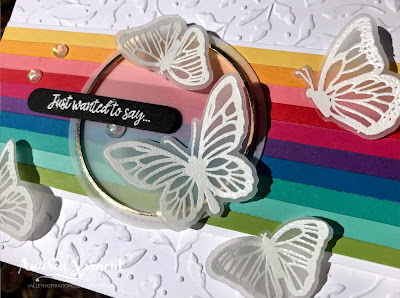
Given the striped panel across the centre of the card, I thought I would use all 10 Brights, so cut 5mm strips from each of the Bright's cardstocks. Each strip was adhered to some Basic White card-stock, leaving a small mount of Basic White at the top and bottom.

A vibrant happy card featuring Stampin' Up! products - the Brights colour family and Floating & Fluttering bundle by Andrea Sargent at Valley Inspirations, Australia.

A piece of Basic White card-stock, that had been cut to card front size, was embossed with the leafy Meadows Moments Embossing Folder. Then it was adhered directly on a Thick Basic White card base. The Brights striped panel spanned across the centre of the card, being adhered in place with Dimensionals.

A vibrant happy card featuring Stampin' Up! products - the Brights colour family and Floating & Fluttering bundle by Andrea Sargent at Valley Inspirations, Australia.

As I was walking my dog, the idea of using Vellum card-stock to add some further interest while allowing the bright stripes to shine. As I have seen many butterflies walking with Gemma, I decided on white embossed butterflies flying across the card. The set of butterflies from the Floating and Fluttering stamp set was stamped a couple of times with Versamark ink on Vellum and heat embossed using White Stampin' Emboss powder. Coordinating dies from the Fluttering dies were used to cut them out together with a tad of sniping to seperate each butterfly.

A vibrant happy card featuring Stampin' Up! products - the Brights colour family and Floating & Fluttering bundle by Andrea Sargent at Valley Inspirations, Australia.

A stitched circle from the Stitched Shapes dies was cut from Vellum and it was adhered in a couple of spots to the striped panel where 
it would be covered by butterflies. A Gold Hoop embellishment was layered on top using rolled Glue Dots. The vellum butterflies were scattered across the card front. That sounds simple, doesn't it, but ... getting the right arrangement was not easy for me. I finally found an arrangement that I was happy with before heading off to bed last night, but the butterflies had been knocked and moved by the time I came to finish the card this morning. And yes, I wasn't able to achieve an arrangement that I was really happy with. 

A vibrant happy card featuring Stampin' Up! products - the Brights colour family and Floating & Fluttering bundle by Andrea Sargent at Valley Inspirations, Australia.

The butterflies were either adhered directly to the card front or popped up on a Mini Dimensional. A sentiment from the Many Messages bundle was added with a Mini Dimensional either side of the Gold Hoop. Previously I had played with the Many Messages bundle and created a set of sentiments with Momento ink on Basic White card-stock and another set heat embossed with Versamark and White Emboss powder on Basic Black card-stock. It is very handy having a bowl of sentiments ready and waiting on my desk.

A vibrant happy card featuring Stampin' Up! products - the Brights colour family and Floating & Fluttering bundle by Andrea Sargent at Valley Inspirations, Australia.

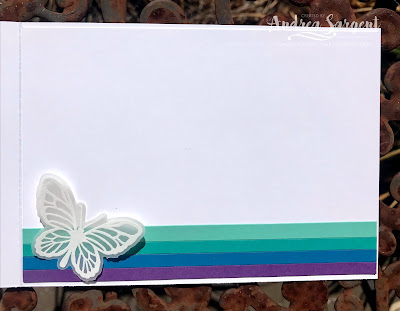
A few gorgeous Opal Rounds were added as a finishing touch. The card inner was created with thin strips of Coastal Cabana, Bermuda Bay, Pacific Point and Gorgeous Grape card-stock layered at the bottom with an embossed vellum butterfly. Some butterflies from the Floating and Fluttering stamp set were stamped in Bermuda Bay Classic Stampin' ink on a C6 Basic White envelope so that the envelope would give a hint of what could be fount inside.

A vibrant happy card featuring Stampin' Up! products - the Brights colour family and Floating & Fluttering bundle by Andrea Sargent at Valley Inspirations, Australia.

That's it from me this month. I hope you are enjoying this Social Stamping Blog Hop which has focussed on the Bright colours. If you started at the beginning with our amazing Social Stamping Host, Kelly Kent, then the next talented crafter is Elizabeth Gross at Lillybet's Papers. Either click on Elizabeth's name or click on the "next" graphic to be taken to her blog.


To see the full list of participants, click on this link and be taken to Kelly Kent's Host Blog Post at My Papercraft Journey where you will find all the individual links that can take you to each person's blog

I hope to see you again next month, when we will be focussing on the In Colours' families

Do look after yourself and your loved ones. Stay well, stay safe and be kind to yourself and others in these strange times. Hopefully improvement is around the corner.

Andrea 😘

Wednesday, 24 February 2021

Art with Heart Colour Creations Showcase - #37 Pretty Peacock

Pretty Peacock with Arrange a Wreath and Today's Tiles

Hi. Welcome to Valley Inspirations with Andrea and the 37th 2020/2021 Colour Creations Showcase by members of the Art with Heart Team.


I am so please you have called by.


This week we are focussing on a a deep teal blue green called Pretty Peacock. Pretty Peacock is one of Stampin' Up! 2019-2021 In Colour collection. It is a beautiful deep rich colour that is a delight to use. Pretty Peacock can be found in Stampin' Up!s card-stock, both A4 & 12"x12"Classic Stampin' inks (ink pads, re-inkers); Stampin' Write Markers; Stampin' Blends, some Designer Series Papers, including the Forever Greenery and Whale of a Time DSP, Pretty Peacock Scalloped Linen Ribbon, the delightful Pretty Peacock/Old Olive Reversible Ribbon, Woven Threads Sequin Assortment and Butterfly Gems.

Two cards featuring a deep teal blue-green, Pretty Peacock, one card with 2-step layered stamping and heat embossing; the other with water-coloured die cuts and dry embossing.

I've created two different cards this week, both featuring Pretty Peacock, however, the colour schemes and techniques are different. The first card includes water-coloured die cuts with minimal stamping, while the second card uses layered 2-step stamping and heat embossing.

CARD 1:

A card featuring a deep teal blue-green, Pretty Peacock, with water-coloured die cuts and dry embossing.

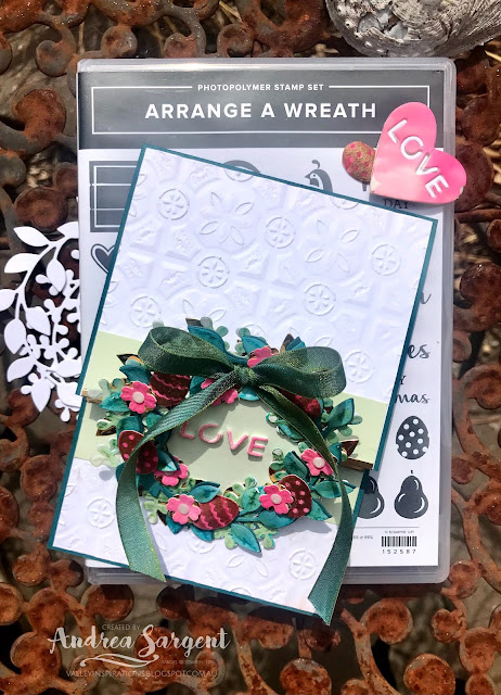
The oh so gorgeous Pretty Peacock/Old Olive Reversible Ribbon was the inspiration for this first card. The ribbon features Pretty Peacock with an Old Olive tinge on one side and the reverse on the other side, both with a metallic sheen. Also, I recently saw a video creating different styles of easel cards and was intrigued to try an upright wreath easel card. This is my version using quality Stampin' Up! products.

A card featuring a deep teal blue-green, Pretty Peacock, with water-coloured die cuts and dry embossing.

The Pretty Peacock cardstock card base was scored in half, folded and burnished - as normal.  Approximately 5cm was trimmed off the front flap of the card base. A card front was prepared in Basic White card-stock and cut in two at the same point as the front of the base. Both pieces of the card front were dry embossed using the Tin Tile 3D embossing folder. The bigger piece was directly adhered to the top section of the card and the other piece adhered to the card base, ensuring that when the card is closed flat embossed white card-stock is fully seen. 

A card featuring a deep teal blue-green, Pretty Peacock, with water-coloured die cuts and dry embossing.

Two strips of Soft Sea Foam card-stock were cut to sit across the card at the edges of the embossed card-stock. A sentiment was stamped in the centre of one strip using Pretty Peacock Classic Stampin' ink. I chose "Happy Easter" from the Arrange a Wreath stamp set as I was creating an Easter Wreath. (I'm getting in early with preparations for Easter.) This is such a versatile set as it can be used for a range of celebrations. The two light green strips were adhered to abutting edges of the embossed white card, ensuring the sentiment would be seen on the base. A thin strip of Brass Foil was adhered to the bottom edge of the Soft Sea Foam strip on the top section of the card. Another thin strip of Brass Foil was adhered to the top section of the Soft Sea Foam strip on the base of the card. Two more strips of foil were layered on top of this strip, thereby forming a lip that will hold the wreath as an easel. 

A card featuring a deep teal blue-green, Pretty Peacock, with water-coloured die cuts and dry embossing.

Using the two different wreath dies from the Wreath Builder dies, one of each was cut from Shimmery White card-stock and a third from Brass Foil using the leafy wreath die. The leaf Shimmery White wreath was water-coloured with Pretty Peacock Classic Stampin' ink refill adding touched of Old Olive ink and the spriggy wreath was water-coloured with Old Olive with touches of Pretty Peacock. Extra wreaths were cut from Basic White card-stock and they were adhered directly to the underneath of the water-coloured wreaths to add extra strength. The wreaths were layered and adhered together.

A card featuring a deep teal blue-green, Pretty Peacock, with water-coloured die cuts and dry embossing.

A strip of Shimmery White card-stock was water-coloured with Cherry Cobbler Classic Stampin' ink, ensuring some variation of depth of colour. Once dry, Easter eggs from the Arrange a Wreath stamp set were stamped in Versamark ink and heat embossed using Gold Stampin' Emboss Powder. The eggs and some little flowers were die cut from the water-coloured strip using the coordinating Wreath Builder dies. Little flowers were also die cut from  Brass Foil. Each water-coloured flower was layered with a brass flower. Also cut from the Cherry Cobbler water-coloured strip (that had been mounted on a piece of Foam Adhesive Sheet) was a heart with letters spelling "LOVE" cut out.


The eggs and flowers were arranged around the wreath, with a bow of the Reversible Ribbon being adhered at the top with a couple of Glue Dots. Small white Elegant Faceted Gems were added to the centre of each flower. A Soft Sea Spray die cut circle (cut using the Layering Circle Dies) was adhered to the back of the wreath. A smaller circle, die cut from Pretty Peacock card-stock was folded in half and with one half adhered to the underneath side of the card front. The other half of the circle was adhered to the upper centre of the back of the wreath - thus forming the hinge for the wreath. The cut out water-coloured lettering was adhered to the centre of the wreath.

A card featuring a deep teal blue-green, Pretty Peacock, with water-coloured die cuts and dry embossing.

An extra piece of Basic White card-stock was adhered above the embossed section on the inner section of the card. This is for writing a message to the recipient. A white heart was die cut (using the same set of dies) and adhered directly to the card inner together with a left over water-coloured flower with an Elegant Faceted Gem adhered at the centre.

A card featuring a deep teal blue-green, Pretty Peacock, with water-coloured die cuts and dry embossing.

A wreath (from the same stamp set) was partially stamped on a Basic White C6 envelope to provide an inkling of what may be inside.

A card featuring a deep teal blue-green, Pretty Peacock, with water-coloured die cuts and dry embossing.

I loved creating a different version of an easel card. I learnt along the way, so will make changes to my next card, including moving the layered section further down so the easel wreath sits at an angle rather than at right angles to the card base. This has spiked my creativity and I am looking forward to further exploration of ideas.

CARD 2:

As I pondered the other project to create showing Pretty Peacock, my mind went to an uninked stamp set, Today's Tiles. I decided to combine Pretty Peacock with Pool Party and silver embossing.

A card featuring a deep teal blue-green, Pretty Peacock, with 2-step layered stamping and heat embossing.

Using my trusty Stamparatus, I set it up with a stamp from the Today's Tiles stamp set that would stamp 2 rows of 4 tiles in one go. Wanting alternate tiles of Pretty Peacock and Pool Party, I had planned to use Stampin' Spots to ink the tiles. In preparing, I wondered if there would be more control using the Marker to Stamp technique ... I tried this option. 

A card featuring a deep teal blue-green, Pretty Peacock, with 2-step layered stamping and heat embossing.

I stamped the full stamp in Pool Party Classic Stampin' ink knowing that Pretty Peacock was a strong colour and could cover the lighter Pool Party. As this was my first use of the stamp set, I needed to stamp, re-ink and stamp again to attain good ink coverage. I then coloured each alternate tile using a Pretty Peacock Stampin' Write Marker - stamping one tile at a time. The stamping plate was moved 2 notches to stamp another set of 8 tiles adjacent to the first. You have to love Stampin' Up's attention to detail that ensured the tile width matched the Stamparatus width of 2 notches. 

As the stamp had significant area that touched the paper, the Basic White card-stock moved each time I lifted the stamp, even though it was held with 3 bar magnets. I tried to re-align it back into the same spot, but as you can see in the close-ups, it wasn't exact all the time and led to a little shadowing on some of the Pretty Peacock tiles. I wasn't happy with my first attempt so started afresh, adding an extra bar magnet. It still wasn't perfect, but I needed to progress the card - forgetting that there would be close-up photos. Ah well, in sharing the imperfections it is showing areas to watch out for, if you give this a go. I'm certainly looking forward to playing again with this set and working out how to ensure the card-stock doesn't move.

A card featuring a deep teal blue-green, Pretty Peacock, with 2-step layered stamping and heat embossing.

I set up the second stamp designed to highlight certain aspects of the tile design. I stamped it in Versamark ink and then heat embossed the tiles using Silver Stampin' Emboss Powder. I then moved the stamp plate 2 steps along and added Versamark ink to the adjoining set of 8 tiles. Wow, I was so excited with the effect (I know, it doesn't take much for me to get excited.)

A card featuring a deep teal blue-green, Pretty Peacock, with 2-step layered stamping and heat embossing.

The stamped square of 4 by 4 tiles was trimmed close to the tiles. I mounted it directly on a slightly larger square of Basic White card-stock and then mounted it on larger square of Pool Party card-stock using Dimensionals. It was then adhered directly to the Pretty Peacock card-stock base. A sentiment from the same Today's Tiles stamp set was stamped in Versamark on Pool Party card-stock and heat embossed with Silver Stampin' Emboss Powder. It was trimmed to a strip that spanned the tile design and mounted onto a wider piece of Basic White card-stock. Some white twine from the Snail Mail Combo Pack was tied around the sentiment strip ending in a bow. This was popped up with Dimensionals over a strip of 4 tiles. The final touch was the addition of 3 clear Elegant Faceted Gems.

A card featuring a deep teal blue-green, Pretty Peacock, with 2-step layered stamping and heat embossing.

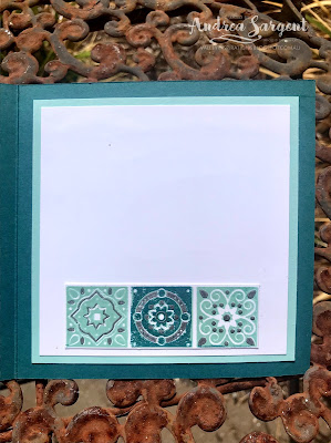
A piece of Basic White card-stock, mounted on Pool Party card-stock was adhered to the inside of the card. Three tiles from the discarded stamped tiles was added to carry the focal design through to the inside. As the card was not a standard size at about 12.5 x 12.5cm I custom-made an envelope using a piece of the Forever Greenery Designer Series Paper. A Basic White die cut oval was adhered to the front of the envelope for writing name & address.

A card featuring a deep teal blue-green, Pretty Peacock, with 2-step layered stamping and heat embossing.

I am looking forward to playing with this stamp set again and working to eliminate the imperfections. The coordinating dies are gorgeous and I have numerous ideas to include them on a project. So stay tuned ...

A card featuring a deep teal blue-green, Pretty Peacock, with 2-step layered stamping and heat embossing.

Thank you so much for spending time with me. 😘

Catherine Proctor is the fantastic host of the Art with Heart Colour Creations Showcase. If you haven't finished visiting all of the team's colour creations, you can visit/revisit Catherine's page at What Cathy Made, where she hosts all the links to the participating blogs so you can find everyone's Pretty Peacock creations. Checking out everyone's creations and their interpretation of the amazing Stampin' Up! colours is always inspiring. 

I hope to see you again next week when members of the team share projects that hero Pumpkin Pie, a strong orange. 

Stay well, stay safe and be kind to yourself and others as these strange times continue.  

Andrea 💕🐾


Wednesday, 17 February 2021

Art with Heart Colour Creations Showcase - #36 Poppy Parade

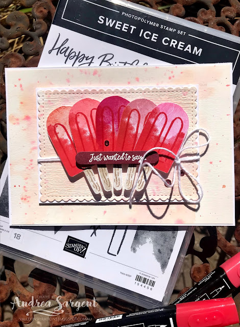
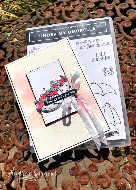
Poppy Parade with Sweet Ice Cream and Under My Umbrella

Hello. Welcome to Valley Inspirations with Andrea and the 36th 2020/2021 Colour Creations Showcase by members of the Art with Heart Team.


This week we are focussing on a vibrant clear red called Poppy Parade. Poppy Parade can be found in the Stampin' Up! Bright's collection. While its a great red, it is not a colour I reach for frequently, but do love the colour when the design requires it, such as when colouring poppies. Poppy Parade can be found in Stampin' Up!s card-stock, both A4 & 12"x12"Classic Stampin' inks (ink pads, re-inkers); Stampin' Write Markers; Stampin' Blends, a number of Designer Series Papers, including the Flowers for Every Season Designer Series Paper and Memories and More Card pack.


I've created two different cards again this week. Apart from both featuring Poppy Parade, I have also used water-colouring in some form for the background, plus a little Petal Pink, a centre panel die cut using a ... scalloped rectangular die and the Many Messages bundle for the sentiment, bringing some consistency between the two cards. Both cards have also been inspired by two talented crafters who I respect, that is Susan Wong, a Stampin' Up! Artisan and member of the #CraftyCarrotCollective; and Emma Goddard, of Coastal Crafter, past Stampin' Up Artisan and amazing lady.

Here are a couple of cards featuring Stampin' Up!s Poppy Parade, with water colouring, 2-step stamping and alcohol pens blending by Andrea Sargent at Valley Inspirations, Australia.

CARD 1:  This first play with the Sweet Ice Cream stamp set has been inspired by watching Susan Wong create with the Sweet Ice Cream stamps during the Crafty Carrot Collective Birthday Bash in January. Susan talked about colour theory and her cards reflected complimentary colour combinations. Working from memory and intentionally making a number of changes, I decided to have a harmonious colour scheme, that is primary & secondary colours that are adjacent to each other on the 'colour wheel'.

A card featuring Stampin' Up!s Poppy Parade, with Sweet Ice cream stamps and water colouring, 2-step stamping and different embossing techniques by Andrea Sargent at Valley Inspirations, Australia.

I started by stamping the base of the ice-block (or icy-pole or popsicle or whatever you call it) in Poppy Parade Classic Stampin' ink. I stamped it numerous times so I could experiment with different colours for the top of the ice block. Each ice-block requires 5 different stamps, ie the base and top of the ice-block, the stick, plus some woodgrain texture and the rounded long thin stamp representing indentations in the ice-block. I then stamped the top of the ice block overlapping the base and tried 6 different colours, ie Blushing Bride, Petal Pink, Melon Mambo, Flirty Flamingo, Calypso Coral and Mango Melody. The pop sticks were stamped in Sahara Sand and Crumb Cake. It was such fun playing with the colour combinations and seeing the effects of each combo. Rather than having the ice blocks the same I decided to use 5 of the different colour combos (dropping the one with Mango Melody) - as they harmonised together.

A card featuring Stampin' Up!s Poppy Parade, with Sweet Ice cream stamps and water colouring, 2-step stamping and different embossing techniques by Andrea Sargent at Valley Inspirations, Australia.

I gathered a number of potential colours of card-stock and laid the fussy cut ice-blocks on each card-stock colour. I decided on the harmonious choice of Petal Pink and prepared the base and the central panel - the latter being die cut using the second largest scolloped rectangular die from the Stitched So Sweetly die set. But I wasn't 100% happy. In the end I decided to water-colour the background using Fluid 100 Water-colour paper with Petal Pink Classic Stampin' Refill and a splatter of Poppy Parade Classic Stampin' Refill. I also think the water-coloured paper would have been great for a strawberry ice cream creation - may try that another time.

A card featuring Stampin' Up!s Poppy Parade, with Sweet Ice cream stamps and water colouring, 2-step stamping and different embossing techniques by Andrea Sargent at Valley Inspirations, Australia.

When the watercolour paper was dry, I die cut the label from the centre. Then both pieces were passed through the Stampin' Cut & Emboss machine with the Subtles 3D embossing folder. I so love the added gentle texture and practically, the slight buckle in the watercolour paper was flattened. The outer piece was adhered directly to the Thick Basic White card base.

A card featuring Stampin' Up!s Poppy Parade, with Sweet Ice cream stamps and water colouring, 2-step stamping and different embossing techniques by Andrea Sargent at Valley Inspirations, Australia.

The scalloped label was mounted on a slightly larger piece of Basic White card-stock and some white twine from the Snail Mail Twine Combo pack was wrapped around the label and tied in a bow. The 5 different ice-blocks were positioned across the label with some overlap and adhered in place with Dimensionals. The label was also popped up on Dimensionals and centred on the background hiding the die cut hole.

A card featuring Stampin' Up!s Poppy Parade, with Sweet Ice cream stamps and water colouring, 2-step stamping and different embossing techniques by Andrea Sargent at Valley Inspirations, Australia.

I have a bowl of sentiments prepared from the Many Messages bundle. This is a "must have" bundle. There is a great range of messages that can be stamped in one go using your Stamparatus and then die cut with the coordinating die. It's amazing. You easily end up with a range of prepared sentiments that can sit on your desk ready for you to craft. I had previously stamped the sentiments in Momento ink on Basic White card-stock as well as a set that had been heat embossed with Versamark on Basic Black card-stock and using White Stampin' Emboss Powder. The white on black sentiment was a tad stark so instead I heat embossed on Merry Merlot card-stock with Versamark ink and White Stampin' Emboss Powder. The label was popped up with Mini Dimensionals and 3 Rhinestone Basic Jewels that had been coloured with a Dark Poppy Parade Stampin' Blend were added to finish off the card front.

A card featuring Stampin' Up!s Poppy Parade, with Sweet Ice cream stamps and water colouring, 2-step stamping and different embossing techniques by Andrea Sargent at Valley Inspirations, Australia.

The card inner was stamped with an ice-block using Poppy Parade, Flirty Flamingo, Sahara Sand and Crumb Cake and a tiny heart from the Many Messages bundle was added. A C6 Basic White Envelope was also stamped with the same colour combo ice-block.

A card featuring Stampin' Up!s Poppy Parade, with Sweet Ice cream stamps and water colouring, 2-step stamping and different embossing techniques by Andrea Sargent at Valley Inspirations, Australia.

CARD 2:  When I first thought of featuring Poppy Parade I was concerned that it would become a project that was "heavy" with red, however, featuring a colour doesn't mean that it is used more than any other colour - it may be that a touch of a colour is actually the most powerful use. This reminded me of a set of gorgeous cards created by Emma Goddard, featuring Poppy Parade and Night of Navy. With that in mind, I thought I would create a black and white card with highlights of Poppy Parade. That was my initial concept but it evolved along the way.

A card featuring Stampin' Up!s Poppy Parade, with Under My Umbrella and water colouring, stamping and alcohol pens blending by Andrea Sargent at Valley Inspirations, Australia.

I thought I would feature a black and white umbrella holding Poppy Parade flowers. I stamped the umbrella from the Under My Umbrella stamp set on a couple of the geometric sides of the True Love DSP. The little flowers were stamped in Momento Ink on Basic White card-stock. These flowers were coloured with Dark & Light Poppy Parade Stampin' Blends with a touch of Dark Daffodil Delight in the centre. The leaves were coloured with a Dark Soft Seaside Spray Stampin Blend (they were too small to play around with blending). The flowers and the umbrellas were all fussy cut.

A card featuring Stampin' Up!s Poppy Parade, with Under My Umbrella and water colouring, stamping and alcohol pens blending by Andrea Sargent at Valley Inspirations, Australia.

The central label was die cut using one of the rectangular dies from the Stitched So Sweetly set of dies and it was mounted on a slightly larger Basic Black card-stock mount. Some White Crinkled Seam Binding Ribbon was tied around the central panel ending with a bow. 

A card featuring Stampin' Up!s Poppy Parade, with Under My Umbrella and water colouring, stamping and alcohol pens blending by Andrea Sargent at Valley Inspirations, Australia.

Hmm. The umbrella and flowers would sit on this central panel but what were the options for the background? I decided to play with water-colour just using Poppy Parade Classic Stampin' Refill but water the colour down a bit. I used wet on wet water-colouring with drops of Poppy Parade Classic Stampin' Ink Refill applied with a mid-sized Water Painter. When dry the background was stamped with the floral stamps in Petal Pink. I chose Petal Pink as I didn't want the water-coloured panel overpowered, however, it was so delicate that is hardly shows - in fact the camera doesn't pick them up. The water-coloured paper was embossed with the Subtle 3D Embossing folder. It was also mounted on a slightly larger piece of Basic Black card-stock and then onto the Thick Basic White card base.

A card featuring Stampin' Up!s Poppy Parade, with Under My Umbrella and water colouring, stamping and alcohol pens blending by Andrea Sargent at Valley Inspirations, Australia.

I positioned all the pieces and realised that the mainly black umbrella was too dark so choose the white with black dots umbrella. (The blacker umbrella was trimmed and added to the card inner so it didn't go to waste.) The umbrella was lightly shaded with Smoky Slate Stampin' blends and positioned with Mini Dimensionals. The flowers were arranged and adhered in place with Tombow Multipurpose Liquid Glue. The central panel was positioned to the background with Dimensionals.

A card featuring Stampin' Up!s Poppy Parade, with Under My Umbrella and water colouring, stamping and alcohol pens blending by Andrea Sargent at Valley Inspirations, Australia.

I checked out my bowl of pre-prepared Many Messages sentiments and found this greeting that seems perfect for the card. It was adhered directly to the umbrella. Rhinestone Basic Jewels were coloured with a Dark Poppy Parade Stampin' Blend and added to finish the card.

A card featuring Stampin' Up!s Poppy Parade, with Under My Umbrella and water colouring, stamping and alcohol pens blending by Andrea Sargent at Valley Inspirations, Australia.

As mentioned, the darker umbrella was adhered to the Basic White card inner and 3 remaining sets of flowers were added poking out from the umbrella.  The card inner was mounted on Basic Black card-stock and adhered inside the card. A Basic White C6 envelope was stamped with flower stamps in Petal Pink.

A card featuring Stampin' Up!s Poppy Parade, with Under My Umbrella and water colouring, stamping and alcohol pens blending by Andrea Sargent at Valley Inspirations, Australia.

I really enjoyed playing with water-colouring and creating these Poppy Parade cards. As mentioned, I was tentative that the cards would be overpowered with red, but I'm pleased with the results - I hope you are as well.

Thank you so much for spending time with me. 😘

Catherine Proctor is the brilliant host of the Art with Heart Colour Creations Showcase. If you haven't finished visiting all of the team's colour creations, you can visit/revisit Catherine's page at What Cathy Made, where she hosts all the links to the participating blogs so you can find everyone's Poppy Parade creations. Checking out everyone's creations and their interpretation of the amazing Stampin' Up! colours is always inspiring. 

I hope to see you again next week when members of the team share projects that hero Pretty Peacock, a gorgeous deep blue green. 

Stay well, stay safe and be kind to yourself and others as these strange times continue ... 

Andrea 💕🐾


Wednesday, 10 February 2021

Art with Heart Colour Creations Showcase - #35 Pool Party

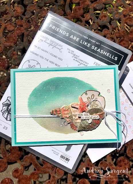
Pool Party with Friends are Like Sea Shells and A Touch of Ink

Hi. Welcome to Valley Inspirations with Andrea and the 35th 2020/2021 Colour Creations Showcase by members of the Art with Heart Team.

So glad you have called by.


This week we are focussing on a lovely soft aqua called Pool Party. Pool Party can be found in the Stampin' Up! Subtle's collection. This is another gorgeous versatile colour.  As the name suggests it is great for watery themes and is amazing as a background to flowers, scenes, etc. It is one of my favourite Stampin' Up! colours. Pool Party can be found in Stampin' Up!s card-stock, both A4 & 12"x12"Classic Stampin' inks (ink pads, re-inkers); Stampin' Write Markers; Stampin' Blends, a range of Designer Series Papers, the Looking Up Card Kit, the Sweet Little Valentine cards and a number of embellishments, including the Pool Party Sheer Ribbon, Whale of a Time sequins and the Ice Cream Corner Sprinkles..

These cards feature the Stampin' Up! colour Pool Party and combine watercolouring with A Touch of Ink  & Friends are like Seashells stamp sets.

I've created two different cards again this week. Apart from both featuring Pool Party, I have also used Petal Pink, Sahara Sand, Gold Heat Embossing and water-colouring techniques to keep some consistency between the two cards.

This card features the Stampin' Up! colour Pool Party and combines water-colouring with the Friends are like Seashells stamp set.

Card 1:  This first card was inspired by Emma Goddard, an amazing lady and Independent UK Stampin' Up! Demonstrator. At Emma's launch of the January-June Mini Catalogue earlier this year, she created a couple of cards where she water-coloured a hand drawn circle for her background. Knowing any attempt to draw a circle (or an oval) would end up as a big mess, I die cut an oval using the Layering Circle dies from a scrap piece of Basic White card-stock. I positioned the oval hole over a piece of Fluid 100 Water-colour paper.

This card features the Stampin' Up! colour Pool Party and combines water-colouring with the Friends are like Seashells stamp set.

Using the mid size Water Painter, I spread water over the watercolour paper though the hole. After lifting the template off, I increased the oval of water a little so it looked a little more natural (that is - contrived free-hand).  I then dropped both Pool Party and Sahara Sand Classic Stampin' ink onto the water oval, ensuring a little blending of the colours. Playing a little, I added more Pool Party ink. It certainly became darker than planned, but I was intrigued that Pool Party would become this dark and build up to look like Bermuda Bay (see the comparison with the fine Bermuda Bay card-stock mount). I am so fascinated with colour creation and its interactions.

This card features the Stampin' Up! colour Pool Party and combines water-colouring with the Friends are like Seashells stamp set.

As a fair bit of liquid had been used to create this water-colour background, the water-colour paper was a little warped so I ran it through the Cut & Emboss machine, embossing it with the Subtle 3D embossing folder; which flattened the paper and added some subtle texture.

A selection of shells from the Friends are Like Seashells stamp set were stamped in Versamark ink on Fluid 100 Water-colour paper and heat embossed with Gold Stampin' Emboss powder. I so love the Sand and Sea suite. The coordination between the stamps, dies and embossing folder is amazing. The stamped shells are gorgeous and while the stamp set has stamps for two step stamping, I decided to watercolour the embossed shells using Petal Pink, Calypso Coral with touches of Pool Party and Sahara Sand Classic Stampin' inks. These shells were then laid in the Seashells 3D embossing folder and passed through the Cut & Emboss machine.

This card features the Stampin' Up! colour Pool Party and combines water-colouring with the Friends are like Seashells stamp set.

Some Frost White Shimmer Paint was flicked over the card front. White twine from the Snail Mail Twine Combo pack was twice wrapped around the mounded card front and tied in a bow to the RHS. The shells were arranged and adhered in place with a mix of Multipurpose Liquid Glue and Dimensionals. A sentiment from the same stamp set was also heat embossed in  gold. The sentiment was fussy cut and divided in two with the first half of the sentiment placed over the shells and the second half added to the card inner.

This card features the Stampin' Up! colour Pool Party and combines water-colouring with the Friends are like Seashells stamp set.

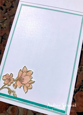
A piece of Basic White card-stock was mounted onto some Bermuda Bay card-stock and then adhered into the Pool Party card base. A little gold embossed sea plant was added near the sentiment.

A couple of sea shells were stamped in Pool Party ink onto a C6 Basic White envelope

A few delightful Opal Rounds were added to finish the card. 

This card features the Stampin' Up! colour Pool Party and combines water-colouring with the Friends are like Seashells stamp set.


CARD 2:  For my second card I wanted to again try a watercolour background but make it much a much softer Pool Party. As mentioned, Pool Party is a fantastic colour for a background, whether water-coloured, as I have done; or creating a soft background with blending brushes or sponge rollers; or by running a Pool Party Stampin' Blend around the edge of the stamped image. Just adding a little Pool Party around a stamped image softens the effect superbly.

This card features the Stampin' Up! colour Pool Party and combine water-colouring with A Touch of Ink stamp set.

This water-colour background was more free flowing than the first card. Water was added to Fluid 100 Water-colour paper using a Water Brush. Drops of Pool Party Classic Stampin' ink refill were added and gently moved around the wet area. Excess moisture and ink were mopped up with a paper towel and the water-coloured paper was put aside to dry naturally. To help in flattening after it had dried, this background was dry embossed with the Painted Texture 3D embossing folder. As I looked at it I realised I had created my own version of one of the designs in the Fine Art Floral DSP - similar but different, as they say.

This card features the Stampin' Up! colour Pool Party and combine water-colouring with A Touch of Ink stamp set.

The embossed water-coloured background was adhered to a Pool Party card-stock mount. The card base was made from Thick Basic White.

This card features the Stampin' Up! colour Pool Party and combine water-colouring with A Touch of Ink stamp set.

Leaves and flowers from the Sale-a-bration free stamp set, A Touch of Ink, were stamped in Versamark ink onto the Fluid 100 water-colour paper and heat embossed with Gold Stampin' Emboss powder. The leaves were water-coloured using Sahara Sand Classic Stampin' ink and the flowers with Petal Pink and delicate touches of Rococo Rose ink. The sentiment was accidentally stamped on Basic White card-stock rather than a scrap of the water-colour paper. It doesn't show in real life but the camera has captured the differences in the white of the card-stocks. It is annoying me, but no time to correct it now. I will re-stamp it later!

This card features the Stampin' Up! colour Pool Party and combine water-colouring with A Touch of Ink stamp set.

The leaves and flowers were all fussy cut and arranged in place. That sounds simple ... but ... I fiddled and faffed so much to get the arrangement 'right'. I tried different positions, added a water-coloured humming bird then took it off; added the butterfly and took it off, even tried adding different dragonflies from the Dandy Laser-cut paper, but no - they all detracted from the overall simplicity and space of the design. This hadn't been the only indecision with this card. I had tried different combinations of mounts and also various ribbon or twines. I lost track of the time taken - but ... that is the creative process. Sometimes inspiration just flows and other times there is a lot of fiddling and trying various options. 

This card features the Stampin' Up! colour Pool Party and combine water-colouring with A Touch of Ink stamp set.

Some white twine from the Snail Mail Twine Combo Pack was wrapped around the card front twice on the left hand side and tied in a bow near the top. A few Opal Rounds were added to add a little touch of glimmer. These embellishments are so gorgeous.

This card features the Stampin' Up! colour Pool Party and combine water-colouring with A Touch of Ink stamp set.

The card inner was created by mounting Basic White card-stock onto Pool Party card-stock. A thin strip of Bermuda Bay card-stock was adhered to the bottom of the white card together with a piece of white twine - both were laying on my table from the previous card. A C6 Basic White envelope was stamped with leaves using Sahara Sand ink.

This card features the Stampin' Up! colour Pool Party and combine water-colouring with A Touch of Ink stamp set.

I really enjoyed creating these cards (even with the faffing around), and furthering my water-colour exploration. Its all a learning process.

Thank you so much for spending time with me. 😘

Catherine Proctor is the amazing host of the Art with Heart Colour Creations Showcase. If you haven't finished visiting all of the team's colour creations, you can visit/revisit Catherine's page at What Cathy Made, where she hosts all the links to the participating blogs so you can find everyone's Pool Party creations. Checking out everyone's creations and their interpretation of the amazing Stampin' Up! colours is always a highlight of my week. 

I hope to see you again next week when members of the team share projects that hero Poppy Parade, a bright red that has a touch of orange. 

Stay well, stay safe and be kind to yourself and others as these strange times continue - and yes, they are continuing ... 

Andrea 💕🐾


AWH Colour Creations Blog Hop #34 Melon Mambo

Melon Mambo with Memorable Blooms Hello. Welcome to  Valley Inspirations with Andrea  and the  Art with Heart Colour Creations Blog Hop.  We...