Pool Party with Friends are Like Sea Shells and A Touch of Ink
Hi. Welcome to Valley Inspirations with Andrea and the 35th 2020/2021 Colour Creations Showcase by members of the Art with Heart Team.
So glad you have called by.
This week we are focussing on a lovely soft aqua called Pool Party. Pool Party can be found in the Stampin' Up! Subtle's collection. This is another gorgeous versatile colour. As the name suggests it is great for watery themes and is amazing as a background to flowers, scenes, etc. It is one of my favourite Stampin' Up! colours. Pool Party can be found in Stampin' Up!s card-stock, both A4 & 12"x12"; Classic Stampin' inks (ink pads, re-inkers); Stampin' Write Markers; Stampin' Blends, a range of Designer Series Papers, the Looking Up Card Kit, the Sweet Little Valentine cards and a number of embellishments, including the Pool Party Sheer Ribbon, Whale of a Time sequins and the Ice Cream Corner Sprinkles..
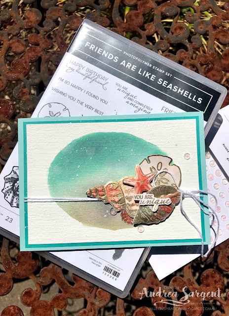
Card 1: This first card was inspired by Emma Goddard, an amazing lady and Independent UK Stampin' Up! Demonstrator. At Emma's launch of the January-June Mini Catalogue earlier this year, she created a couple of cards where she water-coloured a hand drawn circle for her background. Knowing any attempt to draw a circle (or an oval) would end up as a big mess, I die cut an oval using the Layering Circle dies from a scrap piece of Basic White card-stock. I positioned the oval hole over a piece of Fluid 100 Water-colour paper.
Using the mid size Water Painter, I spread water over the watercolour paper though the hole. After lifting the template off, I increased the oval of water a little so it looked a little more natural (that is - contrived free-hand). I then dropped both Pool Party and Sahara Sand Classic Stampin' ink onto the water oval, ensuring a little blending of the colours. Playing a little, I added more Pool Party ink. It certainly became darker than planned, but I was intrigued that Pool Party would become this dark and build up to look like Bermuda Bay (see the comparison with the fine Bermuda Bay card-stock mount). I am so fascinated with colour creation and its interactions.
As a fair bit of liquid had been used to create this water-colour background, the water-colour paper was a little warped so I ran it through the Cut & Emboss machine, embossing it with the Subtle 3D embossing folder; which flattened the paper and added some subtle texture.
A selection of shells from the Friends are Like Seashells stamp set were stamped in Versamark ink on Fluid 100 Water-colour paper and heat embossed with Gold Stampin' Emboss powder. I so love the Sand and Sea suite. The coordination between the stamps, dies and embossing folder is amazing. The stamped shells are gorgeous and while the stamp set has stamps for two step stamping, I decided to watercolour the embossed shells using Petal Pink, Calypso Coral with touches of Pool Party and Sahara Sand Classic Stampin' inks. These shells were then laid in the Seashells 3D embossing folder and passed through the Cut & Emboss machine.
Some Frost White Shimmer Paint was flicked over the card front. White twine from the Snail Mail Twine Combo pack was twice wrapped around the mounded card front and tied in a bow to the RHS. The shells were arranged and adhered in place with a mix of Multipurpose Liquid Glue and Dimensionals. A sentiment from the same stamp set was also heat embossed in gold. The sentiment was fussy cut and divided in two with the first half of the sentiment placed over the shells and the second half added to the card inner.
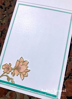
A piece of Basic White card-stock was mounted onto some Bermuda Bay card-stock and then adhered into the Pool Party card base. A little gold embossed sea plant was added near the sentiment.
A couple of sea shells were stamped in Pool Party ink onto a C6 Basic White envelope.
A few delightful Opal Rounds were added to finish the card.
CARD 2: For my second card I wanted to again try a watercolour background but make it much a much softer Pool Party. As mentioned, Pool Party is a fantastic colour for a background, whether water-coloured, as I have done; or creating a soft background with blending brushes or sponge rollers; or by running a Pool Party Stampin' Blend around the edge of the stamped image. Just adding a little Pool Party around a stamped image softens the effect superbly.
This water-colour background was more free flowing than the first card. Water was added to Fluid 100 Water-colour paper using a Water Brush. Drops of Pool Party Classic Stampin' ink refill were added and gently moved around the wet area. Excess moisture and ink were mopped up with a paper towel and the water-coloured paper was put aside to dry naturally. To help in flattening after it had dried, this background was dry embossed with the Painted Texture 3D embossing folder. As I looked at it I realised I had created my own version of one of the designs in the Fine Art Floral DSP - similar but different, as they say.
The embossed water-coloured background was adhered to a Pool Party card-stock mount. The card base was made from Thick Basic White.
The leaves and flowers were all fussy cut and arranged in place. That sounds simple ... but ... I fiddled and faffed so much to get the arrangement 'right'. I tried different positions, added a water-coloured humming bird then took it off; added the butterfly and took it off, even tried adding different dragonflies from the Dandy Laser-cut paper, but no - they all detracted from the overall simplicity and space of the design. This hadn't been the only indecision with this card. I had tried different combinations of mounts and also various ribbon or twines. I lost track of the time taken - but ... that is the creative process. Sometimes inspiration just flows and other times there is a lot of fiddling and trying various options.
Some white twine from the Snail Mail Twine Combo Pack was wrapped around the card front twice on the left hand side and tied in a bow near the top. A few Opal Rounds were added to add a little touch of glimmer. These embellishments are so gorgeous.
The card inner was created by mounting Basic White card-stock onto Pool Party card-stock. A thin strip of Bermuda Bay card-stock was adhered to the bottom of the white card together with a piece of white twine - both were laying on my table from the previous card. A C6 Basic White envelope was stamped with leaves using Sahara Sand ink.
I really enjoyed creating these cards (even with the faffing around), and furthering my water-colour exploration. Its all a learning process.


Wow! You put so much work into your cards Andrea! I particularly love how you have showed us another way to use A Touch of Ink - all those lovely layers!
ReplyDeleteBoth cards are so pretty, Andrea. I love the gold-embossing, with soft pastel colours, watercoloured. Your blog post gave me a couple of good laughs - about the potential for a "big mess" with a freehand oval (oh yes, this is me, too!), and your description of your creative process, trying all sorts of different elements and matting combinations. Fun, but sometimes frustrating! You have done a lovely job of showcasing Pool Party on these cards.
ReplyDeleteAndrea I am always astonished at the level of detail in your beautiful cards. These two don’t disappoint. The texture and all the gorgeous layers are stunning.
ReplyDeleteBoth your cards are so soft, beautiful and elegant Andrea - just amazing! And yes I can totally relate to the "big mess" - I'm so scared i've yet to open my gold embossing leafing! Thank you for sharing your Pool Party ideas on the Colour Creations Showcase!
ReplyDeleteAndrea, again you show your creative mind in both of these amazing cards. The time and work you put into each card really pays off with the gorgeous details. Those opal embellishments finish off your A Touch of Ink card beautifully.
ReplyDeleteAndrea, your amazing cards never cease to inspire. So much thought and so many wonderful details to look at on each one. You’ve showcased the softness and strength of colour with your Pool Party cards.
ReplyDelete