Petal Pink with Hydrangea Haven, Wild Rose and Watercolour
Hi. Welcome to Valley Inspirations with Andrea and the 34th Colour Creations Showcase for 2020/2021 by members of the Art with Heart Team.
While pondering how I would showcase Petal Pink, I decided I would use three stamp sets from my new stash that were yet to see ink. I also decided to play with water-colouring.
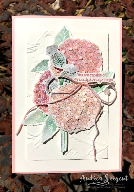
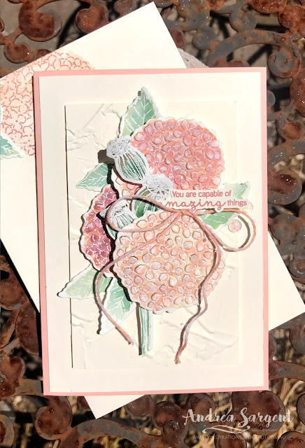
Card 1: I love Petal Pink with Very Vanilla and so my first card uses Very Vanilla as the background card-stock. The hydrangeas and their leaves from the Hydrangea Haven stamp set were each stamped three times in Versamark ink on Fluid 100 Watercolour paper and heat embossed with White Emboss Powder. The stem of 3 seed pods from the Enjoy the Moment stamp set was similarly heat embossed on Fluid 100 watercolour paper.
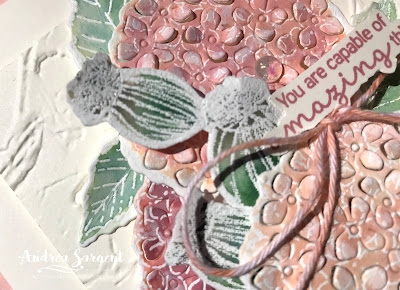
The hydrangeas were watercoloured with Petal Pink Classic Stampin' ink. One hydrangea was only coloured with Petal Pink, while the other 2 also used differing amounts of Rococo Rose ink. The leaves were water-coloured with Mint Macaroon Classic Stampin' ink, as was the seedpod twig, although a little Sahara Sand ink was added near the tip of the seedpods. They were all left to dry.
A piece of Very Vanilla card-stock to add to the centre of the background was embossed with the 3D Painted Texture embossing folder. This was popped in place with Dimensionals.
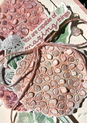
The hydrangeas and leaves were die cut with the coordinating Hydrangea dies. The hydrangeas were also die cut with the flower die that cuts little flowers within the flower head. The seedpods needed to be fussy cut as there is no coordinating die with the Enjoy the Moment stamps. The flowers, leaves and seedpods were arranged and layered using a mix of Multipurpose Liquid Glue and Dimensionals.
A sentiment from the Hydrangea Haven stamp set was stamped in Rococo Rose ink onto Very Vanilla card-stock. This was fussy cut and positioned with Mini Dimensionals. Some white twine from the Snail Mail Twine Combo pack was coloured with a Dark Petal Pink Stampin' Blend. I purposely did not go over it again to ensure the colour was evenly distributed as a mix of lighter and darker patches of colour suited the watercolour effect. The coloured twine was tied into a bow and positioned under the sentiment with a Glue Dot. Gorgeous Opal Rounds embellishments were added as the finishing touch.
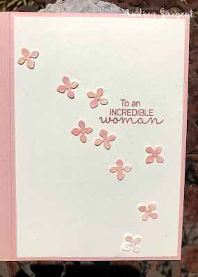
A C6 Very Vanilla envelope was stamped with the hydrangea flower using Stampin' markers to colour the flower head in Rococo Rose and the leaves with Mint Macaron. The flower head was infilled with Petal Pink ink using the coordinating infill stamp.
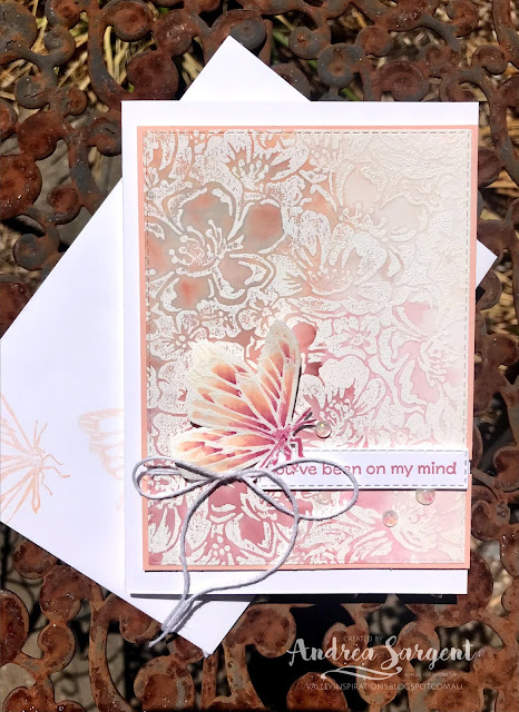
Once dry, the largest die from the Stitched Rectangle dies was used to cut a rectangle of embossed and water-coloured shimmery card-stock. This was mounted on a slightly larger piece of Petal Pink card-stock. To ensure it adhered flat, it was passed through my Cut and Emboss Machine a couple of times, which worked brilliantly.
A couple of small notches where punched on either side of the mounted card front and some white twine from the Snail Mail Twine Combo pack was wrapped around twice and tied in a bow. A sentiment from the ... stamp set was stamped in Rococo Rose ink on a scrap of Basic White card-stock (the Petal Pink was too light) and die cut with the smallest long thin Stitched Rectangle die.
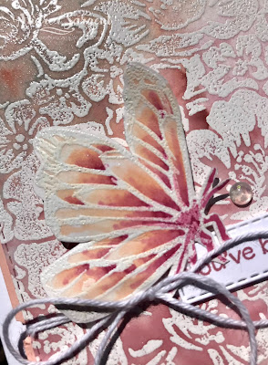
The card still needed something, so I looked through my floral stamp sets for a similar style rose. As I did so I saw the lovely Touch of Ink stamp set that is available for free during Sale-a-bration when you purchase $180.00 worth of product. It is a lovely set that also provides a watercolour look. I stamped the butterfly in Versamark ink and similarly heat embossed it. As time was running out, I didn't have time to watercolour the butterfly so decided to colour it with Stampin' Blends using Light and Dark Petal Pink and Rococo Rose Blends combos. The fussy cut butterfly was popped up on Dimensionals and to align with Card 1, Opal Rounds were added as the finishing touch. The opal look in these embellishments have a pinky tinge that coordinates so well with Petal Pink.
A piece of Basic White card-stock was stamped in Petal Pink ink with the same Butterfly stamp. This was mounted onto a slightly larger piece of Petal Pink card-stock and adhered to the right hand side of the inside of the card to coordinate with the card front design.
A C6 Basic White Envelope was also stamped with the butterfly in Petal Pink ink. The card front was popped up on Dimensionals ensuring alignment with the card's right hand side.








Andrea your cards have a lovely old fashioned shabby chic elegance to then - just gorgeous! Thanks for joining the CCS tonight!
ReplyDeleteIsn't it funny that Petal Pink is one of your favourite colours, and one of my least favourite colours?! You have used it beautifully, Andrea. I really love your second card, especially - the way you've faded out the watercolouring on the main panel is just beautiful. Such a pretty, delicate, design.
ReplyDeleteWow you have done so much work Andrea! These are lovely cards! I am way too lazy to emboss with white first then colour - and yet it always looks so beautiful! I love what you have done with Wild Rose stamp - each time I see it in the catalogue I am SO tempted!
ReplyDeleteI love your hydrangea card, but wow, that Wild Roses background is stunning, especially the way you faded the colour!
ReplyDeleteI look forward to seeing your cards each week Andrea. They are always amazing with such details and well written descriptions on the techniques you have used. This week is no different - both cards are so lovely. I am drawn to the second one with that gorgeous colour fading effect - just gorgeous.
ReplyDelete